We've seen a lot of carmakers redesign their logos in recent years. In almost every case, the change has involved flattening the logo out and simplifying it for a cleaner look that's better suited to digital applications. And sure enough, the new Škoda logo has followed suit, but there's also a bit more to it than that.
As well as flattening its logomark, the Czech car manufacturer has adopted new on-trend colours and it's attempted to resolve (or hide) an issue that it says was confusing global audiences. What does it take to make a successful logo? see our guide to how to design a logo for some tips.

Škoda describes the change as its biggest rebranding in the last 30 years. It considered 165 proposals, which were whittled down to a shortlist that was tested with feedback from 2,200 respondents from the Czech Republic, Germany, Italy, Norway, India and Israel.
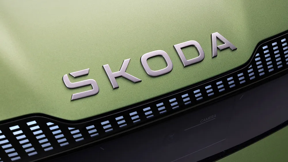
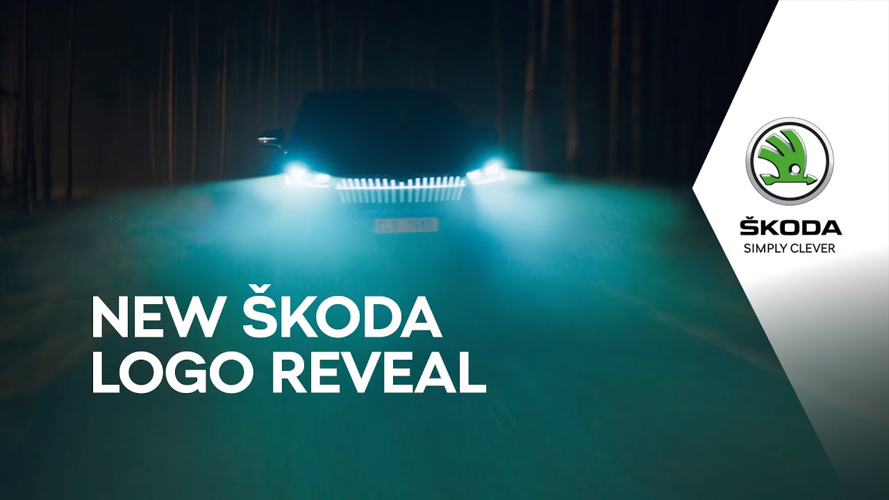
The result is that it's flattened its winged arrow symbol (no, we're still not sure what the circle on the wing is; it seems a strange place for an eye) – and it's developed a new wordmark. The latter will get pride of place, replacing the badge on the front of Škoda cars as the brand transitions to electrification.

The type logo also aims to resolve the issue of the inverted circumflex accent, or caron, over the S in the brand's name, which the company says is confusing for a global audience. I can't say I found it confusing (although it's a pain to type), but the solution is interesting.
Rather than ditch the accent another, Škoda's incorporated it into the shape of the S itself. Anyone not already familiar with the brand wouldn't see it, and that seems to be the idea. Customers in Škoda's domestic market and other regions that use carons will recognise it, while everyone else can forget it's there... although actually they can't because beyond the logo, the brand name is still officially spelled Škoda.
It's an interesting approach, but it does make the logo a little reminiscent of another maker of electric cars. The hook has a vaguely similar shape to the top of the A in the Tesla logo. And while it's a small detail, it's an association that's hard to avoid considering the companies are in the same sector and even happen to have the same number of letters in their names.

As for the colour, Škoda's traditional green has been replaced with two new shades: emerald and electric, which the brand says will look better on digital devices. Head of marketing Petra Mackeová says, "Few brands have the colour green as ingrained in their DNA as Škoda. The new shades maintain the link with history, but also refresh the design and allude more strongly to electromobility."
The colours certainly will look better on mobile, and they do look more 'electric', but they're also quite a departure from the previous shade (see the Škoda log history in the video below). And that minty 'electric green' is so on trend that it could be a colour from any recent fintech app rather than a heritage car company, which makes me wonder how long it will look fresh.
We've seen lots of carmakers follow the trend of flattening or simplifying their logos to make them look more modern and easier to apply at small sizes for digital use. The new Aston Martin logo designed by Peter Saville is one of the most recent successful examples, along with the new Citroen logo. While some say this means logos are all starting to look the same, it makes sense, and logos have always followed trends to an extent.
Time will tell how long Škoda's new logo looks fresh, but perhaps an inadvertent unconscious association with Tesla isn't a bad thing for a brand that's going big on electric cars. The new logo will first roll out across communications materials and won't appear on cars until 2024. In the meantime, check out our pick of the best logos of all time for more logo inspiration, and take a look at our recommendations of the best graphic design software if you're looking to get designing yourself.
Read more:

