The latest Aston Martin logo makes perfect sense
A subtle change made a big difference.
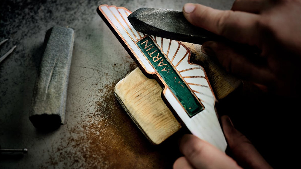
The British luxury car maker Aston Martin is known for speed and sleek design – after all, the DB5 is James Bond's vehicle of choice (at least, in many of the films). Its most recent rebrand (earlier this year) aimed to ensure it keeps that edge by bringing in famed graphic designer Peter Saville CBE to update its winged logo. The move shouldn't be a surprise – it follows a trend we've seen many other car manufacturers adopt of late, but it makes perfect sense for the brand.
The change might not seem like a massive transformation – Saville's described it as "subtle but necessary". But it's a lesson in logo design that respects a heritage brand while keeping it fresh and modern. If you're looking for design tips for your own logo designs, see our guide to how to design a logo and make sure you have the best graphic design software.
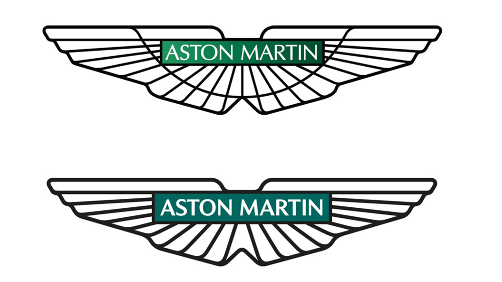
The previous Aston Martin logo looked positively busy by today's standards with its green gradient background and fussy semi-circular line. The lines reflected the original Egyptian inspiration for the design but didn't seem to say much about the brand today. Saville, a graphic designer most famous for his album covers for the Manchester record label Factory Records, sensibly ditched both of those elements.
Article continues belowThe gradient was replaced with a solid British racing green, and the remaining lines have been thickened. That makes them bolder, but also more streamlined and modern-looking, showing an intent to boost the Warwickshire-based company's appeal among a younger and more international audience, while respecting the brand's history.
As Aston Martin's executive vice president Marek Reichman said, "every millimetre of each line – of each shape within the new wings, are drawn forward from the depths of our 109-year Aston Martin creative wellspring."
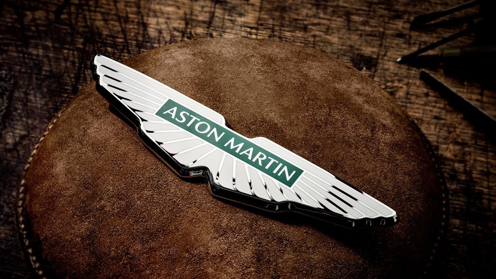
Saville himself has described the update as a "classic example of the necessary evolution of logotypes of provenance." He said his tweaks were "subtle but necessary enhancements" not only to keep the logo fresh but also to allow it to be applied to new technologies and situations in the future.
The simplification – and often flattening – of car brand logos, and logos in general, is a trend that's been going on for some years as brands adapt their marks to make them more suitable for users in smaller, often digital applications such as app icons. We've already seen BMW, Cadillac, Kia, Renault and Volvo follow the same path (UPDATE: a new Skoda logo has also since been revealed). Most have been fairly successful, but Kia's rebrand has led to widespread confusion instead.
Sign up to Creative Bloq's daily newsletter, which brings you the latest news and inspiration from the worlds of art, design and technology.
Always in flight. Forever in evolution.A new era of high performance and ultra-luxury symbolised by a modern new interpretation of our iconic wings.#AstonMartin #INTENSITYDRIVENJuly 20, 2022
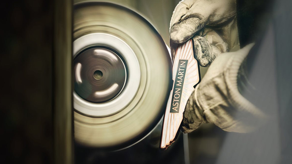
But the current Aston Martin logo, which is accompanied by a new tagline – "Intensity: Driven" and a suitably bombastic film (see the tweet above), will be used as a physical badge on its cars as well. They'll be made by the two-centuries-old Birmingham silversmiths Vaughtons – makers of the Thank You NHS badge.
The Aston Martin logo through the ages
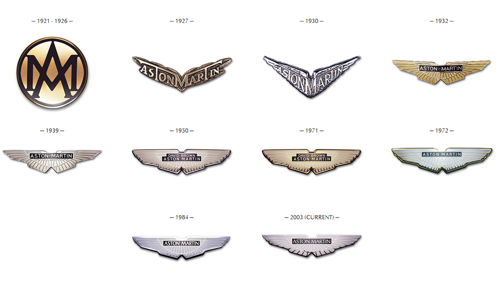
The Aston Martin logo and badge were last tweaked in 2003, but they've had the same general form since way back in 1932. There were some previous designs: first a rather masonic-looking monogram followed by an almost gothic-looking wing-shaped wordmark. But since 1932, Aston Martin's been tweaking the same scarab beetle-influenced shape, which was apparently chosen for its connotations with new beginnings in Egyptian mythology. In general, the changes have tended towards simplification in colours and form, as clearly exemplified in the latest update.
For more motoring logo inspiration, see our pick of the best car logos of all time and the new Citroen logo. Also, simplified logos were one of the things we identified at the start of the year in our guide to the hottest graphic design trends in 2022.
Read more:
- Are these the worst logos of 2022 so far?
- The YouTube logo: a history
- These clever logo mashups are totally on-point

Joe is a regular freelance journalist and editor at Creative Bloq. He writes news, features and buying guides and keeps track of the best equipment and software for creatives, from video editing programs to monitors and accessories. A veteran news writer and photographer, he now works as a project manager at the London and Buenos Aires-based design, production and branding agency Hermana Creatives. There he manages a team of designers, photographers and video editors who specialise in producing visual content and design assets for the hospitality sector. He also dances Argentine tango.
- Georgia CogganEditor
