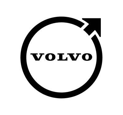
Volvo's minimal new logo falls flat (literally)
The famous car brand gets a 2D makeover.

Sign up to Creative Bloq's daily newsletter, which brings you the latest news and inspiration from the worlds of art, design and technology.
You are now subscribed
Your newsletter sign-up was successful
Want to add more newsletters?
Time and time again we see companies swapping out their well established logo for a newer design that doesn't always hit the mark. Unfortunately for Volvo, its time has come around and the internet aren't loving its new flat design logo.
The Swedish car manufacturer has sported a number of logos since its opening in 1927, getting simpler and simpler as time has gone on. It was only in 2020 that we saw Volvo scrap its famous circle/arrow combination for a simple text-based logo of the word 'Volvo'. That didn't last for long though, with eagle-eyed Facebook users, spotting that the car brand changed its profile picture to a new logo featuring that iconic circle and arrow design. (Can it retain its place in our pick of the best car logos?)

Volvo's new logo is a flat design featuring the well recognised circle and logo combination. We would like to see a little bit more colour in the new logo, as the all black design makes it look a bit too oversimplified. Either way, you can still instantly recognise the new design as a Volvo logo.
Article continues belowVolvo isn't the first company to redesign its logo with a flatter look, it has been a rebranding trend for a while now. And while some like the Burger King logo succeed in pulling off a flat redesign, many iconic brands like Pringles, Warner Bros and Google Photos haven't been as successful. (Should've checked out our beginner's guide for flat design.)
It wouldn't be a rebrand without a few jibes from the internet, and Volvo's newest design is no exception. One user tweeted, "one of the ugliest logos I have ever seen to be honest," while another said, "looks horrible, as much as I love a simple design, this feels like a bust." It's very apparent that this redesign is not going down well.
Looks like Volvo has gone with the refinement culture look with their new logo, no? @PaulSkallas pic.twitter.com/qFVNSj6zN8September 23, 2021
Logo for a funeralSeptember 23, 2021
Poor Volvo might have to head back to the drawing board with this logo design. If you fancied making your own logo, or having a go at remaking Volvo's, then make sure to check out our round up of the best free logo designer software. Or if you are seeking some inspiration, why not have a look at our list of the hottest design trends for 2021.
Read More:
Sign up to Creative Bloq's daily newsletter, which brings you the latest news and inspiration from the worlds of art, design and technology.
- Welcome to the Billie Eilish Amazon collab nobody asked for
- "Rubbish" new British Rail logo has the original designer fuming
- Ingenious McDonald's Halloween ad is an internet hit

Amelia previously worked as Creative Bloq’s Staff Writer. After completing a degree in Popular Music and a Master’s in Song Writing, Amelia began designing posters, logos, album covers and websites for musicians. She covered a range of topics on Creative Bloq, including posters, optical illusions, logos (she's a particular fan of logo Easter eggs), gaming and illustration. In her free time, she relishes in the likes of art (especially the Pre-Raphaelites), photography and literature. Amelia prides herself on her unorthodox creative methods, her Animal Crossing island and her extensive music library.
