"Rubbish" new British Rail logo has the original designer fuming
It's fifty shades of green.

Sign up to Creative Bloq's daily newsletter, which brings you the latest news and inspiration from the worlds of art, design and technology.
You are now subscribed
Your newsletter sign-up was successful
Want to add more newsletters?
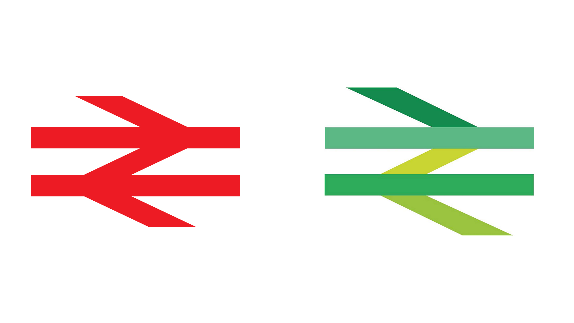
It's hardly the most exciting logo in the world, but the British Rail design is certainly recognisable. Featuring two horizontal lines and a left and right arrow, the all-red icon is pleasingly simple – or at least it was until this morning.
The organisation has revealed a new logo, designed to promote the environmental benefits of rail travel, featuring not one, not two, but five shades of green. Far from being one of the best logos of all time, the green goblin is turning heads for all the wrong reasons – and even the designer of the original logo isn't happy.
This #WorldCarFreeDay why not leave the car at home and take the train to cut carbon emissions by two thirds!#WeMeanGreen #LetsGetBackOnTrack pic.twitter.com/vG2IvTFKlSSeptember 22, 2021
Talking to the Guardian, Gerry Barney, who designed the original logo in 1964, called the new green update "a load of old bollocks". "I could understand it if they had just swapped red for green," he said. "But why on earth have they got that many colours? It's a mess."
Article continues belowAnd it seems Twitter agrees. "Too many greens spoil the broth," one user comments, while another adds, "They’ve managed to take a simple graphic representation of train travel and remove all meaning." Indeed, we doubt many designers are feeling green with envy over the new logo.
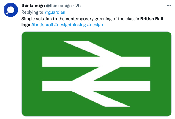
1. Open British Rail logo in Paint2. Select the green column on the palette function & fill each line3. Buy a big bag to put the money inA pretty lucrative hour of work from the looks of it pic.twitter.com/jb8CNOeTatSeptember 22, 2021
As many have pointed out (including Barney), the issue here isn't so much the fact that the logo has been turned green, but that the designers apparently couldn't decided which green to go for – and so opted for what looks like fifty shades. Plenty of users have already demonstrated that the logo would be a much classier affair if stuck to a single hue.

Like Amazon's disastrous new app icon and Kia's illegible new design, it's fair to say British Rail's new logo isn't a hit. If you fancy creating a design that definitely isn't a load of old you-know-what, check out our guide to logo design.
Read more:
Sign up to Creative Bloq's daily newsletter, which brings you the latest news and inspiration from the worlds of art, design and technology.

Daniel John is Design Editor at Creative Bloq. He reports on the worlds of design, branding and lifestyle tech, and has covered several industry events including Milan Design Week, OFFF Barcelona and Adobe Max in Los Angeles. He has interviewed leaders and designers at brands including Apple, Microsoft and Adobe. Daniel's debut book of short stories and poems was published in 2018, and his comedy newsletter is a Substack Bestseller.
