The Airbnb logo has 4 hidden meanings – can you spot them all?
Viral TikTok video reveals all.

Sign up to Creative Bloq's daily newsletter, which brings you the latest news and inspiration from the worlds of art, design and technology.
You are now subscribed
Your newsletter sign-up was successful
Want to add more newsletters?
We've seen plenty of controversial rebrands over the years, but none have got people talking quite as much as the current Airbnb logo, first revealed in 2014. The design was derided for resembling, among other things, female genitalia. And it seems the logo is still surprising people seven years later.
A TikTok video has gone viral, revealing the three "hidden meanings" of the Airbnb logo (spoiler alert: none of them are the resemblance mentioned above). Like many of the best logos, it turns out there's a lot going on within this apparently simple design.
@borys.s What else can you see in the Airbnb logo? 👀 #logo #logodesign #Airbnb #hiddenmeaning #logos #logodesigner
♬ She Share Story (for Vlog) - 山口夕依
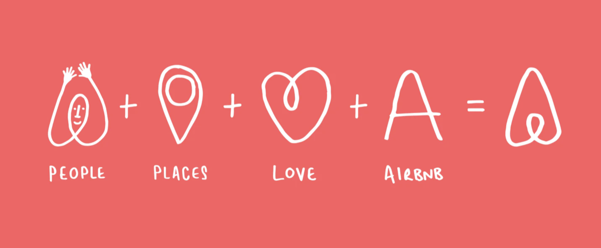
The video by brand identity designer Borys Skowron (above) reveals that the design is more than simply a rounded 'A' - it also represents people, places and, of course, love. Flip the logo upside-down and it looks like a heart. That middle cone resembles a location pin. And this last one's a bit of a stretch, but the shape (which Airbnb calls the 'Belo', naturally), also looks like a person with their arms in the air. Don't believe us? Check out this illustration from Design Studio, the team behind the 2014 rebrand:
Article continues below 
It might have been one of the most hated rebrands of 2014, but we reckon time has been kind to the Airbnb logo. Indeed, TikTok users are appreciating those hidden messages, with one user calling it "one of the most creative logos for sure" and "utter genius" in the comments on Skowron's video.
From Toblerone's secret bear to the 7 letters hiding in the Toyoto logo, some of the most famous icons are more complicated than you might think. For a bunch of the best examples in one place, check out this astonishing infographic revealing 50 logo secrets. And if you fancy creating a logo of your own, take a look at today's best Adobe Creative Cloud deals below.
Read more:
- Baffled by the new iOS 15 Safari design? Here's how to fix it
- You won't believe how much this bizarre gold bagel sculpture is worth
- The best photo-editing software in 2021
Sign up to Creative Bloq's daily newsletter, which brings you the latest news and inspiration from the worlds of art, design and technology.

Daniel John is Design Editor at Creative Bloq. He reports on the worlds of design, branding and lifestyle tech, and has covered several industry events including Milan Design Week, OFFF Barcelona and Adobe Max in Los Angeles. He has interviewed leaders and designers at brands including Apple, Microsoft and Adobe. Daniel's debut book of short stories and poems was published in 2018, and his comedy newsletter is a Substack Bestseller.
