Cadillac's logo gets a monochrome makeover, but fans aren't happy
The future is...grey?

Sign up to Creative Bloq's daily newsletter, which brings you the latest news and inspiration from the worlds of art, design and technology.
You are now subscribed
Your newsletter sign-up was successful
Want to add more newsletters?
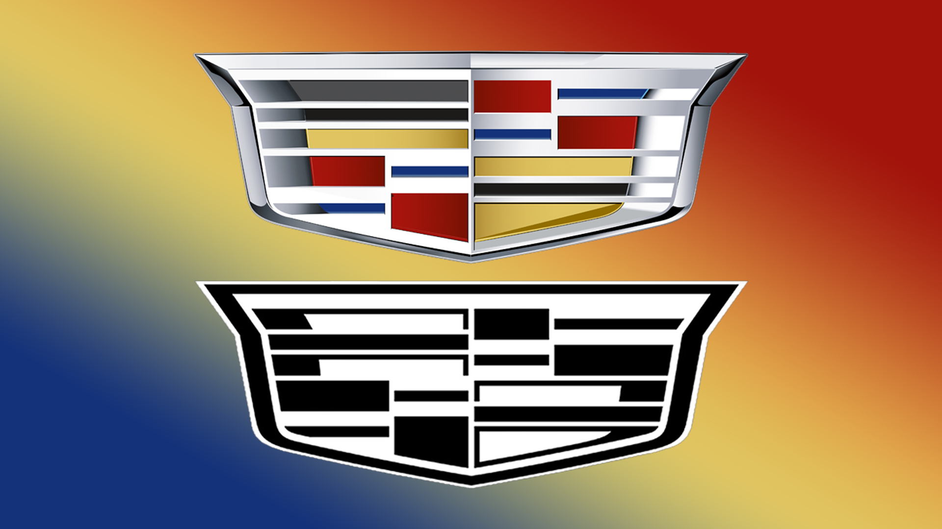
Time and time again we see companies switching out their logos for a simplified redesign, and luxury car brand Cadillac is the latest brand to hop on the trend. It's taken its famous blue, red and yellow design and swapped the primary colours for a new, modern greyscale look.
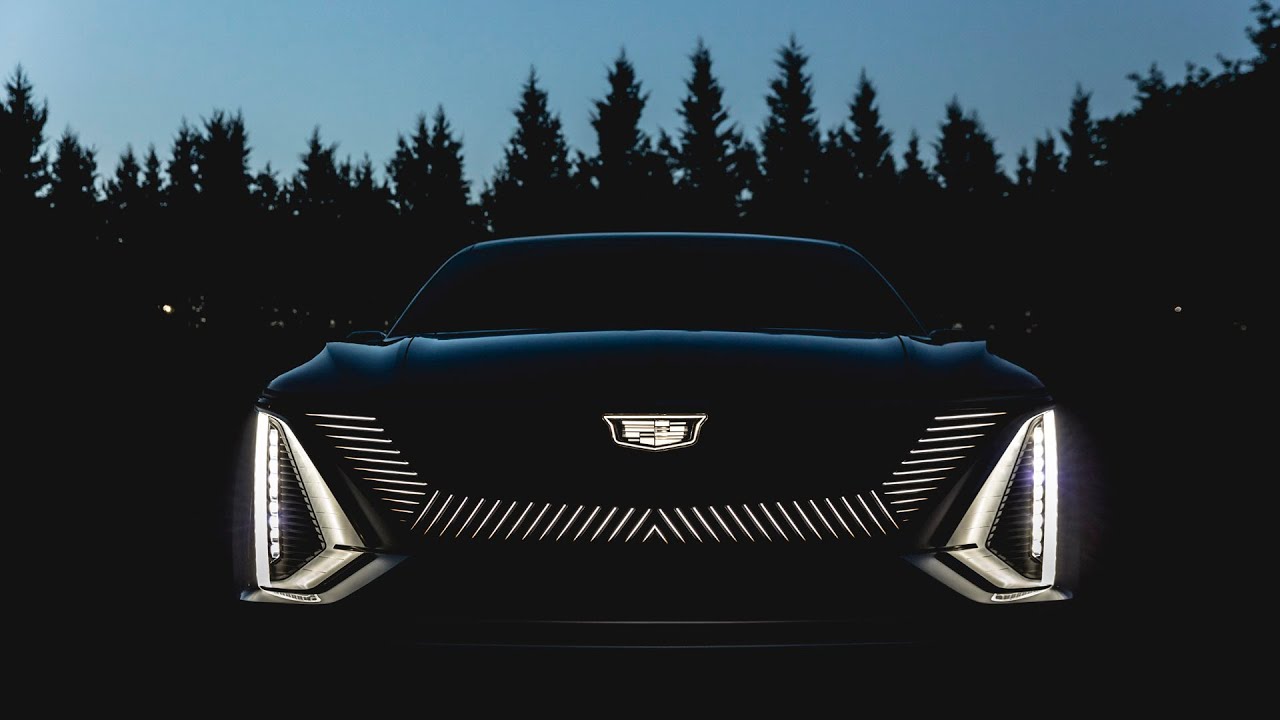
The new logo has been spotted on the company website and social media channels, as well as featuring on new Cadillac models in the grill of the car (see below). According to GM Authority, "this new design approach is a sign of what’s to come with regard to future electrified Cadillac models." But some people aren't so sure. If you're one of the haters why not have a go at designing your own alternative? Make sure you check out our golden rules of logo design first.

It seems that while many Twitter users aren't keen on the new design, Redditors actually like it. One Redditor posted, "from a design standpoint I think it looks way better on the car than any of the printed media," with another responding to the comment, "Yup this time Cadillac has put some efforts in designing the logo, hope its cars will be as good as its logo."
Article continues belowOver on Twitter, fans weren't as happy, with one user tweeting "I don’t understand the compulsion to fuss with logo design to the extent that some automakers have lately".
Reject modernity. Embrace tradition. https://t.co/uT086Co4fx pic.twitter.com/PStQmjYraXOctober 6, 2021
Cadillac logo 5 years from now. https://t.co/sfzmIVh4oY pic.twitter.com/ldlPFGizpoOctober 7, 2021
Don’t worry, I have 2030s Cadillac logo here. Follows the progression. https://t.co/o7gVQN2L9I pic.twitter.com/aztzAgAD4GOctober 7, 2021
We think that the futuristic logo looks sleek on the Lyriq car model seen above, and while the redesign is quite simple, it is arguably very effective. The lit-up version of the logo is both modern and still recognisably Cadillac, which seems like a winning combination when it comes to logo redesign. Not to mention the fact that the glow-in-the-dark version is also super cool.
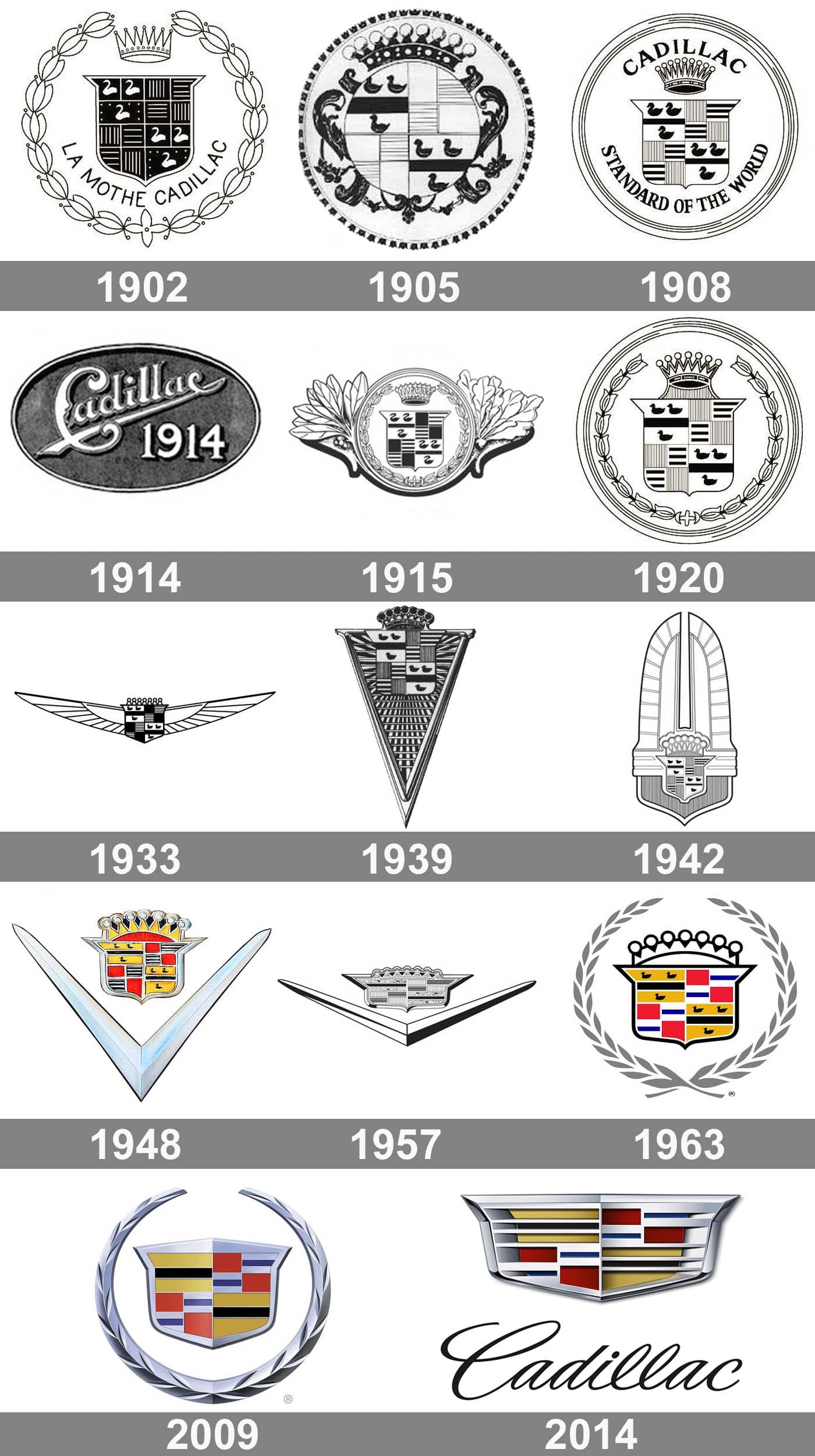
Cadillac has been around for over 100 years now, so it's no wonder that fans of the car manufacturers feel quite impassioned by the logo change. The site 1000Logos posted a timeline of the Cadillac logo design evolution from 1902 to 2014, and it's safe to say it's been through some changes over time. The 2021 update is certainly different, but the return to monochrome is both a nice nod to the company's past and a celebration of the future of the brand.

While it might take a little longer for fans to decide on a mutual feeling about the logo, we think this is a successful redesign (and especially more effective than Volvo's new over-simplified logo.) If you're hoping to create your own logo and need some inspiration, then why not check out our roundup of the best logos, or dive straight into designing and check out our guide on how to create a powerful logo shape.
Sign up to Creative Bloq's daily newsletter, which brings you the latest news and inspiration from the worlds of art, design and technology.
Read More:
- This essential extension fixes Safari 15's biggest design flaw
- Rumoured iPhone 14 feature could make it Apple's most pro smartphone yet
- That terrible new McDonald's logo, explained

Amelia previously worked as Creative Bloq’s Staff Writer. After completing a degree in Popular Music and a Master’s in Song Writing, Amelia began designing posters, logos, album covers and websites for musicians. She covered a range of topics on Creative Bloq, including posters, optical illusions, logos (she's a particular fan of logo Easter eggs), gaming and illustration. In her free time, she relishes in the likes of art (especially the Pre-Raphaelites), photography and literature. Amelia prides herself on her unorthodox creative methods, her Animal Crossing island and her extensive music library.
