How to craft a powerful logo shape
The logo shapes used by big brands aren't chosen by chance, here's how to harness the power of the psychology of shape.
Sign up to Creative Bloq's daily newsletter, which brings you the latest news and inspiration from the worlds of art, design and technology.
You are now subscribed
Your newsletter sign-up was successful
Want to add more newsletters?
For some brands, just their logo shape is enough to make them instantly recognisable. An even more exclusive club has achieved ownership of a particular shape so that it doesn't even need to be fully realised into a logo form to be associated subconsciously with its brand.
A powerful logo may look simple but there's nothing easy about creating effective logo shapes. Be aware that the logo shapes used to portray the most visible brands in our culture have not been chosen by chance – there are some strong psychological forces at work.
In this post, we outline how to use the psychology of shape in your logo to create a powerful logo that stands on its own. If you want more stellar logo advice, head over to our how to design a logo guide and our steps for creating better logos. After that, check out the world's best logos and find out where to find the best logo design inspiration.
Article continues belowHow to use the power of logo shape
01. Understand how humans view logo shapes
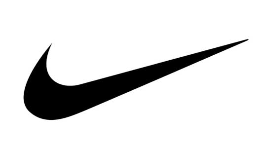
Our subconscious minds respond in different ways to different logo shapes. Straight lines, circles, curves and jagged edges all imply different meanings and so a skilled logo designer can use shape to infer particular qualities about the brand.
Think, for example, of the Nike Swoosh: the combination of curves ending in a sharp point offers a strong suggestion of movement.
Particular logo shapes send out particular messages:
- Circles, ovals and ellipses tend to project a positive emotional message. Using a circle in a logo can suggest community, friendship, love, relationships and unity. Rings have an implication of marriage and partnership, suggesting stability and endurance. Curves on any sort tend to be viewed as feminine in nature.
- Straight edged logo shapes such as squares and triangles suggest stability in more practical terms and can also be used to imply balance. Straight lines and precise logo shapes also impart strength, professionalism and efficiency. However, and particularly if they are combined with colours like blue and grey, they may also appear cold and uninviting. Subverting them with off-kilter positioning or more dynamic colours can counter this problem and conjure up something more interesting.
- It has also been suggested that triangles have a good association with power, science, religion and law. These tend to be viewed as masculine attributes, so it's no coincidence that triangles feature more prominently in the logos of companies whose products have a masculine bias.
- Our subconscious minds associate vertical lines with masculinity, strength and aggression, while horizontal lines suggest community, tranquillity and calm.
- The implications of shape also extend to the typeface chosen. Jagged, angular typefaces may appear as aggressive or dynamic; on the other hand, soft, rounded letters give a youthful appeal. Curved typefaces and cursive scripts tend to appeal more to women, while strong, bold lettering has a more masculine edge.
02. Understand shape psychology
There are certain ‘clip art’ style visual cliches guaranteed to make any logo design expert gnash their teeth. Avoid common offenders such as lightbulbs to represent ’ideas’ or globes as shorthand for 'international’ at all costs.
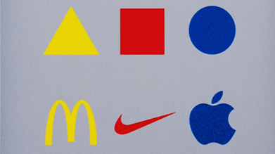
But shape psychology goes far beyond the obvious. Often used as a symbol of the hugely influential Bauhaus School of Design are the yellow triangle, red square and blue circle – the product of research by Wassily Kandinsky, who argued that shape and colour can transcend cultural and language barriers.
Kandinsky argued that bright, zingy yellow complements the angular sharpness of a triangle; cool, spiritual blue is a perfect match for a circle; while an earthy, visceral red partners nicely with a square. We’ll explore colour theory in a bit more detail later on.
03. Apply shape psychology
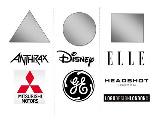
Before you start designing a logo for your client, write down a list of values and attributes that the logo should convey. (This is one of the reasons you need to get to know your client and their business as well as you possibly can). Ask your client to compile a list of corporate values or take a close look at their mission statement.
Once you have a feel for the message the logo needs to disseminate, you will be able to look at how to match this up with not only logo shapes, but also colours and typefaces as well.
Use these three elements in combination to your advantage: for example, if you pick a strong shape but find it too masculine, then introduce a colour or colours that will tone down the male aspect.
04. Know Gestalt theory

To extend your use of psychology to a deeper level, brush up on the Gestalt theories of German psychologists from the 1920s. They hold that the human brain unifies the visual elements it sees to form a whole that carries significantly more meaning. People form patterns out of similarly shaped objects, while objects that differ from the group become a focal point of the image.
Another Gestalt principle, closure, is often used in logo design; this is when an object is incomplete but there is enough detail for the human eye to make the whole picture. A good example of this is the panda logo used by the WWF, shown above. The World Wildlife Fund logo uses the closure principle of Gestalt theory to describe a panda, even though the shape is not fully closed.
The logo shapes you incorporate into your designs become an intrinsic element in the message they will convey to the company's customers and the wider public. Once you understand the psychology behind logo shapes you will be able to use this knowledge to create powerful brands for your clients.
05. Strip it back to basics
There are a few golden rules to which all the best examples of logo shapes adhere. Firstly, and perhaps most importantly: simplicity.
Put thought into your concept, but don’t overwork the execution, or adorn a mark purely for the sake of it. You want ease of recognition, as well as versatility of scale and application. Think: will it work as well when used tiny in the footer of a website, as it will emblazoned on the front of a building?
A great way to test the simplicity of your concept is to keep subtracting elements until you reach its most basic form. Be brutal here. Is it still recognisable if you sketch it quickly with a few rough strokes? What are its most unique, defining features? Generally speaking, the simpler a logo design, the more memorable it will be.
06. Master grids and structure
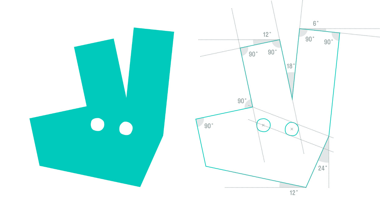
It’s becoming increasingly common for design agencies to air their sketchbooks in public, whether on online platforms such as Behance or Dribble, or as part of project case studies on their own websites, or released to the design press. DesignStudio’s rebrand of Deliveroo is no exception (above).
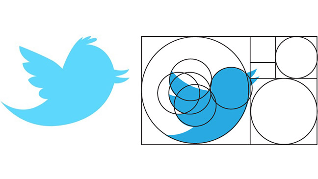
Often these workings include the technical side of a design’s composition, revealing and discussing the grid that underlies its construction and the specific curves and angles that define the shape.
Such projects can be invaluable reference points to inform your own work, and can help make abstract design principles such as the golden ratio come alive in application. Twitter’s most recent icon is built around a series of interlocking circles that, according to this diagram, conform to the ‘golden ratio’ of 1:1.618.
07. Employ negative space
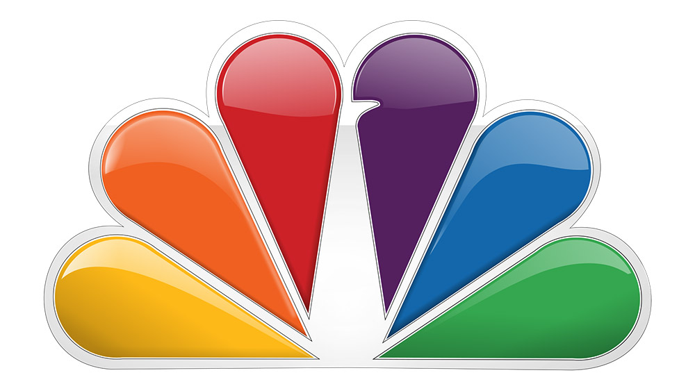
Smart use of negative space in a mark can raise a smile, using wit to aid brand recognition. Even the most subtle use of negative space can be incredibly effective. FedEx is an oft-cited example of smart negative space used in a purely typographic mark, but there are plenty of stand-out examples of symbols employing it too. For NBC (above), it only takes a little notch to transform six rainbow-coloured droplets into a peacock.
Used cleverly and appropriately, negative space can also pack extra meaning into a logo design, reinforcing the theory that simplification through subtraction can lead to a more memorable brand mark.
08. Make use of wit and humour

Negative space is just one way to raise a knowing smile. The late, great Alan Fletcher, founding partner of Pentagram, was one of the leading pioneers in employing simple wit in graphic design, a practice that lends itself beautifully to logo design in particular.
A prominent example of a logo that uses wit is Turner Duckworth’s Amazon logo (above).
Related articles:
- Brand typography: A complete guide
- Best sports logos: Top sports logo designs
- 3-letter logos: The best ever made
Sign up to Creative Bloq's daily newsletter, which brings you the latest news and inspiration from the worlds of art, design and technology.
