The original Netflix logo was pretty wild
It's come a long way since the early days.

Sign up to Creative Bloq's daily newsletter, which brings you the latest news and inspiration from the worlds of art, design and technology.
You are now subscribed
Your newsletter sign-up was successful
Want to add more newsletters?
These days, the Netflix logo is up there with the likes of Apple and Nike when it comes to ubiquity. The curved red wordmark is instantly recognisable – but it looks nothing like the logo Netflix launched with in 1997.
The company launched as a DVD rental service – long before the word 'binge' had anything to do with watching TV. We're taking a look at the streamer's history of logos. It wasn't until 2001 that Netflix landed on the embryo of its current design – and before that, users were treated to two that certainly won't be troubling our roundup of the best logos of all time.

The first design (below) was about as '90s as it gets. With its swooshing film and dated purple/black gradient, it's easy to imagine this gracing the entrance of a small cinema chain 25 years ago (and hey, Netflix wasn't the behemoth it is today back then). It's also unclear why the words 'Net' and 'Flix' are separated.
Article continues below 
After that, things went a little more noughties. In 2000, Netflix (or is that Net Flix? or netflix?) was given a new logo (below) in which the wordmark sat inside a black oval – with a TV dotting the 'i' of the name. Groovy!

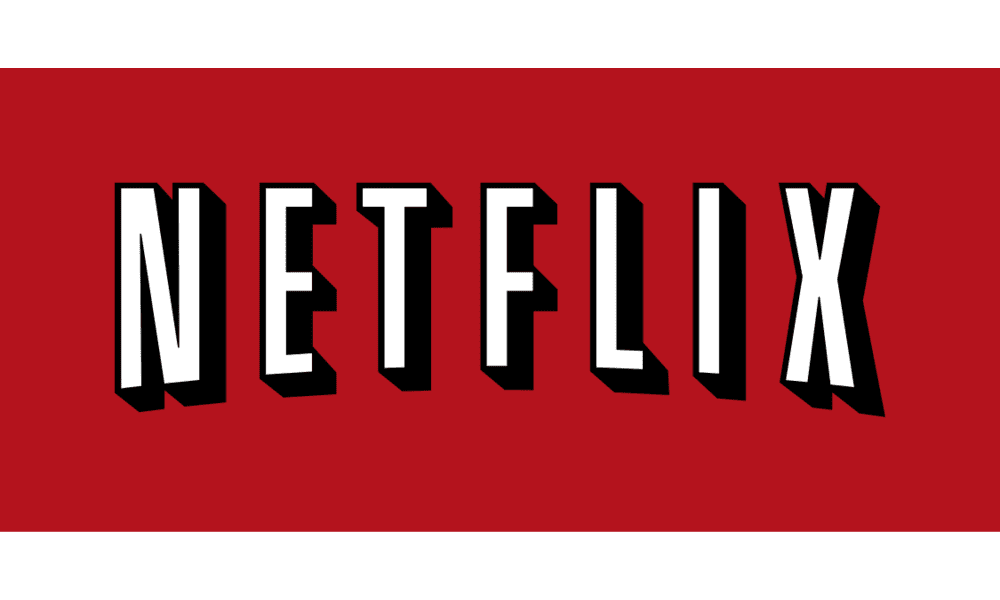
But only four years into its life, Netflix settled on something (below) akin to its current logo. The uppercase sans-serif wordmark and curved design are present and correct, as is the now iconic red – although only as the background here. And because flat design was a just glint in the graphic design community's eye back in 2001, this is a decidedly 3D affair thanks to some bold black shadowing. In 2014, Netflix dropped the shadowing and inverted the colour scheme, and it's still using that design today.

It's always fascinating to look at how iconic logos have transformed over time. From Apple's hilariously ostentatious original design to Google's block lettering, some of the most famous companies in the world once sported very different designs. If you're inspired to take on a design project of your own, be sure to check out our guide on how to design a logo.
Read more:
Sign up to Creative Bloq's daily newsletter, which brings you the latest news and inspiration from the worlds of art, design and technology.

Daniel John is Design Editor at Creative Bloq. He reports on the worlds of design, branding and lifestyle tech, and has covered several industry events including Milan Design Week, OFFF Barcelona and Adobe Max in Los Angeles. He has interviewed leaders and designers at brands including Apple, Microsoft and Adobe. Daniel's debut book of short stories and poems was published in 2018, and his comedy newsletter is a Substack Bestseller.
