The new Paris 2024 Olympic pictograms are the most radical design departure yet
(For better and worse.)
Sign up to Creative Bloq's daily newsletter, which brings you the latest news and inspiration from the worlds of art, design and technology.
You are now subscribed
Your newsletter sign-up was successful
Want to add more newsletters?
The branding for Paris 2024 didn't get off to a great start, with the 'flame' logo mercilessly mocked on release in 2019 for resembling, er, a woman with a 'Karen' hairstyle. But we've just had our next glimpse at the games' branding as a whole, and things are looking up.
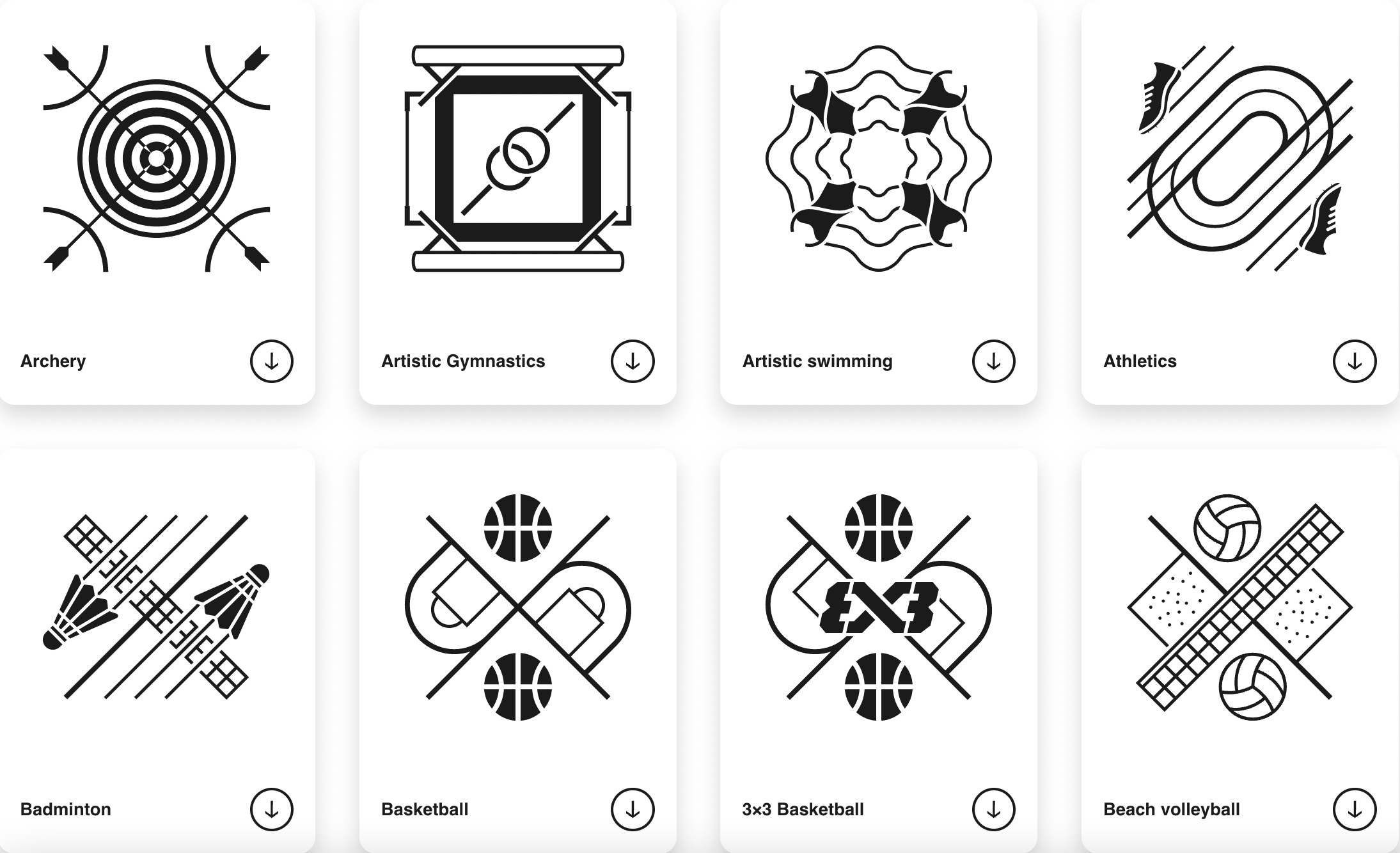
The International Olympic Committee has unveiled a new set of 62 pictograms for the Olympic and Paralympic Games, claiming to have "reinvented the concept" of the symbols. And with not a swooshy stick person in sight, these are certainly a departure. (Looking for design inspiration? Check out the best logos of all time.)

In a new blog post, Paris 2024 explains that the new designs are elevated "from mere visual aids to striking coats of arms serving as rallying cries for sports fans." Indeed, along as merely informative, these coats of arms certainly convey a greater sense of pride and diversity.
"Having first appeared over half a century ago, Games pictograms are no longer just simple and generalised images for signage, as the whole concept has been reinvented by Paris 2024," the committee explains. "The newly unveiled pictograms illustrate each of the Olympic and Paralympic sports in a unique coat of arms, paying homage to the complexity of each of these sports and what makes them original. Each of the 62 Paris 2024 pictograms is a rallying cry and a symbol; a standard that will ignite fans’ pride during the world’s largest sporting event."

This time around, the pictograms will also be converted into merchandise, with the designs adorning the likes of pins an T-shirts as part of a series of ‘Make Your Games’ packs which will be available to order this month.

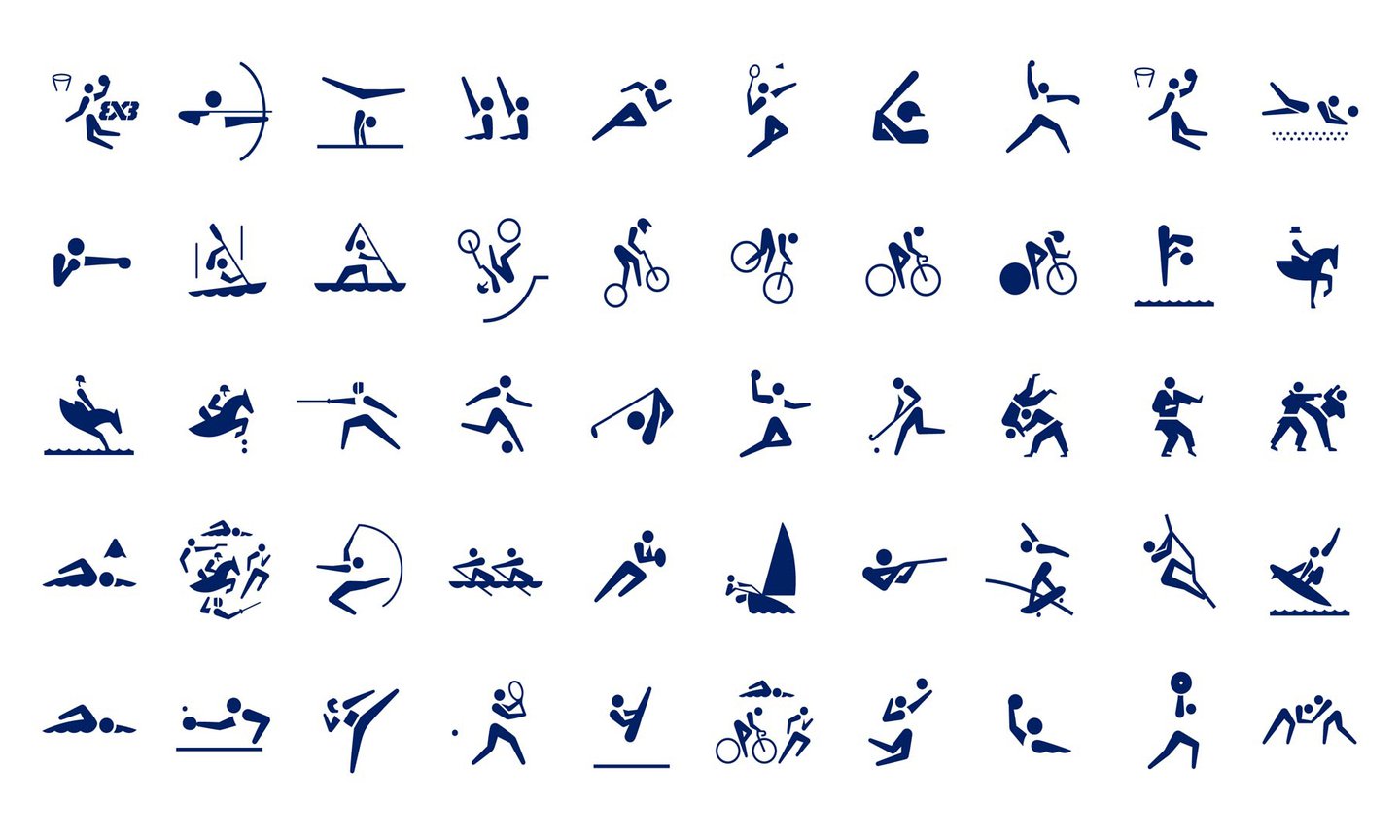
Indeed, while Tokyo 2020's animated pictograms were an Olympic first, the Paris 2024 symbols feel like the most meaningful departure for a while. It's perhaps unsurprising therefore that not everyone is a fan – over on Reddit, the designs have users divided, with some claiming that the designs are too busy to be effective from an accessibility perspective. "These defeat the point of having pictograms as wayfinding devices, which is absolutely one of their purposes, especially at a global event with people not speaking the language," reads the top-rated comment. "They are not visually distinct or recognisable enough, especially at a distance. These were designed with TV and branding in mind, with little consideration for accessibility." Still, the pictograms are arguably still enjoying a warmer reception than those hilarious Paris 2024 mascots.
Read more:
Sign up to Creative Bloq's daily newsletter, which brings you the latest news and inspiration from the worlds of art, design and technology.

Daniel John is Design Editor at Creative Bloq. He reports on the worlds of design, branding and lifestyle tech, and has covered several industry events including Milan Design Week, OFFF Barcelona and Adobe Max in Los Angeles. He has interviewed leaders and designers at brands including Apple, Microsoft and Adobe. Daniel's debut book of short stories and poems was published in 2018, and his comedy newsletter is a Substack Bestseller.
