With the turn of the new decade will come a new Reebok brand image. In its first design overhaul since the introduction of the Delta logo in 2011 (below), Reebok has announced the unification of its signature vector logo and 'drop-R' wordmark across the majority its sports and lifestyle brands, including footwear and apparel.
Reebok says the design overhaul aims to celebrate the brand's rich history and connect its legacy to the exciting future that lies ahead. but what exactly has changed? Will this be a rebrand to inspire, like those in our logo design guide? Let's take a closer look.

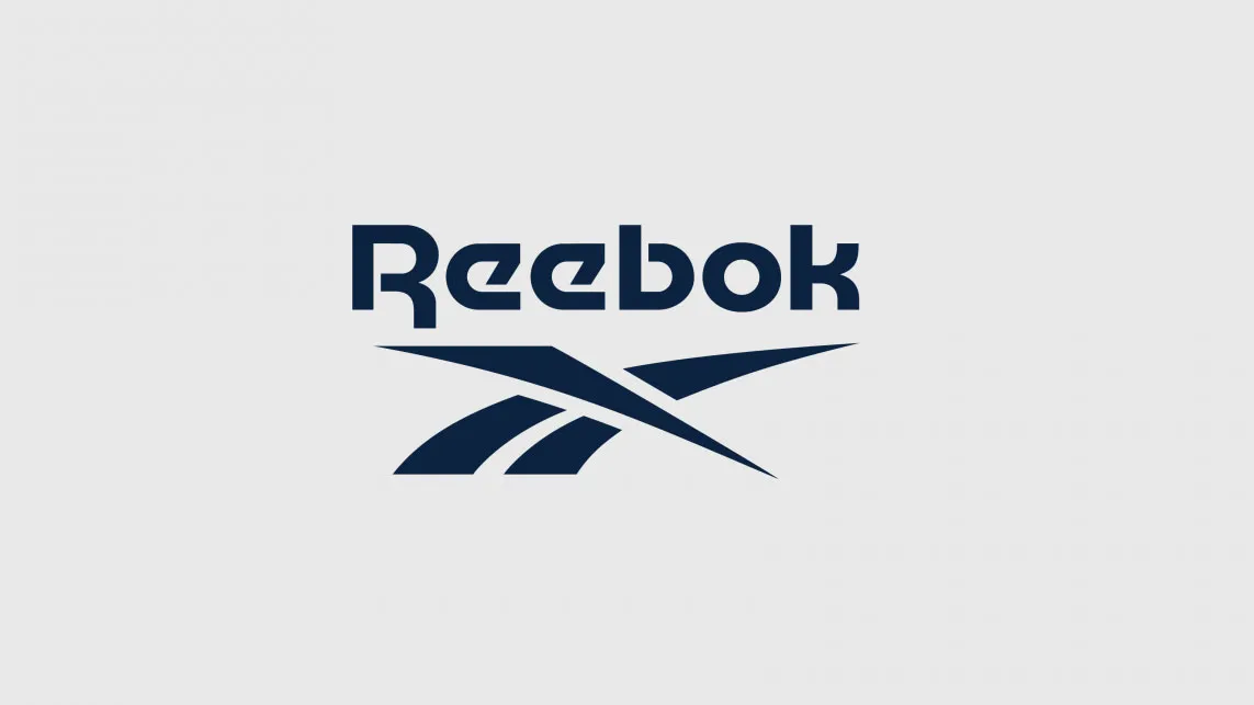
The fitness company's branding has mostly riffed on the same Union Jack-based vector (below, left) with the company's full name above it since the introduction of its first vector logo in 1992. And it looks as if the next adaptation won't be too far away from its roots, as Reebok says that the logo wordmark is an "updated, subtle, modern evolution" of the 1992 version, which serves to unify the brand under one sleek banner.
Though Reebok has been predominantly using the Delta logo across its product ranges since 2011, the original vector logo is the one that resonates with customers as the most recognisable Reebok symbol. The 1992 vector logo continued to appear on lifestyle products and the Reebok Classics line after the brand's transition to the Delta's red triangle, and it's about to take centre-stage once more.

Creative Direction VP Karen Reuther explains the move back to the original stylings: "Under a unified banner, all of our products and experiences will tell a single story that is clear and consistent.
"The vector was created as a logo version of the iconic Reebok side stripes and cross-check design that dates back more than fifty years. It’s compelling, dynamic and powerfully linked to some of our greatest cultural moments."
We have to admit, when we first saw the new incarnation, it took a minute to work out what has changed, subtle is indeed the right word to describe the evolution. But on closer inspection, when looking at the two versions side-by-side, we can see that the vector lines have straightened-up and elongated, and the wordmark has become more streamlined, too.
Reebok's design evolution video gets more technical. It explains that the vector now has "a flattened top to create dynamic forward movement", "a stabilised base for better alignment and stronger balance" and "wider channels for better legibility at small sizes". So now we know.
The 2011 Delta logo will still appear on UFC-branded and Crossfit products, though, so it's not gone for good just yet. What do you think of the new look? How does it compare to the best (and worst) rebrands of 2019?
Read more: