Logo memory challenge befuddles participants
How good is your logo design recall?
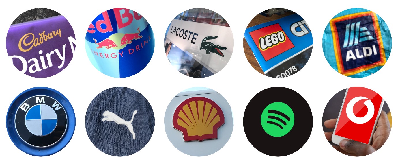
Logos are everywhere. They are such a part of our environment that we can recognise the most famous ones immediately, and sometimes just by a shape or a patented colour (we're looking at you, Cadbury).
This consumer knowledge was put to the test recently by Adler, who asked 100 people to draw some of the most well-known logos from memory. We have to say that, even with our logo obsession (and even after reading our logo design guide), we're not entirely sure how well we would have done.
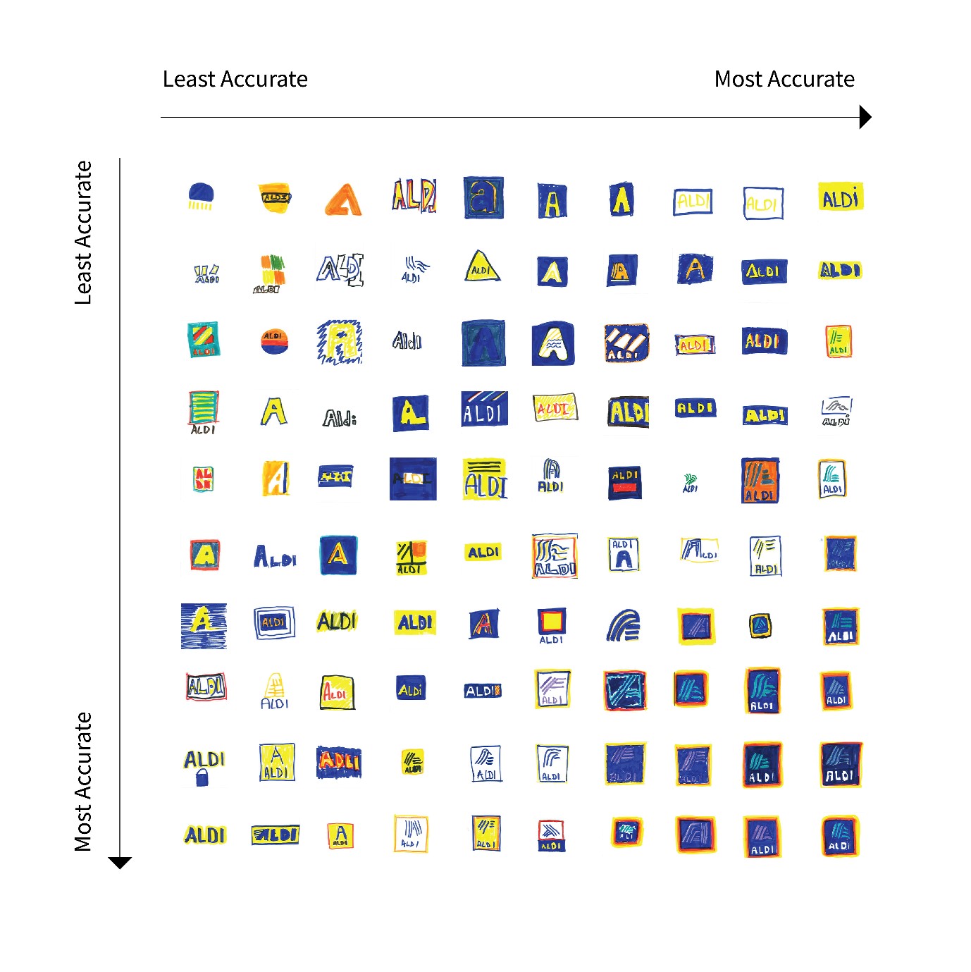
In the Adler challenge, the Aldi logo was the one that most people got wrong. Some people – 17 per cent in fact – didn't bother writing the whole word at all, they just drew a single 'A' in various colours. Though most representations have nailed at least one of the correct colours from the distinctive colour palette.
We are pretty impressed with the folks who got the direction of the lines spot on in the logo graphic, and we can only guess that those occupying the top-left of the graph must live in a Waitrose area.
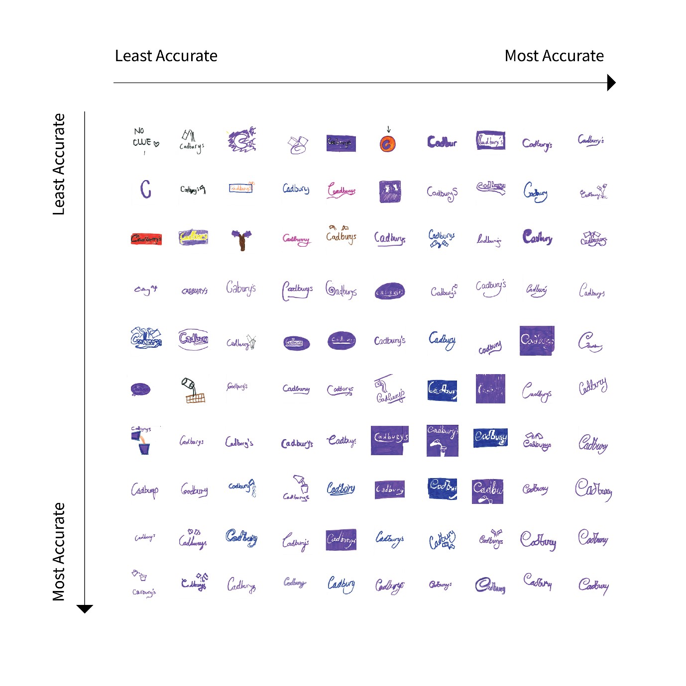
Moving on to the Cadbury logo, it's clear that Pantone 2865c has imprinted in the minds of the public as almost everyone got the colour right. And despite those famous milk glasses not having ever been a part of the official logo, they have clearly made a serious impression on consumers as 24 per cent of participants thought they should be included.
Most amusingly, though, half of the 'artists' aren't sure exactly how the brand name is spelled or pronounced, with responses including Cadbury's and Cadburys. We can see why, we're usually too eager to get inside the packet to even notice the brand name. And tbh we just call it Dairy Milk, anyway.
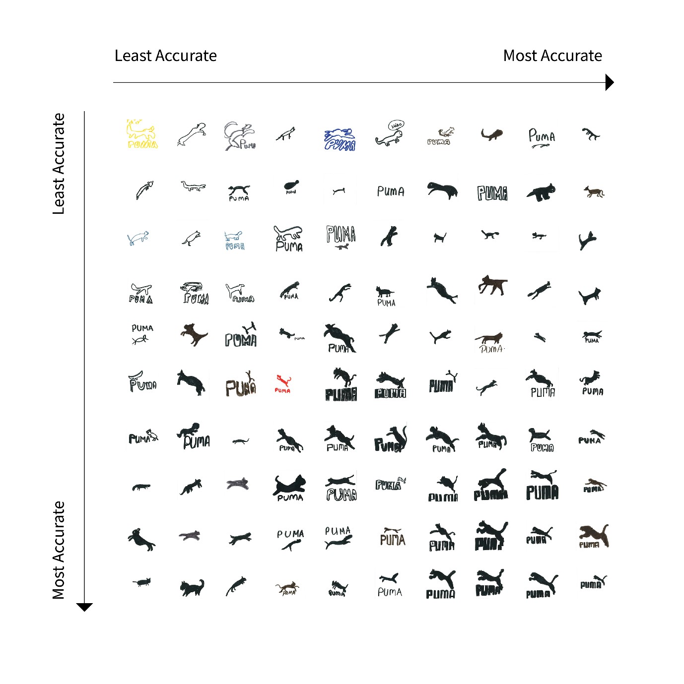
The Puma attempts are perhaps the funniest, because of the variation of animals included. It seems people struggled to remember the exact position of the leaping puma (those people at the bottom-right must actually work for Puma). We can see a lovely looking pet cat in there, though.
Sign up to Creative Bloq's daily newsletter, which brings you the latest news and inspiration from the worlds of art, design and technology.
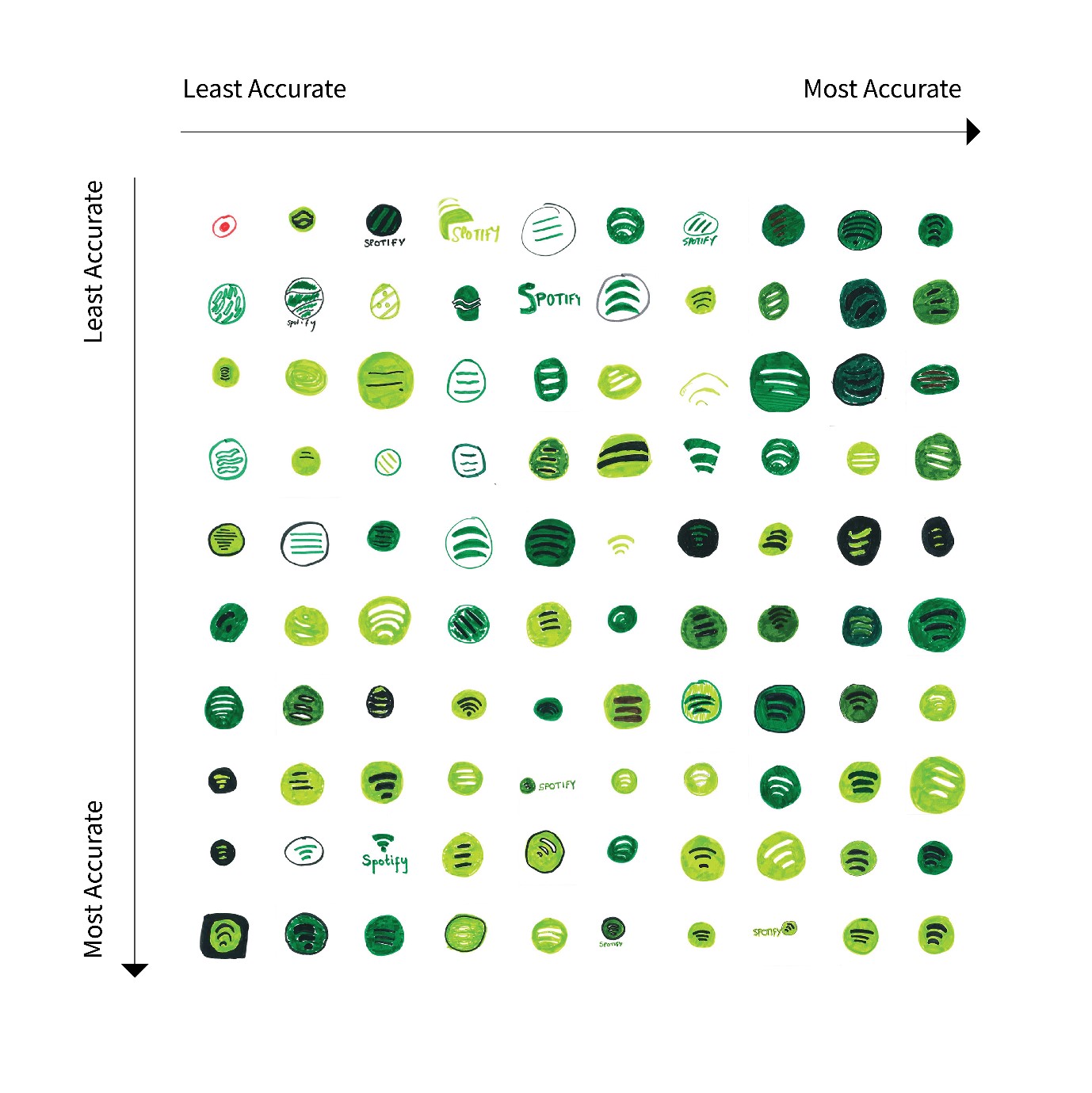
Whether it's because most of us actually click on this logo multiple times a day, or because of its super-simple, striking circular design, Spotify was extremely accurately represented. All but one of the drawings resemble the original. Only the shade of green tripped people up, with 46 per cent of the group using a darker shade of green than in the real thing.
This isn't the first logo memory challenge we've covered, and it probably won't be the last. But it's still as fascinating to see the extent that branding is rooted inside the brain of the consumer (or not). Think you could do better? Send us your results via Twitter, Facebook or Instagram.
Read more about the Adler challenge here.
Read more:

Georgia has worked on Creative Bloq since 2018, and has been the site's Editor since 2023. With a specialism in branding and design, Georgia is also Programme Director of CB's award scheme – the Brand Impact Awards. As well as immersing herself with the industry through attending events like Adobe Max and the D&AD Awards and steering the site's content streams, Georgia has an eye on new commercial opportunities and ensuring they reflect the needs and interests of creatives.
