Controversial football rebrand gets the red card from designers
Has this new-look logo gone too far?
Twitter is where you can find the referees of logo design and branding, and a recent football rebrand has seen some fishing for the red card in their proverbial pocket. Potentially guilty this time round of fouls against design is the Royal Spanish Football Federation (RFEF), the Spanish equivalent of the FA and who some may wish had done sweet F.A. regarding a much-admired logo.
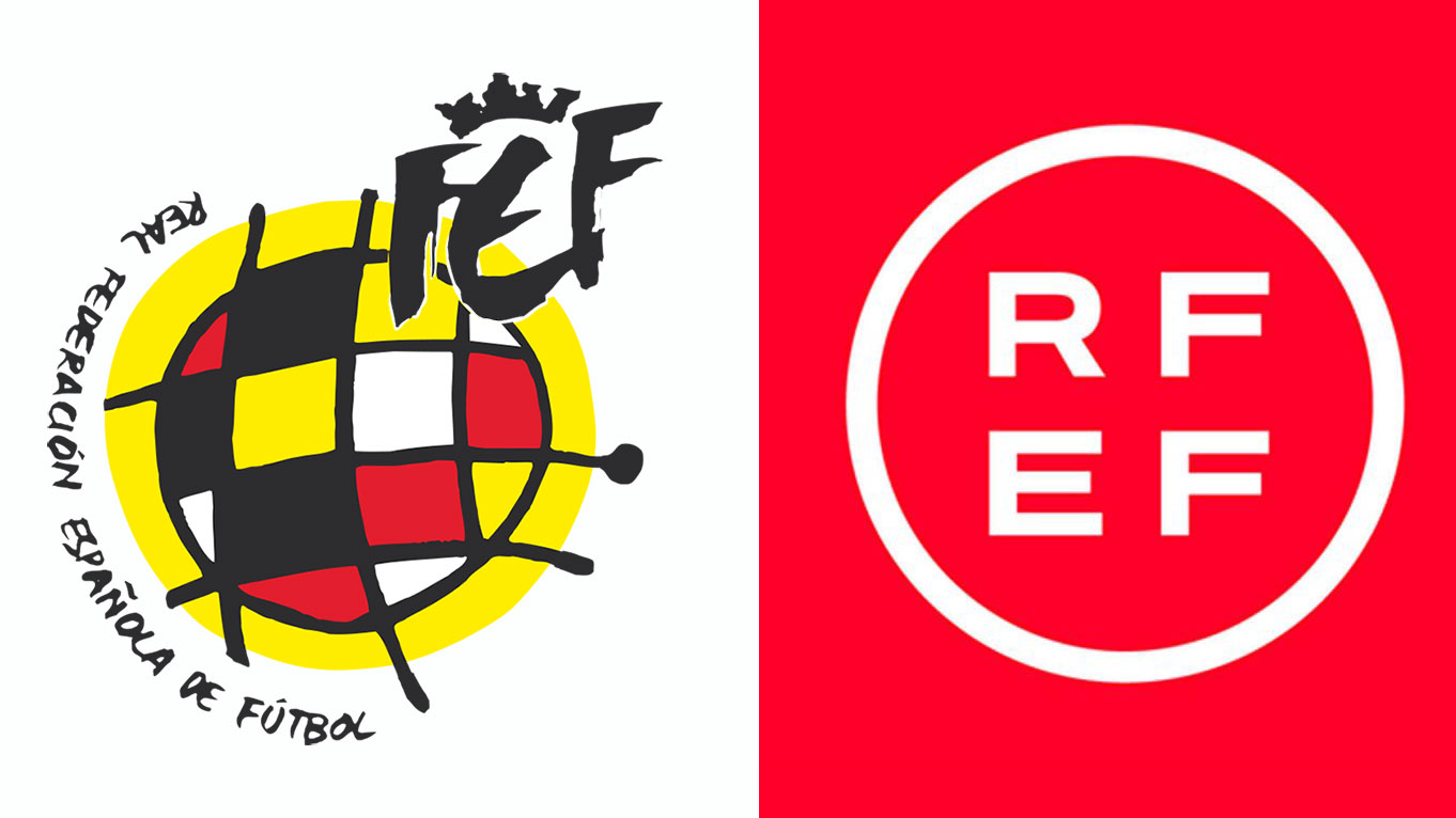
The first own goal was maybe RFEF's decision to ditch their original branding altogether. A popular icon inspired by the artist Joan Miró, the old design spun with a jazzy, effervescent flair and gave designers some genuine logo inspiration. But instead of, say, reconceptualising the logo for a new generation, the RFEF instead went with something less inspired by a Spanish master painter, and perhaps more inspired by the corporate boardroom.

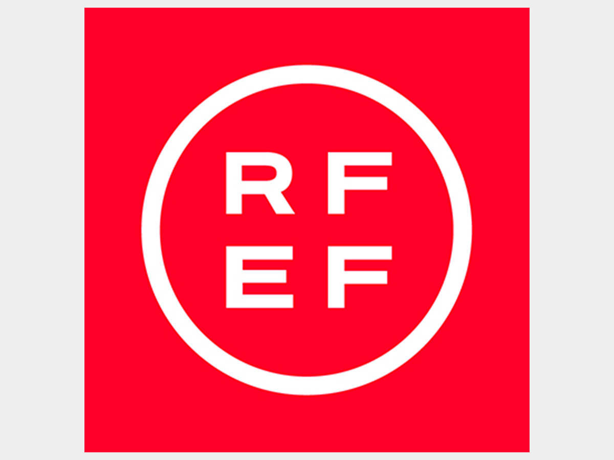
As you can see in the above comparison image or the close-up below, the RFEF's new logo is a very different ball game. First up, it's hard to tell which brand it's meant to represent: is it the RFEF? Or the REFF? It's not easy to assume which reading order the letters are meant to be in.
Article continues belowThe biggest outcry online has been over losing the rather painterly look of the original and longstanding logo. The Beautiful Game could always do with more beauty in its presentation, and design too gets flack for sometimes foregoing visual creativity. This is a logo though which, for better or worse, puts function over form.

Designers and footie fans alike have been up in arms about the decision; one even compared it to "something you'd see in the reception area of a pharmaceutical company."
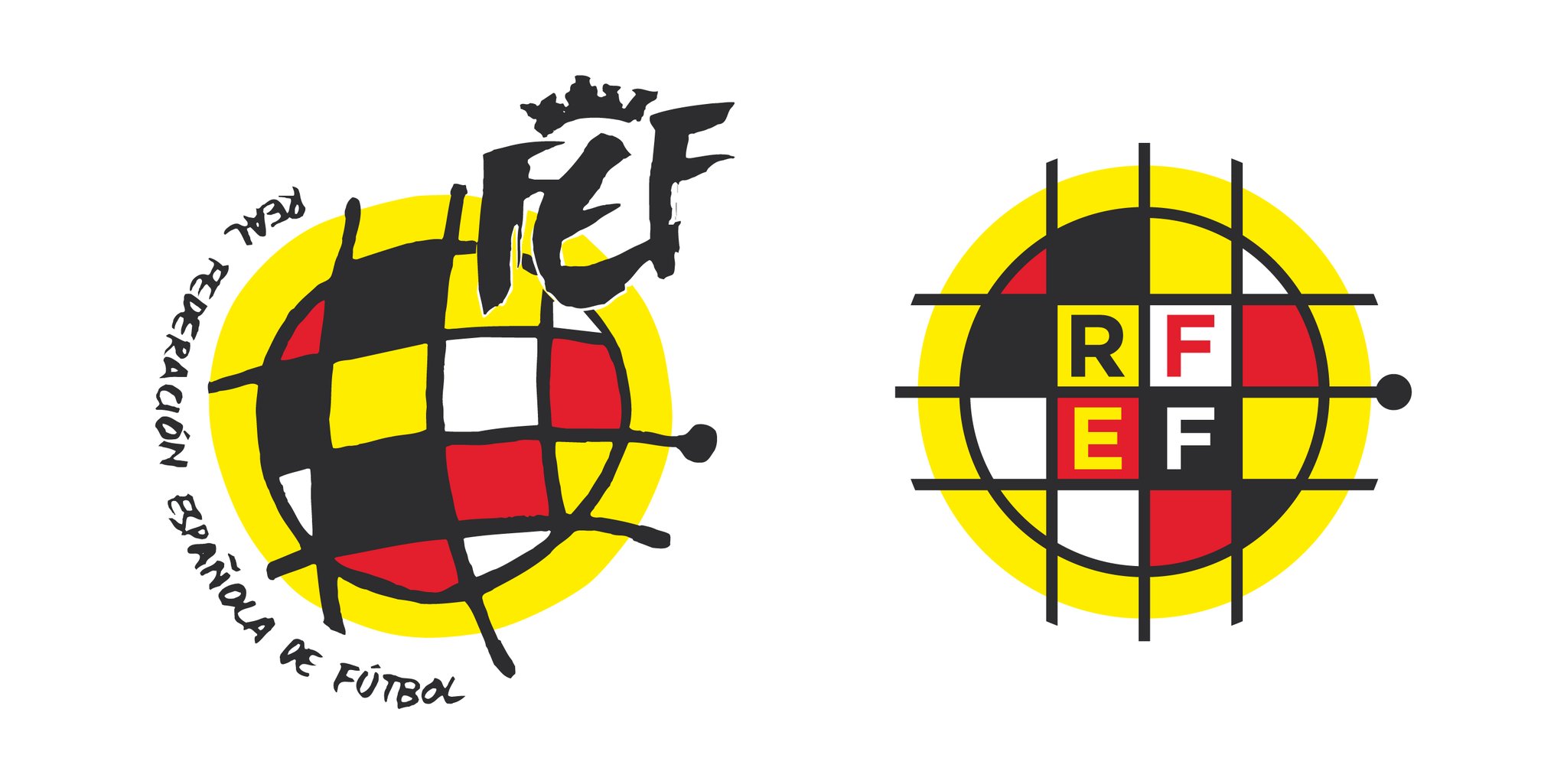
One creative has even been inspired to 'rebrand the rebrand', if you will. We're talking about football kit concept designer Juan López Moses, who offered their own take on the RFEF logo which you can check out below.

Instead of being radical and creating a brand new icon, Juan here has opted to take the original and reconceptualise it for a new era. The colours and form of the original all present, but with the tidier, flatter feel that most modern logos possess.
Sign up to Creative Bloq's daily newsletter, which brings you the latest news and inspiration from the worlds of art, design and technology.
While it's still hard to read the brand name in the right order, we'd say Juan has created something that keeps both sides of the pitch happy: those who like neat design, and those who like things a little more impressionistic. In fact, it rather reminds us of BMW's new logo, no doubt the car rebrand of the decade so far.
Read more:

Giacomo is a writer and talking head who has covered creativity and creative tools for Wallpaper*, Digital Arts, Creative Boom, VICE, Little White Lies, the BBC and more. Giacomo has also hosted for Adobe and D&AD, and judged the annual New Blood Awards. He was deputy editor of Creative Bloq for a short time in 2021.
