Does the new Paramount+ logo contain a HUGE mistake?
Every designer's worst nightmare.

Sign up to Creative Bloq's daily newsletter, which brings you the latest news and inspiration from the worlds of art, design and technology.
You are now subscribed
Your newsletter sign-up was successful
Want to add more newsletters?
Though not every logo redesign looks great overall, it's unusual for a straight-up, bonafide design error to be signed off on. And with the amount of approvals required for the rebrand of a larger company, every pixel has usually been pored over before a design goes live. So the fact that eagle-eyed viewers have spotted a potential mistake on the new Paramount+ logo is more than a little surprising.
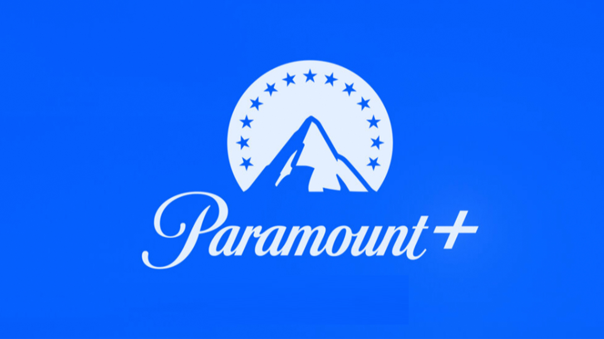
Revealed last week, the design for Paramount+ (one of a squillion or so streaming services to emerge in the last few years), is a contemporary take on the film studio's famous mountain. Like most new logos, the two-tone design is a decidedly flat affair. But unlike any of our best logos, it's getting designers talking for all the wrong reasons.

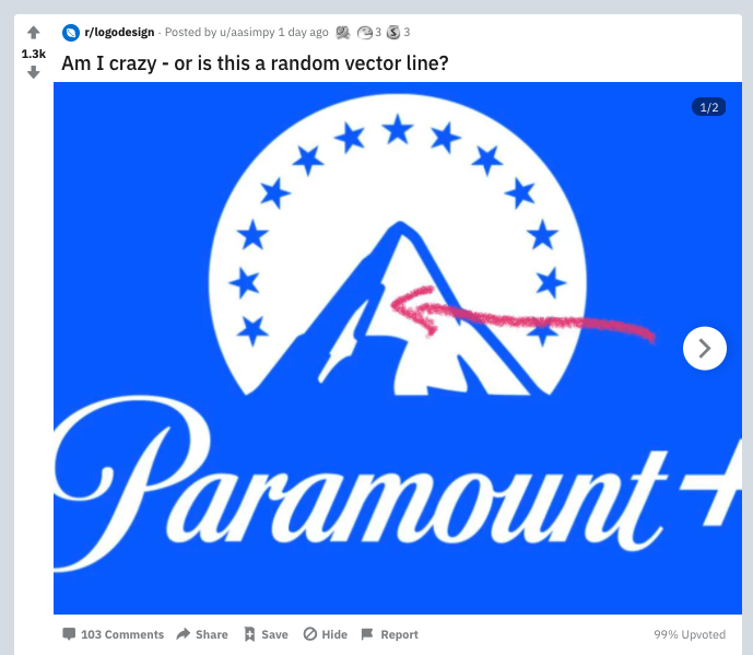
A Reddit user pointed out (above) that one detail of the mountain looks suspiciously like a random, rounded vector line – inconsistent with the rest of the logo's sharper shading. And now, just like everyone else on Reddit, we simply can't unsee it. Perhaps the designer didn't check out our best vector art tutorials before setting out to climb this mountain of a task.
Article continues belowMany have speculated whether the rounded line was left in the final design by mistake. "This is my fear as a designer," one Redditor commented, "that the internet is gonna see a mistake on my design." "I wonder if they uploaded the wrong file by mistake and now it's everywhere?" another added. "Client probably unwittingly grabbed the wrong version and rolled with it. It was final_final_final.svg not final_final.svg." (We've all been there.)
wow, the paramount logo has a random vector line right in the middle of it.can’t unsee it.#designtwitter #paramount pic.twitter.com/ZpEv5HQ0V6March 20, 2021
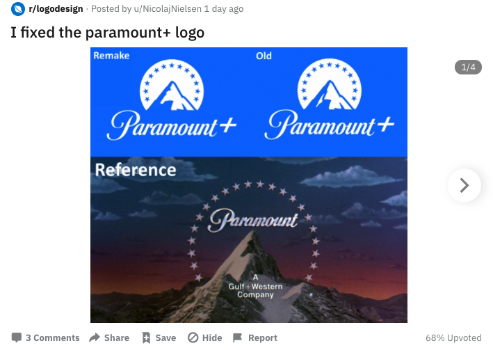
One designer has even 'fixed' the design, removing the offending line entirely (below). But while this means our eyes are no longer drawn to the possible error, it also reduces the mountain's texture. Surely a thinner, sharper version of the line is all that's required?

But while Reddit is convinced that the line is a mistake, after viewing the case study by Loyalkaspar, the studio behind the design, we're not so sure. As the image below shows, the studio chose its highlights very deliberately, with one diagonal line corresponding exactly with those offending pixels.

Of course, it's still possible that while the presence of said line was intentional, it wasn't supposed to be quite so jarringly round and thick. Either way, neither Paramount nor Loyalkaspar is likely to be delighted that their design is drawing so much suspicious scrutiny from designers.
Sign up to Creative Bloq's daily newsletter, which brings you the latest news and inspiration from the worlds of art, design and technology.
Whether or not the design was deliberate, we'll be filing Paramount's mysterious vector line firmly under 'cannot unsee' – where it joins the likes of Amazon's unfortunate new app icon and the logo so offensive it received a police complaint.
Read more:

Daniel John is Design Editor at Creative Bloq. He reports on the worlds of design, branding and lifestyle tech, and has covered several industry events including Milan Design Week, OFFF Barcelona and Adobe Max in Los Angeles. He has interviewed leaders and designers at brands including Apple, Microsoft and Adobe. Daniel's debut book of short stories and poems was published in 2018, and his comedy newsletter is a Substack Bestseller.
