Ingenious new San Diego Zoo logo will make you look twice
Can you spot all 3 animals?

Sign up to Creative Bloq's daily newsletter, which brings you the latest news and inspiration from the worlds of art, design and technology.
You are now subscribed
Your newsletter sign-up was successful
Want to add more newsletters?
Most rebrands are complex beasts, but Pentagram certainly had its work cut out with its latest project – which saw two of the world's largest zoos combine as a single organisation. But the new identity (and in particular the new logo) is a triumph.
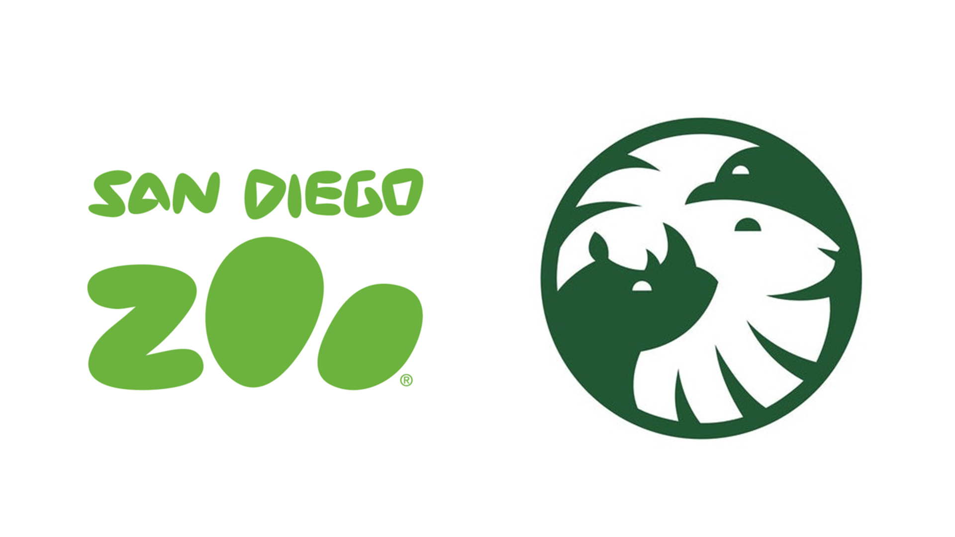
San Diego Zoo and San Diego Safari Park have rebranded as the San Diego Zoo Wildlife Alliance (SDZWA). At the heart of the new identity is a delightful new logo (below), which features not one, not two, but three animals – thanks to some ingenious use of negative space. Many of the best logos of all time contain secret messages, but most aren't hiding a trio of species.
According to Pentagram, the logo's three animals are hugely important to the history of the San Diego Zoo Wildlife Alliance (SDZWA), and "represent its century-long conservation efforts." A lion is joined by a California condor, a species brought back from the brink of extinction by the organisation, and a white rhino, which the organisation is saving with "one of most successful managed breeding programs in the world."
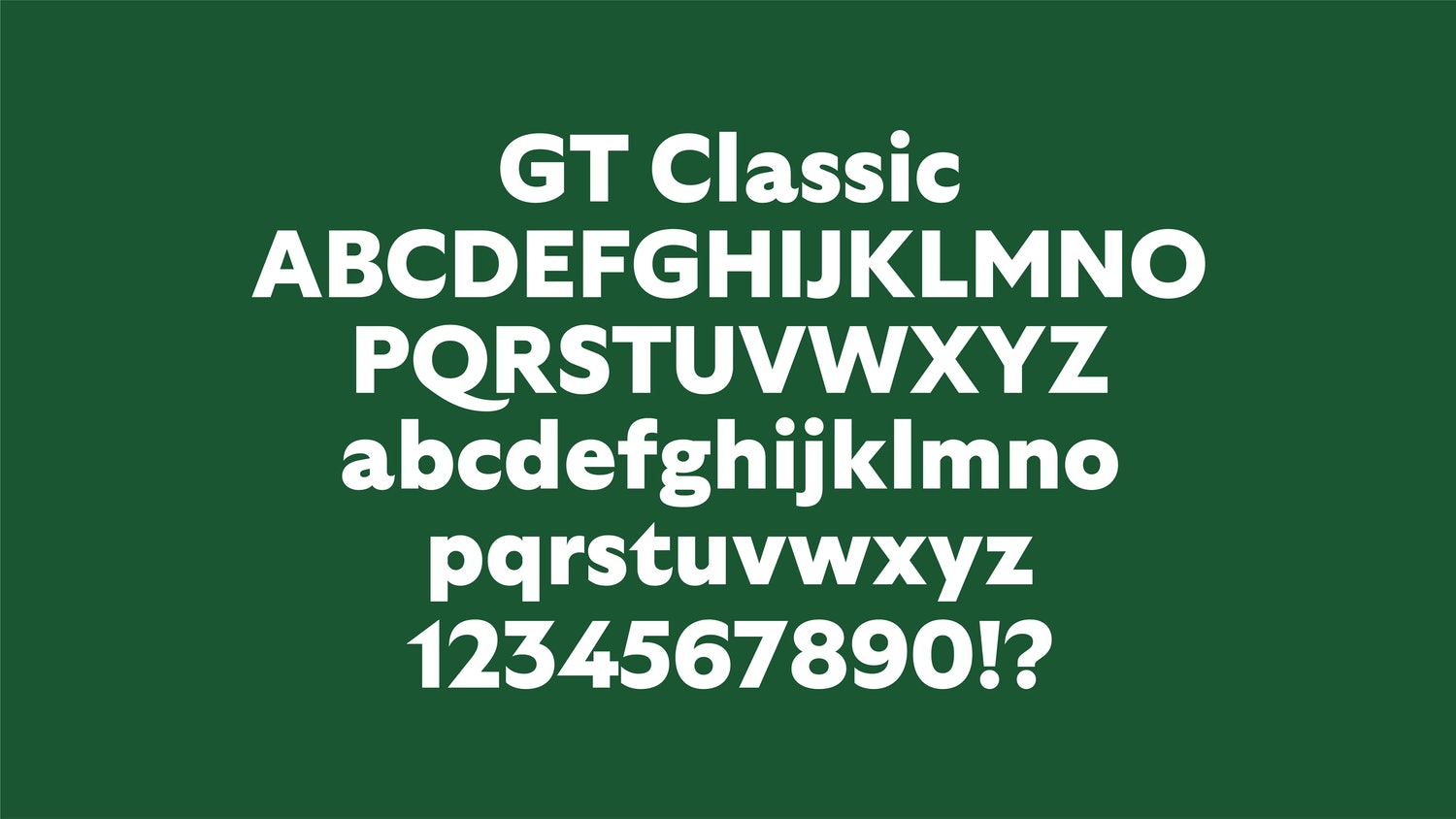
Article continues belowAs well as the new name and logo, the rebrand includes a brand new typeface for the SDZWA. Designed by Grilli Type, GT Classic features "animalistic qualities" like swooping tails and sharp spurs. If you're looking for more typographical inspiration, check out our best free fonts.

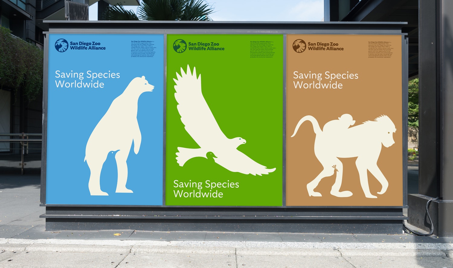
And Pentagram has extended its clever use of negative space to a series of posters (below), featuring multiple animals in silhouette. Like the logo (and indeed the rest of the identity), these are not only graphically striking, but also convey a sense of love for the animal kingdom. And like all of the best print ads, they're bound to elicit a double-take or two.

It's early days, but the SDZWA's new rebrand is already a strong contender for our favourite rebrand of the year. From the CIA's bafflingly 'cool' new look to Peugeot's opinion-dividing new emblem (2021's other lion-based new logo), not every brand has got it quite right. But with this one, we're feeling some serious animal magnetism.
Read more:
Sign up to Creative Bloq's daily newsletter, which brings you the latest news and inspiration from the worlds of art, design and technology.

Daniel John is Design Editor at Creative Bloq. He reports on the worlds of design, branding and lifestyle tech, and has covered several industry events including Milan Design Week, OFFF Barcelona and Adobe Max in Los Angeles. He has interviewed leaders and designers at brands including Apple, Microsoft and Adobe. Daniel's debut book of short stories and poems was published in 2018, and his comedy newsletter is a Substack Bestseller.
