Is Harry and Meghan's Archewell logo a missed opportunity?
Limited success for the Sussex's branding.
Sign up to Creative Bloq's daily newsletter, which brings you the latest news and inspiration from the worlds of art, design and technology.
You are now subscribed
Your newsletter sign-up was successful
Want to add more newsletters?
Prince Harry and Meghan Markle are fully embracing a redesigned brand image, after ditching the Sussex Royal insignia that previously appeared on their correspondence. Now, we're aware the world has an opinion on the controversy surrounding the couple's split from the royal family, but we're just here from a design perspective, okay? Good.
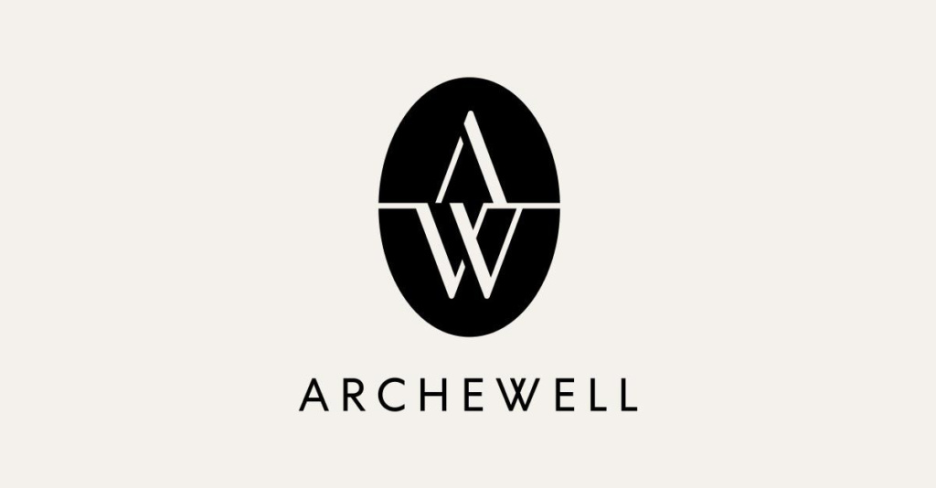
Appearing on the top of a letter addressed to Robert Clack School, the simple new design features a single A atop a W inside an oval. See the tweet below, which shared the logo of Harry and Meghan's media brand on the first piece of official correspondence (replacing the old royal monogram). And be sure to compare it to our pick of the best logos ever.
We had a very special delivery this week. It has been lovely to share this letter and advice with the students and remember our International Women’s Day celebrations last year. #IWD2021 #iwd pic.twitter.com/wLDisgETwpMarch 11, 2021
Okay so it isn't a design that's going to set the world alight (see it more clearly below). But it is simple, stylised and pretty inoffensive as a design made to be found on top of a letterhead. The A is nicely balanced above the W and the letterforms are nicely weighted. It kind of reminds us of a high-end events company.
Article continues below 
But Archewell is actually a multi-faceted media brand, meaning this logo will be visible on more than simply correspondence, and it needs to hold its own in the varied situations it will find itself placed in. First there's Archewell Foundation (an impact-driven 'not-for-profit'), then, Archewell Productions, which has a deal with Netflix, and finally Archewell Audio, which is in partnership with Spotify.
As part of a vibrant media landscape, the logo could be in danger of getting lost. Though it may be classic in style, we wonder how it will sit digitally on the Netflix page, or as part of a podcast database. Will it hold up as a classic (if slightly dull) design, or will it fade into the background? It is worth mentioning that the oval has appeared in different colours on other stationery, so maybe that will be the part that makes the design pop.

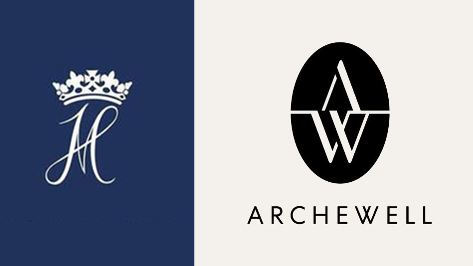
We look forward to seeing the new design in situ to see how it works against the digital landscape. It's clear that the brand needed to touch on the ex-royal's rich history in its design and therefore keep it classic, and the royal monogram (above) was a weighty one to follow. But we have to say, we kind of wish this design had kept some of the playful style of the old monogram, though we suppose the serious nature of the tagline – 'Compassion in Action' – belies something more straight-laced.
The design team was probably aware that pushing design boundaries wasn't going to work in this case (unlike with the way Burger King was able to push the boundaries on flat design, or the CIA went totally off-piste with its new logo).
Sign up to Creative Bloq's daily newsletter, which brings you the latest news and inspiration from the worlds of art, design and technology.

Have you created some world-class branding? Enter the Brand Impact Awards. Submit your best branding for a chance to win – entries close 27 May 2021.
Read more:
- Amazon just fixed its controversial new app icon
- Where to find logo design inspiration
- Logo design: All you need to know

Georgia has worked on Creative Bloq since 2018, and has been the site's Editor since 2023. With a specialism in branding and design, Georgia is also Programme Director of CB's award scheme – the Brand Impact Awards. As well as immersing herself with the industry through attending events like Adobe Max and the D&AD Awards and steering the site's content streams, Georgia has an eye on new commercial opportunities and ensuring they reflect the needs and interests of creatives.
