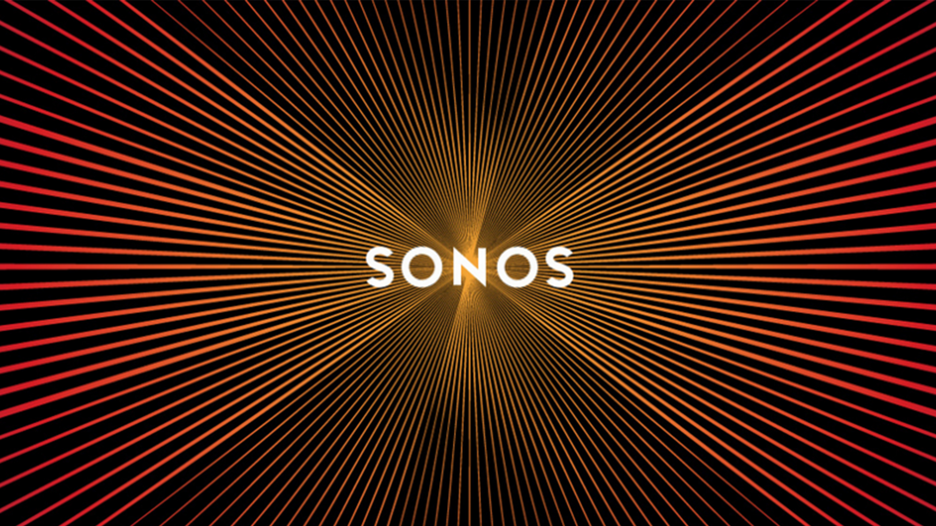
Is this advertising's best ever optical illusion?
You can practically hear Sonos's logo.

Sign up to Creative Bloq's daily newsletter, which brings you the latest news and inspiration from the worlds of art, design and technology.
You are now subscribed
Your newsletter sign-up was successful
Want to add more newsletters?
Sonos is one of the most well-known audio brands around, with many a creative studio rocking its wireless WiFi speakers. It's fitting, then, that a brand known for its stunning sound quality produced a static logo design you can practically hear.
A Reddit user (below) has reminded us of the brilliant optical illusion, pointing out that the various streaking lines behind the Sonos logo appear to pulsate like speakers when scrolling up and down. Our best print ads of all time contain some brilliant optical illusions, but this is certainly one of the most sensory examples we've seen.
The Sonos logo pulses like a speaker when you scroll. from r/DesignPorn
Finished scrolling? Great. Other Reddit users were blown away by the effect. "I think I have trust issues and I hate this kind of awesome shit," one exclaimed, "I can't trust my own god damn eyes!" "I can't stop doing it," another user added. While the effect is mesmerising enough on its own, we're particularly impressed that, by resembling a pulsating speaker, its highly relevant to the brand rather than a mere gimmick.
Article continues belowThe design itself is part of an identity created in 2015 by Bruce Mau Design, made to help broaden Sonos's appeal beyond "in the know" audiophiles. The identity went on to went onto win several awards including a Cannes Lion and Adweek's "Cleverest Logo of the Year".
From these brilliant animal shelter ads to McDonald's' terrifying kissing burgers, optical illusions can be a pretty hit-and-miss visual tool when it comes to advertising. But as far as we're concerned, Sonos's pulsating logo is still a sound example.
Read more:
- Get 25% off the FULL Adobe Creative Cloud suite for one week only
- The secret Cadbury logo image you've probably never noticed
- Apple issues a big warning for MacBook users
Sign up to Creative Bloq's daily newsletter, which brings you the latest news and inspiration from the worlds of art, design and technology.

Daniel John is Design Editor at Creative Bloq. He reports on the worlds of design, branding and lifestyle tech, and has covered several industry events including Milan Design Week, OFFF Barcelona and Adobe Max in Los Angeles. He has interviewed leaders and designers at brands including Apple, Microsoft and Adobe. Daniel's debut book of short stories and poems was published in 2018, and his comedy newsletter is a Substack Bestseller.
