I'm confused about The Range logo
But not for the reason you might think.

Sign up to Creative Bloq's daily newsletter, which brings you the latest news and inspiration from the worlds of art, design and technology.
You are now subscribed
Your newsletter sign-up was successful
Want to add more newsletters?
I was confused when I started to see news stories about The Range, but clicked away in order to find that, no, the UK retail company has not rebranded, nor is it embroiled in some sort of scandal. So what's the story? Well, it's the same thing we saw a few years ago. People just can't get over the 'issue' with The Range's logo.
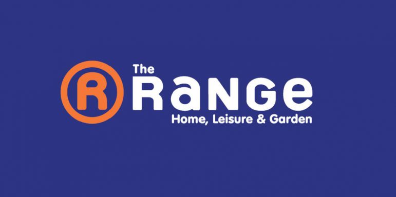
So, I thought I'd hop on the bandwagon and see what all the fuss is about. The crux of the confusion is around The Range's logo, which most people do not seem to think is up there with the world's best logos. It consists of an 'R' in an orange circle, so far, so normal (if a bit bland). But when you pair the logo with the wordmark, 'The Range', people are seeing the word 'Orange', or 'The Orange'.
This is one of the logo secrets that doesn't make the logo seem more appealing, but actually causes more confusion to the consumer. The thing I think this debate is missing is that if you take the 'R' in the circle as part of the wordmark, then the logo actually says 'The O-R-Range'. Now why is no one else talking about that, I wonder.
People have called out the extra 'O' in the The Range's logo several times over the years, with peak orange confusion happening around 2020, when one user's comments set Facebook alight (well, sort of, I mean, it garnered a lot of comments, no one was harmed in the process as far as I know).
The post said: "So I blew my own mind today. I realised that the range has an R in an orange circle as their logo, but I can’t unsee it as saying anything other than orange now?? Has it been called the orange all along and we’ve not noticed? Honestly I am baffled. Someone please explain this to me and restore my faith in humanity."
The Range, to its credit, addressed the comments, saying: "We do love the colour O-Range but all jokes aside we are officially called 'The Range'."
Since then, the name question has cropped up a few more times. In 2021, The Range even floated the idea of changing its branding to full-on orange to reflect its non-name.
Sign up to Creative Bloq's daily newsletter, which brings you the latest news and inspiration from the worlds of art, design and technology.
🍊 Due to the fantastic response on our previous O-Range social post (if you know you know😉) we're looking to banish the blue & a-range for all branding to be solely o-range. Let us know your thoughts on this new look 👀 #therange #orange pic.twitter.com/CWcY4oizKaApril 1, 2021
The response from Twitter users wasn't exactly positive, and we haven't spotted any changes in The Range's branding out in the wild, yet.
So in summary, The Range isn't called Orange, even though its logo makes it looks like it is. No one seems to have noticed that in actual fact, it looks like it says The O-R-Range. The Range thought about rebranding to be more orange, but has not yet done so, and we won't be updating our how to design a logo post with any tips from the UK store. As you were.
Read more:

Rosie Hilder is Creative Bloq's Deputy Editor. After beginning her career in journalism in Argentina – where she worked as Deputy Editor of Time Out Buenos Aires – she moved back to the UK and joined Future Plc in 2016. Since then, she's worked as Operations Editor on magazines including Computer Arts, 3D World and Paint & Draw and Mac|Life. In 2018, she joined Creative Bloq, where she now assists with the daily management of the site, including growing the site's reach, getting involved in events, such as judging the Brand Impact Awards, and helping make sure our content serves the reader as best it can.
