Turns out the Domino's pizza logo has a surprising secret
What do the dots mean?

Sign up to Creative Bloq's daily newsletter, which brings you the latest news and inspiration from the worlds of art, design and technology.
You are now subscribed
Your newsletter sign-up was successful
Want to add more newsletters?
It's one of the most famous food logos around, and, you might think, one of the most literal. The logo for Domino's is simply a domino, right? Sure – but it turns out there's a special meaning behind those three dots.
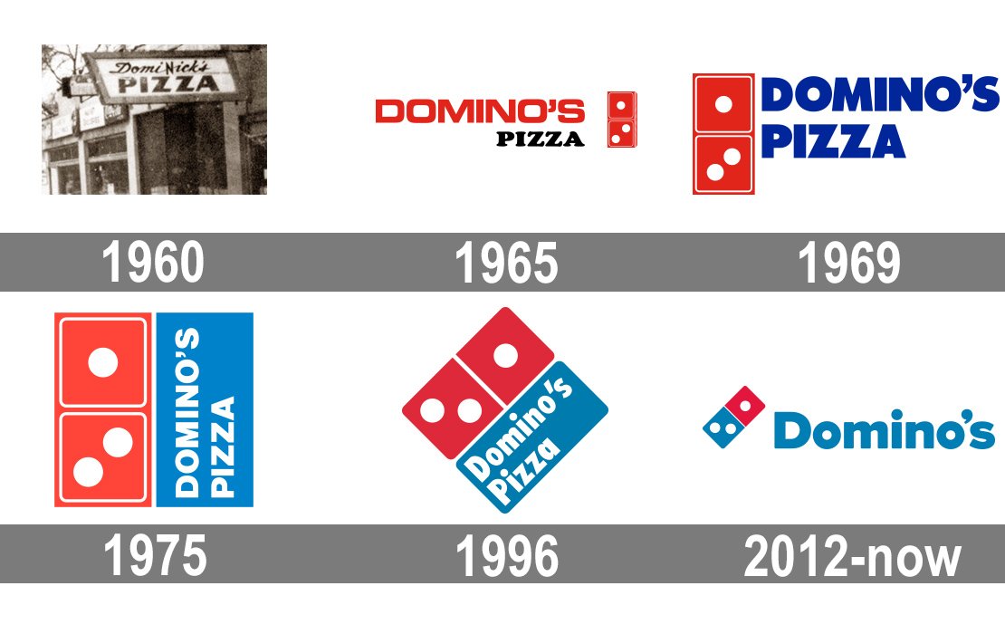
Established in 1960 (as DomiNick's Pizza), the pizza joint's logo hasn't changed a whole lot over the years, aside from the original all-red domino switching to red-and-blue. But if the original design philosophy had remained, we might be looking at a whole lot more dots. (Looking for inspiration? Check out the best logos of all time.)

According to Logopedia, the dots on the domino represent the pizza chain's original three locations. And the company planned to add a new dot for every new restaurant it opened. Which means today's logo would feature over 15,000 of the things.
Article continues belowThankfully, it seems that idea was swiftly abandoned – the first update to the logo, revealed in 1970, still features just three dots. But it wasn't until 2012 that the famous duo-tone design that we recognise today appeared – this was when the red domino became half, blue. It was also the year that 'Pizza' was dropped from the brand name.

Indeed, we've seen plenty of hidden logo messages pop up over the last few months – some intentional, like the brilliant Bluetooth design, some not so much (looking at you, Tesla). If you're inspired to create your own, take a look at our guide on how to design a logo.
Read more:
- The Coca-Cola logo: a history from 1886 to today
- Is this really the most offensive logo?
- The new Aston Martin logo makes perfect sense
Sign up to Creative Bloq's daily newsletter, which brings you the latest news and inspiration from the worlds of art, design and technology.

Daniel John is Design Editor at Creative Bloq. He reports on the worlds of design, branding and lifestyle tech, and has covered several industry events including Milan Design Week, OFFF Barcelona and Adobe Max in Los Angeles. He has interviewed leaders and designers at brands including Apple, Microsoft and Adobe. Daniel's debut book of short stories and poems was published in 2018, and his comedy newsletter is a Substack Bestseller.
