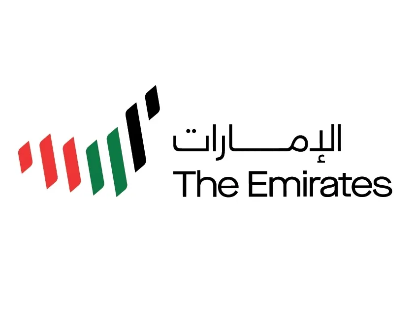
The United Arab Emirates has announced a brand new logo (above), the country's first new emblem in 50 years. Named '7 Lines', the new emblem was decided on in a competition voted on by 10.6 million people from around the world. The winning logo aims to help clear up global confusion about what the UAE actually is, and help cement its unity as a country.
It's also accompanied by a new slogan – Make It Happen – which relates to the nation's journey since its unification 50 years ago. (Compare this new emblem to our pick of the best ever in our best logos post.)

For the project, seven designers from each of the country's seven emirates – so 49 designers in total – were chosen to create a range of new logo options, three of which were offered for the public to vote on. The chosen design is comprised of seven multicoloured lines each representing one of the emirates (Abu Dhabi, Dubai, Ajman, Sharjah, Ras al Khaimah, Fujairah and Umm al-Quwain), in the shape of the map of the UAE.
This was especially important to the nation's rebrand aimed partly to clear up global confusion about what the UAE actually is. “The world is going to know us now as seven emirates,” said Ms Al Hammadi who, at 21, is one of the youngest designers involved. She explained that people around the world think that Dubai and Abu Dhabi, for example, are separate countries and that the message of unification is incredibly important to the country.
The new logo was announced by HH Sheikh Mohammed with the below tweet.
أطلقت اليوم وأخي محمد بن زايد و٤٩ مبدع إماراتي الهوية الاعلامية المرئية الجديدة لدولة الامارات ... هوية تمثل خارطتنا .. وتصاعد طموحاتنا .. وسبع إماراتنا التي تسابق العالم .. وسبعة مؤسسين خلدوا أنفسهم في تاريخنا pic.twitter.com/1qIY3gU4nPJanuary 8, 2020
Sass Brown, design expert and columnist for UAE publication The National, explains that the format and direction of the lines are representative of more than just the seven emirates.
“The gentle undulation of the form reminds me of the curve of a sand dune or the roll of a wave, both representative of the geography of the territory," says Brown. "The simple sans-serif font is clean, modern and easy to read in a digital environment, representative of the stand the Emirates has taken on innovation, entrepreneurship and technology, which propels them into the future."
Unusually, the logo seems to carry a specific timeframe – it aims to carry the country forward over the next 50 years.

Alongside the rebrand, the UAE will be planting over 10 million trees in Nepal and Indonesia – one tree for every vote cast. The trees will be planted in West Papua, Indonesia, a centre for marine biodiversity, and at the Amaltaari planting site in Nawalparasi, Nepal to support the endangered species, such as the Bengal tiger, that live there.
Whether or not the logo and tree planting drive will help shift the UAE’s global reputation remains to be seen, but, from a design point of view, the logo itself is a strong symbol with a clear message. It's a clean and modern update on the imperialistic-looking eagle that was introduced way back in 1973, and holds very different connotations.
Read more:

