5 big logo design trends for 2020
One of the biggest problems with writing articles about logo design trends is that every year, readers expect to be told something new and unexpected. For the last four or five years though, it's been increasingly difficult to do so without bending the truth. Because on the whole, logo design has been going in one specific direction for a very long time. We're talking about the trend for simple, reductive logo designs that can be scaled up and down almost infinitely, whatever the size of the screen.
That said, it's not just a new year we're entering, but a brand new decade. Could this be the year that everything changes? Will we have to update everything in our ultimate guide to logo design, or even our five basic types of logo post? We chatted to some experts to find out.
If you like logos in general, you might also want to check out our favourite 3-letter logos or the best monogram logos ever made.
01. Simple and minimalist
Dull though it may be to report, the main logo design trend in 2019 has basically been the same as that of 2018. As Gabriella Corbett, designer at StormBrands, explains: “Straightforward minimalism has set the standard, as seen with Pentagram simplifying MasterCard's marque and dropping the name from the logo entirely. This kind of minimalist refresh, which can also be seen in the marques of major players like Warner Bros and Facebook, is almost certainly set to continue and evolve in 2020.”
That doesn’t mean, though, that everyone approves. Among the trend’s critics is Dan Bramham, senior designer at Greenwich Design. "I find it bland, bloated in parts; a bit 'meh' really,” he says. “Staples did well to update their typography which was looking a bit tired, but the new 'staple' icon is too versatile and lacks personality. And as for BT, I couldn’t believe it when I saw their new logo. I'd say they really had their pants pulled down on that one."
02. Authenticity and narrative
Will there be a countertrend against bland simplification in 2020, even if it’s just by a minority of companies? Adam Murdoch, senior art director at Grady Britton, thinks so. “Generification of logos and brands are on the way out,” he predicts. “The coming year is an opportunity for brands to be truly authentic and allow the history and narrative to be a living part of their stories and visuals. This can’t be done when design systems look like a template.”
Lee Hoddy, creative partner at Conran Design Group, believes that such a change will certainly occur in the startup world. “In 2019, most startups developed a brand expression which, when viewed together as a suite, felt far less distinctive than it should have done,” he says. “In 2020, I believe more startups will look to differentiate themselves via their design language, and find a level of attitude and uniqueness which will be creatively very exciting.”
Sign up to Creative Bloq's daily newsletter, which brings you the latest news and inspiration from the worlds of art, design and technology.
03. Playful simplicity
Rescuing logo design from generic blandness doesn’t necessarily mean jettisoning the simple approach, though. Chris Moody, global chief design officer at Wolff Olins, believes that it’s perfectly possible to purse “simplification purely in service of creating a structure for something extraordinary, smart, impolite and even downright noisy. Such brands interweave with technology to help to stop you in your tracks, inspire and talk to you; not at you.
"This year, BBC2 went electric with its chameleon logo whilst Spotify did it purely with words," he continues. “The key is transmitting and amplifying a spirit through the power of technology rather than seeing it as a filter to make everything as frictionless and pale as possible. So just like Bob Dylan in 1965, in 2020 it’s time for every brand to plug in and start creating some feedback.”
Pete Jeffs, creative director at loyalkaspar, takes a similar view. “Even if everyone is asking the same questions, we still have an opportunity as designers to come up with unique answers,” he argues. “For example, MailChimp’s refresh features the same ingredients as many other recent rebrands — a simplified wordmark, custom typeface, and hand-drawn illustrations — but the choice of a playful serif font and more expressive illustration style give the brand a unique voice that helps them stand out amongst a sea of sameness.”
04. Clean typography in luxury
One place we’re not likely to see too much graphical playfulness, however, are in the logos for luxury brands. “In 2019, it’s been hard to miss the increasing homogeneity of typography in this sector,” says Chloe Schneider, semiotician at Here Design. “The tide of radically simplified sans-serif logo redesigns has been extensively collated and critiqued: Burberry, Celine, Saint Laurent, the list continues.”
These types of logo have obvious appeal. “They’re bold, practical, effective, geometric,” says Schneider. “They work at any size, ideal in a digital age. As I see it, these redesigns resemble the behaviour of art gallery identities. Luxury fashion brands as curators, as contemporary signifiers of quality, whether they display a fur hat or a baseball cap... because today luxury is constantly switching between the two.
“These logos are designed to work with infinite exhibitions and styles,” she continues. “Luxury is preoccupied with fantasy, reimagining and re-describing its truths with every collection; with this comes a diversity of styles, periods and textures. The move towards typographic neutrality and abstraction, untethering from constant reference to heritage and origins, is luxury setting itself free. An act of redefinition towards the dream of limitless possibilities in a digital age.”
05. Brand mascots
While the luxury sector may have its own rules, in other areas we’ve seen an increasing use of brand mascots in 2019. And Simon Chong, associate creative director at Gretel, feels that’s no coincidence. “The growing abundance and availability of emojis is driving a change in how people communicate, allowing them a wider range of tonal expression,” he points out. “As brands are building closer relationships with their customers on a greater scale, the need to be more flexible in conversation is only going to grow.”
Brand mascots have existed for years of course, but their prominence and importance will be seen and felt in the coming year, Chong believes. “Duolingo and Android have recently rebranded, doubling down on their owl and robot mascots respectively,” he notes. “By doing this, they have a wider spectrum of emotion to both express their brand and communicate with customers. Mascots offer a sense of fun, playfulness and humanity within digital environments, acting as a familiar and friendly guide: someone you trust and would want to hang out with on a daily basis.”
A lost art?
So where do we go from here? Is the future of logo design more of the same, with just a little tweaking around the edges? Mike Foster, founder and creative director of Straight Forward Design, hopes not.
"Logo design has been in a dark place for the past decade or so. It has become a bit of a lost art," he believes. "Logos offer an opportunity to give brands a bit of personality, but we seem to have moved into a generic, boring place, where there’s little room for quirk or whimsy or new ideas. What would Paul Rand make of it all?"
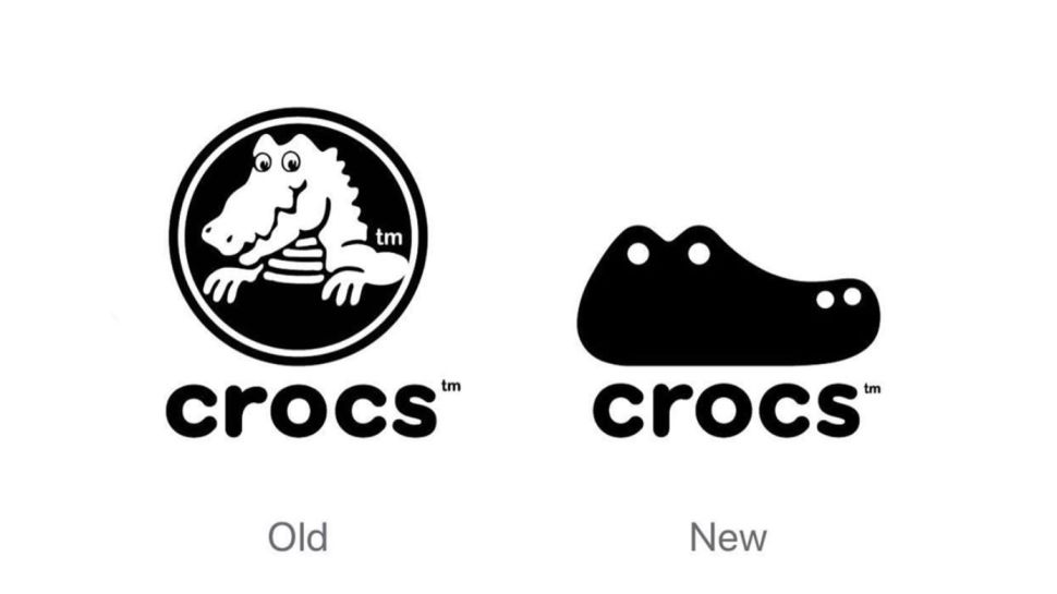
But he has hopes for the future. "When everyone’s a sans-serif, surely brands will have to have a rethink? Maybe the logo’s value as a powerful asset will be rediscovered. There are glimmers of hope: just look at some of the design blogs. They are filled with lovely logos for imagined brands, start-ups, and faux rebrands for huge companies. Stephen Kelleher gave Crocs ‘ugly’ shoe brand a dummy refresh earlier this year. It replaced the original crocodile-in-a-circle design with a simple vector shape, representative of a crocodile’s head and the shoe — brilliant and so simple. Perhaps we’ll see the tide turn in 2020."
Read more:

Tom May is an award-winning journalist specialising in art, design, photography and technology. He is the author of the books The 50 Greatest Designers (Arcturus) and Great TED Talks: Creativity (Pavilion). Tom was previously editor of Professional Photography magazine, associate editor at Creative Bloq, and deputy editor at net magazine.

