Mailchimp rebrand does away with script wordmark
Brand mascot Freddie has also had a makeover.
Sign up to Creative Bloq's daily newsletter, which brings you the latest news and inspiration from the worlds of art, design and technology.
You are now subscribed
Your newsletter sign-up was successful
Want to add more newsletters?
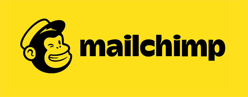
Popular email marketing service Mailchimp has launched a new brand identity and design system. The rebrand comes courtesy of COLLINS, working alongside Mailchimp's in-house design team. Notably, it sees the company doing away with its much-loved script logo design in favour of a sans-serif wordmark, and introducing a cheerful yellow as its brand colour.


Although we've seen a number of companies say goodbye to their script-based wordmarks in recent years, to its credit Mailchimp hasn't joined the ranks of bland, identikit san-serif logos. The new wordmark uses a custom typeface that is equally full of character.
Freddie, Mailchimp's simian mascot, has also had a makeover. The hat and cheeky wink remain firmly in place, but he's now a simplified, single-colour silhouette. The shift also means Freddie can appear alongside the wordmark as part of a more unified system.
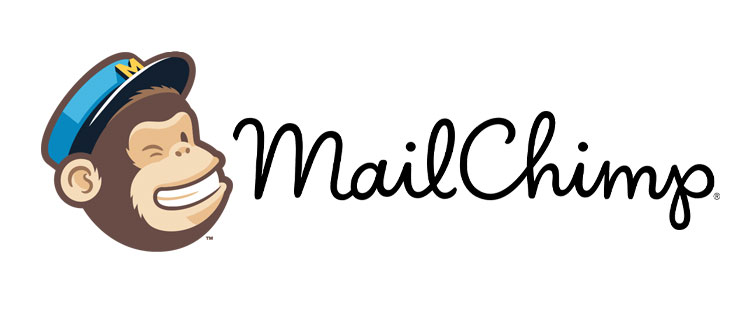
Article continues below"Our beloved logo script and Freddie icon had hierarchy issues and never appeared together," explains Mailchimp. "This meant the icon wasn’t always recognisable on its own. Through a process of iteration and refinement, we've developed a wordmark that lives in harmony with the Freddie icon to build equity for both."

In 2013, Jessica Hische updated the company's original script logo, making it lighter and more legible. However, this time around Mailchimp has taken the plunge and gone for a full-blown rebrand, introducing completely new design system, and dropping the camelcase styling (it's no longer 'MailChimp' but 'Mailchimp').
Mailchimp describes the mood as "playful and expressive". Cooper Light has been adopted as the brand's main typeface, while a sunny Cavendish yellow brand colour introduces a shot of energy into the system. The new look also uses illustration much more heavily, in a distinctive, off-kilter style.
"Our new illustration, motion and photography systems act as the perfect counterpoint to the standardised core brand elements. These expressive parts of our brand are more organic and playful while still communicating a message," says Mailchimp.
Sign up to Creative Bloq's daily newsletter, which brings you the latest news and inspiration from the worlds of art, design and technology.
You can find out more about the rebrand on Mailchimp's website.
Read more:

Ruth spent a couple of years as Deputy Editor of Creative Bloq, and has also either worked on or written for almost all of the site's former and current design print titles, from Computer Arts to ImagineFX. She now spends her days reviewing small appliances as the Homes Editor at TechRadar, but still occasionally writes about design on a freelance basis in her spare time.
