This simple yet brilliant logo is lighting up our lives
Electrifying design.
Sign up to Creative Bloq's daily newsletter, which brings you the latest news and inspiration from the worlds of art, design and technology.
You are now subscribed
Your newsletter sign-up was successful
Want to add more newsletters?
You know us, we're suckers for a brilliant logo design here at Creative Bloq. And I don't mean to spoil the piece already, but this might be one of the best logos designs we've seen in a very long time. The quirky design was spotted at the top of the DesignPorn Reddit page – and for good reason.
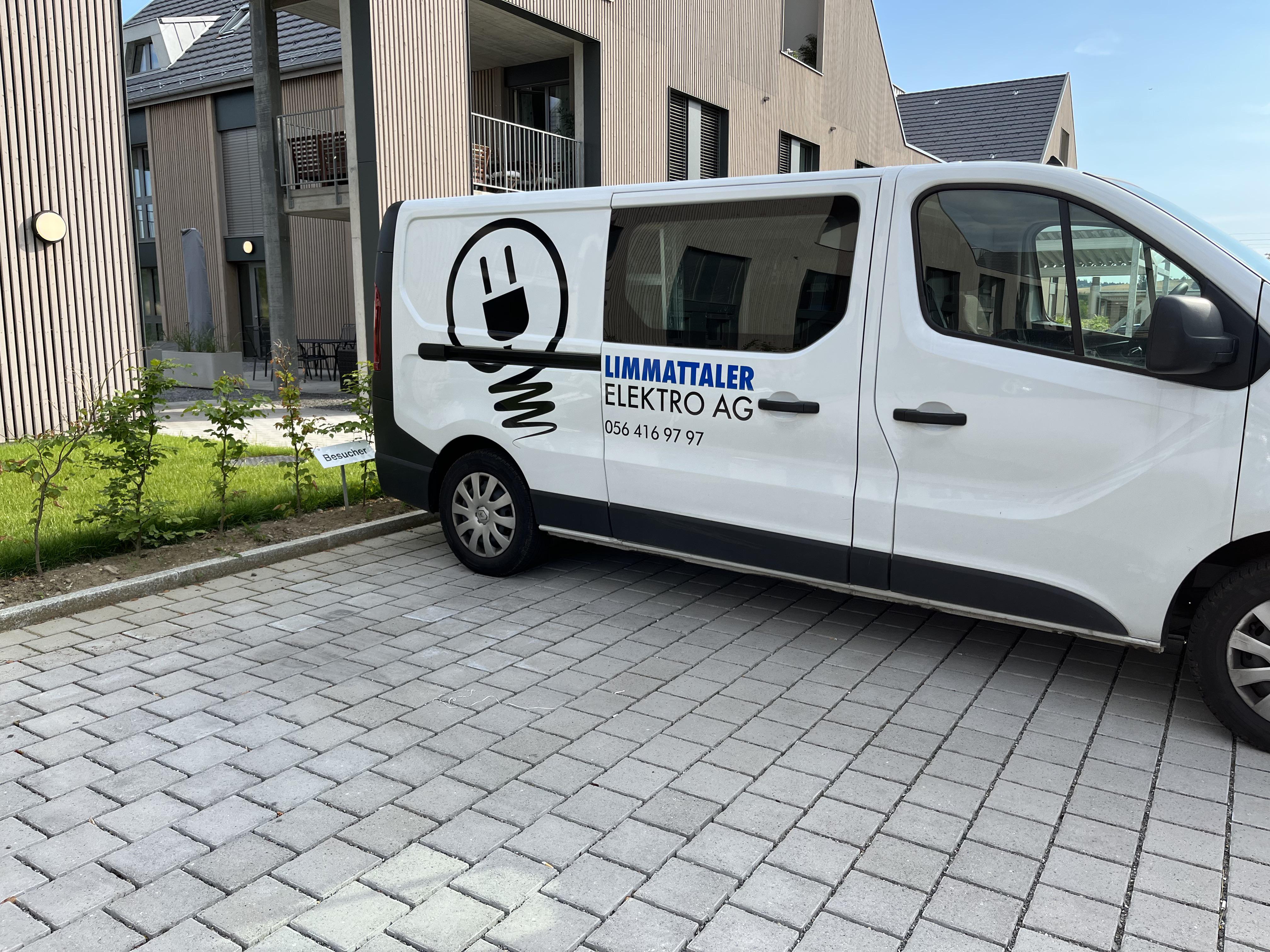
What makes a good logo you ask? Well, we would say a versatile yet recognisable design that accurately represents your brand. And this electrician's logo ticks every one of those boxes with this three-in-one design. At first glance, the logo on this electrician's van (see below) looks like a lightbulb, but when you take a second look, you can also see a smiley face. But the fun doesn't stop there, the face also doubles up as a plug. I think we might have to add this design to our roundup of the best logos of all time.

The design was created for the Swiss electrics company, Limmattaler Elektro AG. And while the design may be simple, it manages to convey so much information about the job. Not to mention the fact that the smiley face is absolutely adorable.
Article continues belowThe design shot straight to the top of DesignPorn earlier this week and has since been gathering up lots of compliments on the design. One user commented, "That's very enlightening," and another said, "As much as I feel outlet logos are a little overdone, this one's pretty awesome".
saw_this_electrician_van_the_logo_is_a_plug from r/DesignPorn
saw_this_electrician_van_the_logo_is_a_plug from r/DesignPorn
If you're feeling inspired by this simple yet effective logo and fancy having a go at making one yourself, download Illustrator and get creative! Or if you need a hand to help get you started, then make sure you head over to our guide on how to design a logo.
Read More:
- How well do you know your fonts?
- Jony Ive is apparently no longer working with Apple
- Surprise, surprise, Damien Hirst has upset someone else
Sign up to Creative Bloq's daily newsletter, which brings you the latest news and inspiration from the worlds of art, design and technology.

Amelia previously worked as Creative Bloq’s Staff Writer. After completing a degree in Popular Music and a Master’s in Song Writing, Amelia began designing posters, logos, album covers and websites for musicians. She covered a range of topics on Creative Bloq, including posters, optical illusions, logos (she's a particular fan of logo Easter eggs), gaming and illustration. In her free time, she relishes in the likes of art (especially the Pre-Raphaelites), photography and literature. Amelia prides herself on her unorthodox creative methods, her Animal Crossing island and her extensive music library.
