New Warner Bros. Discovery logo is widely ridiculed
Designers can't believe their eyes.
Sign up to Creative Bloq's daily newsletter, which brings you the latest news and inspiration from the worlds of art, design and technology.
You are now subscribed
Your newsletter sign-up was successful
Want to add more newsletters?
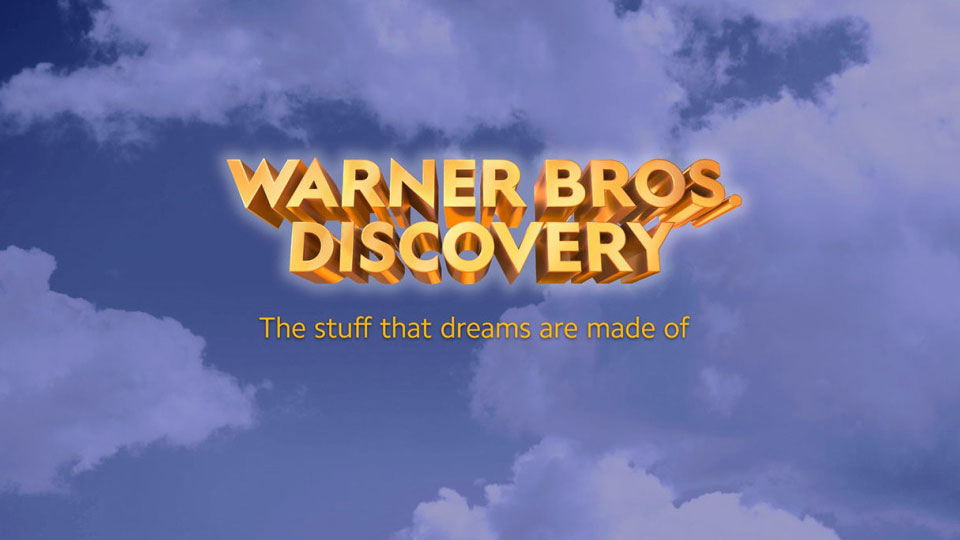
When two media giants merge, one would expect to find some stellar, achingly-up-to-date (or beautifully-classic) design. But, the recent merger between WarnerMedia and Discovery has spawned a bizarre new design that looks like it came straight from the '90s.
Jumping off the page with the kind of gold 3D art that could have been created in Microsoft's WordArt feature, the 'Warner Bros. Discovery' wordmark would certainly look totally at home in a Powerpoint presentation, but some think it is far off the mark for the next big media conglomerate (which aims to be the future of film, television and streaming). Perhaps they should have looked to one of our best free fonts for inspiration instead.

Now, it's worth noting that Discovery says that this design is not the final product but an "initial wordmark", created to sit alongside the announcement of the company name to employees. Since the merger is set to complete in 2022, we assume there will be a new, official iteration released then. But it begs the question of why? For two companies not short on resources (we assume), they could have come out fighting from the off, especially since the this design was always going to attract attention – whatever purpose it was made for.
Article continues belowThe design is totally at odds with the latest update of the Warner Bros. shield (which was redesigned last year, and embraced the on-trend flat design movement – see it here), though it does have echoes of the shiny gold shield – just in a less polished way. We know we've done our share of complaining about design becoming too flat, but the internet agrees that this is problematic in a whole host of other ways, with some doubting the passion put into the project:
Coming up w/ a name & logo is some tough stuff, but... Warner Bros. Discovery..... CUT CUT CUT! This is all wrong, now I want you to go at it again, but w/ more passion please. OKAY?! Okay. Roll again. TAKE 2!#WarnerBros #warnerbrosdiscovery #Discovery #FilmTwitter #film #movies https://t.co/8s1ywuUDHcJune 1, 2021
I saw this new Warner Bros Discovery logo in a tweet and assumed it was a joke... But no. It's real. Both companies have good logos currently but somehow the best they could do combined was WordArt?Did this merger happen in 1998? pic.twitter.com/QJ51wBw3SEJune 1, 2021
Others have felt their own talents have been validated....
Thank you Warner Bros Discovery, for letting me know that I can always have professional graphic design as an easy fall back job. https://t.co/1fFM4pzsjHJune 1, 2021
According to CNN, Discovery CEO David Zaslav (who will be leading the venture) told WarnerMedia employees that the Warner Bros. Discovery brand will "aspire to be the most innovative, exciting and fun place to tell stories in the world", combining "Warner Bros.' fabled hundred-year legacy of creative, authentic storytelling" with "Discovery's global brand that has always stood brightly for integrity, innovation and inspiration".
We're sure the updated wordmark will back up these lofty ambitions, and match up with the slogan 'the stuff that dreams are made of' (taken from Warner Bros. Pictures movie The Maltese Falcon). Though this glitzy affair has some of the drama missing from the ABC logo redesign, we're holding out for a happy in-between.
Sign up to Creative Bloq's daily newsletter, which brings you the latest news and inspiration from the worlds of art, design and technology.
Read more:

Georgia has worked on Creative Bloq since 2018, and has been the site's Editor since 2023. With a specialism in branding and design, Georgia is also Programme Director of CB's award scheme – the Brand Impact Awards. As well as immersing herself with the industry through attending events like Adobe Max and the D&AD Awards and steering the site's content streams, Georgia has an eye on new commercial opportunities and ensuring they reflect the needs and interests of creatives.
