ABC has a new logo (and it feels like déjà vu)
Undramatic redesign comes with lengthy explanation.

Sign up to Creative Bloq's daily newsletter, which brings you the latest news and inspiration from the worlds of art, design and technology.
You are now subscribed
Your newsletter sign-up was successful
Want to add more newsletters?
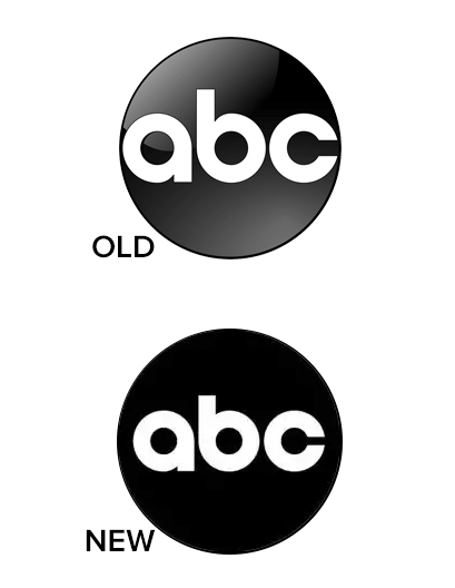
American TV heavyweight, ABC (American Broadcasting Company) has redrawn its 60-year old logo (above) in yet another example of a big corporation embracing the flat design movement. However, we must warn you that if you're here for drama, look away now. The design tweaks are minimal to say the least – with the 3D gloss removed and the font tweaked ever-so-slightly. Not that ABC sees it that way. In fact, the company has launched a lengthy internal explanation for the design changes – one that many think was slightly over the top.
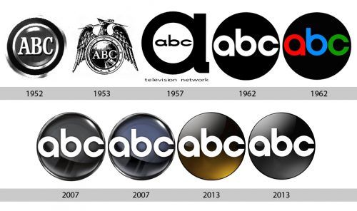
We're not saying there's anything wrong with keeping a similar design, we hasten to add. After all, if it ain't broke, don't fix it. And that adage is certainly one ABC has adhered to since it first adopted its circular form in 1962 (see the logo evolution below). In fact, the latest incarnation looks incredibly similar to that version designed in 1962, with a flat black circle surrounding rounded white font. It isn't the first time a brand has looked to its past for logo design inspiration, with Peugeot also recently adopting its 1960's look (catch up on that here).

And compare the most recent version with the update below:
Article continues below
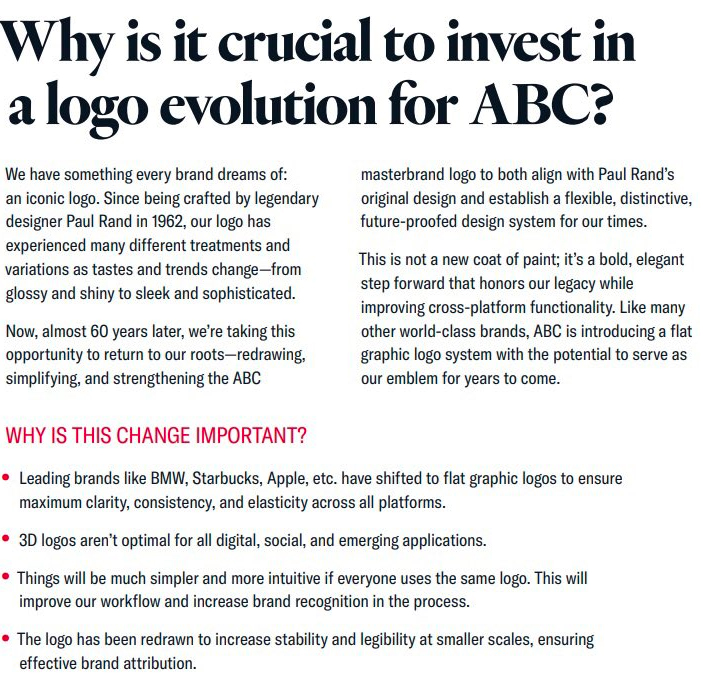
Citing other recent rebrands by Apple, BMW and Starbucks, ABC justifies its move into the flat design space by explaining the needs of digital application. The guide talks about legibility and stability in the new design, whilst calling the move a 'bold, elegant step forward'. We have to say, we're not sure about the bold part but we understand the need to remove the outdated swooshes (though part of us longs for the halcyon days of texture). Have a look at the guide below.

We should say that we know these types of design projects often have internal explanations alongside them (money has been spent, after all), and we don't mean to minimise the need to explain design choices to non-designers. Plus, it's always interesting to read the rationale behind a corporation's decision when it comes to a redesign.
But the whole thing has still provoked some opinions. Some are perturbed that ABC has made such a fuss over such minimal changes: "This is such a minor change that it barely warrants mentioning," says Twitter user Paul Worthington. "99.9% of people will never even notice. It’s the kind of design tweak corporations do all the time. Which renders the hyperbolic text accompanying the changed mark as being wince inducingly unnecessary."
And others feel it isn't as legible as it could be:
Sign up to Creative Bloq's daily newsletter, which brings you the latest news and inspiration from the worlds of art, design and technology.
100%May 27, 2021
And there are some who are onboard with the move away from 3D-style design:
Agree, what seemed modern at the turn of the millenium now seems dated. No one is impressed by a 3D logo in 2021.May 26, 2021
We quite like the idea of the multicoloured affair from the latter years of 1962. It would have given a pop of something different in a saturated market of monochrome flat design (something designers are starting to lose patience with). This redesign is super-similar to the recent Currys redesign (circle – check, rounded font – check... though at least Currys is purple), provoking a feeling of sameness that's all too familiar these days.
However, as our guide to flat design explains, this style is an important part of modern application – we just wish it could be innovative at the same time.
Read more:

Georgia has worked on Creative Bloq since 2018, and has been the site's Editor since 2023. With a specialism in branding and design, Georgia is also Programme Director of CB's award scheme – the Brand Impact Awards. As well as immersing herself with the industry through attending events like Adobe Max and the D&AD Awards and steering the site's content streams, Georgia has an eye on new commercial opportunities and ensuring they reflect the needs and interests of creatives.
