Designer charts his diet with beautiful data visualizations
These beautiful data charts of designer Ryan MacEachern's diet were crafted using colourful foods.
Sign up to Creative Bloq's daily newsletter, which brings you the latest news and inspiration from the worlds of art, design and technology.
You are now subscribed
Your newsletter sign-up was successful
Want to add more newsletters?

We all hate going on a diet, right? Well, designer Ryan MacEachern made it more fun for himself by logging down details of his eating habits via colourful, food-filled and data-rich graphics. They cleverly just how much of each food group he has consumed.
We love the simplicity of these designs. The photography-approach brings the details of carbohydrates, fat and protein in MacEachern's diet to visual life in a way that a dry graph never could. And the subtle use of colour and cleverly placed foods make it a great inspiration both in terms of dieting and data visualization.
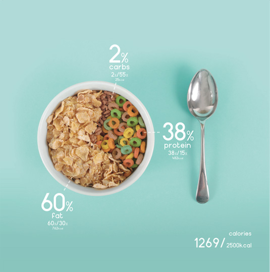
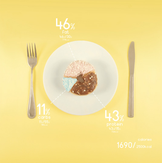
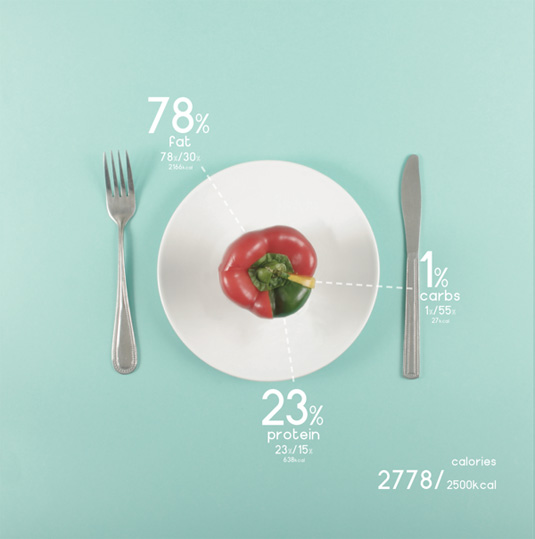
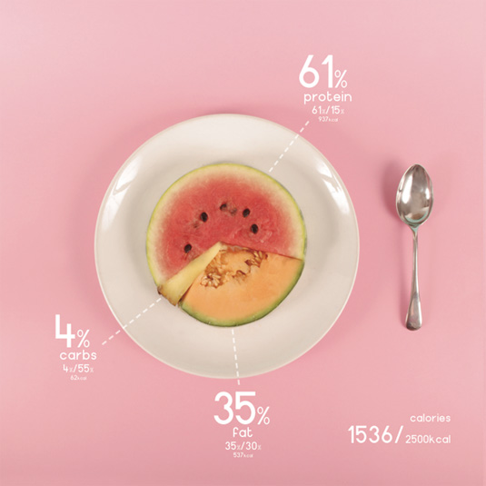
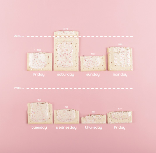
See more food charts over on Ryan's website.
Article continues belowLike this? Read these!
- Free Photoshop actions to create stunning effects
- Create a perfect mood board with these pro tips
- The best Photoshop plugins
Have you seen an inspiring photography series? Let us know in the comments box below!
Sign up to Creative Bloq's daily newsletter, which brings you the latest news and inspiration from the worlds of art, design and technology.

The Creative Bloq team is made up of a group of art and design enthusiasts, and has changed and evolved since Creative Bloq began back in 2012. The current website team consists of eight full-time members of staff: Editor Georgia Coggan, Deputy Editor Rosie Hilder, Ecommerce Editor Beren Neale, Senior News Editor Daniel Piper, Editor, Digital Art and 3D Ian Dean, Tech Reviews Editor Erlingur Einarsson, Ecommerce Writer Beth Nicholls and Staff Writer Natalie Fear, as well as a roster of freelancers from around the world. The ImagineFX magazine team also pitch in, ensuring that content from leading digital art publication ImagineFX is represented on Creative Bloq.
