7 ways to make your brochure design stand out
As brochure printing becomes ever more complex, both in terms of technology and creativity, we examine ways to think outside the box and come up with something truly unique.
The majority of brochures are only 20 or 30 pages long at most. And once you’ve designed an eye-catching front cover, sorted out your typography and layout, included some great images and compelling copy, one brochure is much like another, right?
Wrong.
From large corporates to individual creatives, everyone is trying to think outside the box these days and brochure printing is becoming ever more complex in an attempt to keep up with new design ideas and technical requirements.
Article continues belowSo how can you make your brochure designs have that je ne sais quoi, that little bit of something extra that makes them stand out from the crowd and starts people talking? One way to make a difference is through the physicality of the brochure itself. Whether it’s by using especially large or very tiny paper, by utilizing unusual folding techniques or by including something your audience isn’t expecting, doing something unusual can not only be great fun to design, but be fresh and stimulating to your readers, and that’s got to be good news.
Here are a few ideas to get your creative juices flowing:
01. Corporate folder with loose-leaf inserts
A corporate folder with loose-leaf inserts can look stylish and incorporate all manner of optional extras (CDs, DVDs, postcards, fact-files, business cards etc.), making it ideal when you want to add something extra to your brochure.
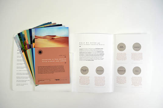
The most useful thing about this approach is that you can customise your brochure according to an individual client, only sending them the elements that are relevant to them.
As well as giving your customer exactly what they need, the loose inserts will ensure that you make cost savings on brochure printing and be more environmentally friendly.
Sign up to Creative Bloq's daily newsletter, which brings you the latest news and inspiration from the worlds of art, design and technology.
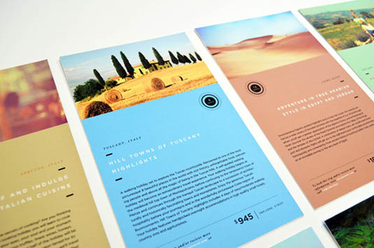
It’s also easy to extend your marketing with this design, since you can send your clients updated or new inserts to add to their brochure. This not only encourages your customers to keep the folder, but also ensures that they look back at it from time to time and allows you to maintain contact with them.
02. Folded paper/origami
Folding paper is a cost-effective and memorable way to connect with your readers, and a surprising amount of information can be contained within a relatively small space.


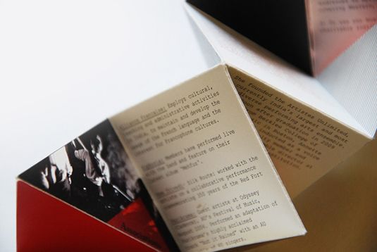
Just be careful when to use this approach, since brochures which don’t lie flat can be more difficult for your clients to keep and refer back to.
03. Tabs
Something as simple as adding tabs to your brochure can have an immediate effect in terms of usability and navigation. And combining tabs with a strong, confident use of colour and striking typography means that it can look good too.

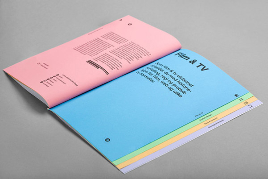
The example above was created by Oslo-based design studio Heydays, for Westerdale School of Communication.
04. Cut-cuts/Die-cuts
Die-cutting can lend some visual interest to a brochure, and when used in conjunction with careful layout design, can be very effective and even add to the message of the brochure itself.
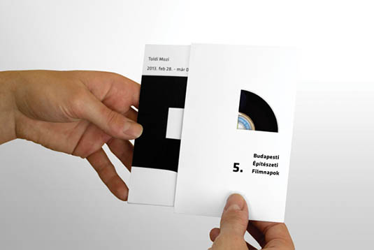
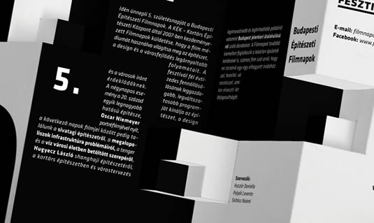
The technique is typically used on front covers, but with a bit of creativity, can be applied anywhere within the body of the brochure too, as shown here.
05. Unusual shapes
There are a whole lot of reasons why most brochures are square or rectangular, from layout issues and printing techniques through to packaging and even psychological considerations. But now and again it’s nice to break out of the box. Or out of the square, so to speak.
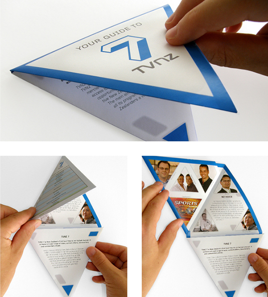
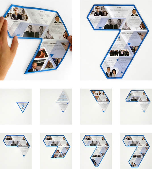
Not only can an unusually shaped brochure create a talking point, but in some cases it can contribute to the marketing potential and brand awareness of the piece, as shown above.
06. Binding
Choosing an unusual binding method for your brochure can create a strong first impression. Since the majority of brochures are saddle-stitched (or perfect bound, if they are longer), almost anything else can catch your readers’ attention.
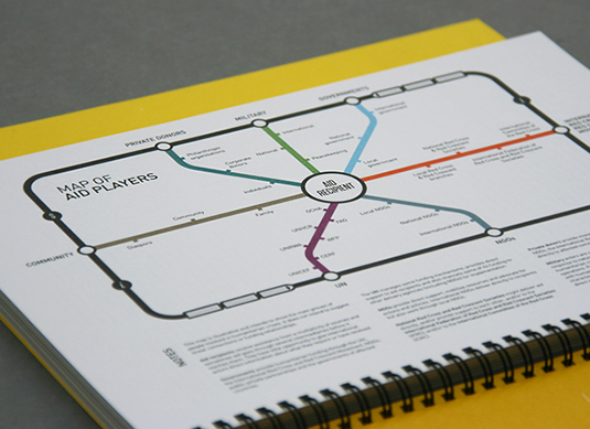
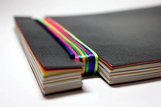
So spiral-bound or your choice of binding will, of course, affect your brochure printing costs, but unusual bindings needn’t be expensive. From threading or sewing, through to using an unusual clip or pin, it doesn’t have to be pricey or complicated to be effective.
When combined with bright yellow, this spiral-bound brochure design from Hype & Slippers gave GHA a solid branding sense and allowed their information to shine through.
07. Keeping it real
Always make sure that the choices you make about the physical look and feel of your brochure tie in with the company’s branding, style and the message they want to give. So if you’re designing for a top-end luxury restaurant, it’s unlikely that a graffiti-style die-cut front cover is going to fit the bill, no matter how cool it looks. You get the picture.
Of course, there’s a fine line to draw between brilliant idea and short-lived gimmick, and you don’t want your crazy structural idea to overshadow the brochure itself. As with all good design, it’s important to keep your eye on the big picture. The purpose of a brochure is to inform the reader, so if your design is so wacky that your reader misses the crucial information, it hasn’t worked.
One final consideration is the important fact that brochures need to be read, so make sure that your brochure is large enough to be legible and not so complicated that it’s difficult to open, close or navigate. As the designer, you should do the hard work so that the reader doesn’t have to.
The world of brochure design and brochure printing has moved on considerably in recent years and despite the multitude of great designs out there, there’s always room for one more. Whether you want to use pop-ups, mix different sizes or textures of paper, or go crazy with lamination or embossing, there’s always something new to try. So go on, what are you waiting for? Get designing!
Words: Simon Tilbrook
Simon Tilbrook is the owner of Swallowtail Print, a premium brochure printing and design firm focused on delivering maximum value to their clients. Further bio on Simon can be found here.
Liked this? Read these!
- Free graffiti font selection
- Illustrator tutorials: amazing ideas to try today!
- Free Photoshop actions to create stunning effects
- The ultimate logo design guide
Have you seen a great example of brochure printing and design? Let us know in the comments below!

The Creative Bloq team is made up of a group of art and design enthusiasts, and has changed and evolved since Creative Bloq began back in 2012. The current website team consists of eight full-time members of staff: Editor Georgia Coggan, Deputy Editor Rosie Hilder, Ecommerce Editor Beren Neale, Senior News Editor Daniel Piper, Editor, Digital Art and 3D Ian Dean, Tech Reviews Editor Erlingur Einarsson, Ecommerce Writer Beth Nicholls and Staff Writer Natalie Fear, as well as a roster of freelancers from around the world. The ImagineFX magazine team also pitch in, ensuring that content from leading digital art publication ImagineFX is represented on Creative Bloq.
