10 brilliantly responsive email newsletters
Mat Hayward of Nottingham agency Tribe selects 10 brands whose email newsletters adapt perfectly to different screen sizes.
Sign up to Creative Bloq's daily newsletter, which brings you the latest news and inspiration from the worlds of art, design and technology.
You are now subscribed
Your newsletter sign-up was successful
Want to add more newsletters?
While responsive web design has taken off over the last year or so, responsive email design has been somewhat left behind. But, if you want your email to be read, surely it needs to be readable.
There are some brands that have already realised the benefit of making life easier for their customers. Here are 10 examples to inspire your own efforts...
- Find out how to build a responsive email by following this tutorial, and read all our responsive web design articles here
01. MailChimp
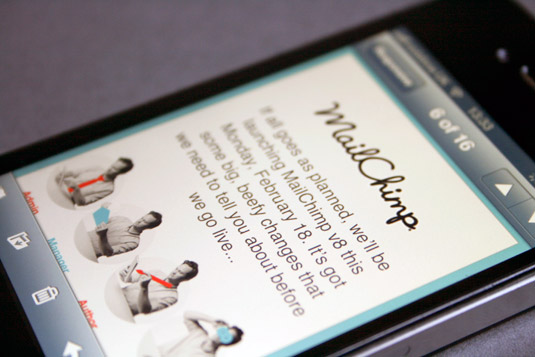
As you'd expect from an email marketing service that sends over 4billion emails a month, Mailchimp's emails are just as readable on the way to work as they are sat at your desk. The cleverest part of this email is its simplicity. The design barely changes between devices, with only the social links altering their layout for smaller screens.
Article continues below02. Toms
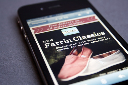
Shoe store Toms' approach to mobile email design is to remove the header and footer sections, ensuring the primary message is visible instantly. It also uploads different images on mobile, presumably smaller in filesize for a quicker load time, but also with larger calls to action and shortened copy for a speedier conversion.
03. Smashing Magazine
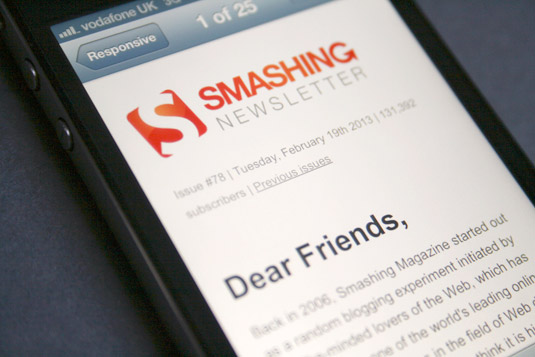
Web design blog Smashing Magazine's newsletter features a simple, text-heavy design, with just one full-width image for each article. This saves time building in mobile-responsiveness because the layout scales down automatically and is still readable and fully useable without the need for zooming in.
04. Moo.com
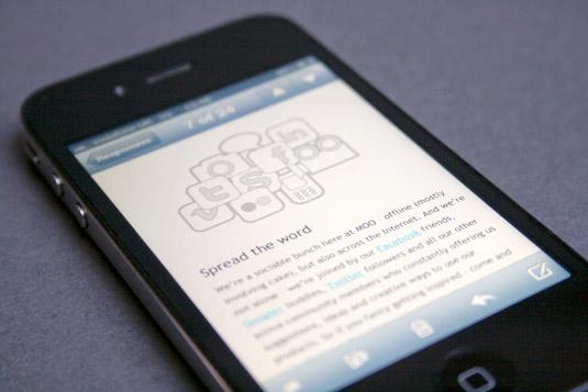
The MOOsLetter provides readers with special offers, tips and creative ideas relating to Moo's printing services. On a smartphone, the secondary articles within the email change from a double to single-column layout, allowing the text-size to enlarge, and all calls to action are stretched to fill the width of the screen.
05. Twitter
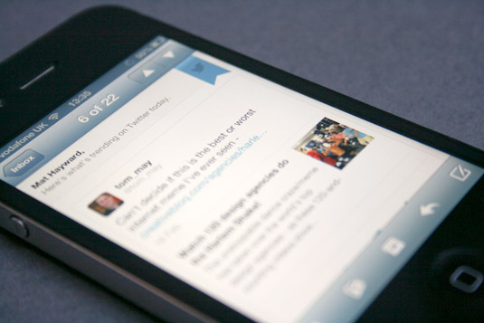
Twitter's responsive email has won lots of praise throughout the industry, and rightly so. Simplifying the header, increasing the space between reply, retweet and favourite actions and enlarging the final call to action makes this email much easier to navigate with your thumb. But why did they move the position of the Twitter flag? Form or function?
Sign up to Creative Bloq's daily newsletter, which brings you the latest news and inspiration from the worlds of art, design and technology.
06. Gilt

Gilt runs time-limited sales on designer labels at huge discounts and to do this it needs its users to be able to move quickly through the process from receiving an email to making a purchase. Removing the list of links on the left-hand side and reducing the size of the main navigation for smaller screens means the recipient can quickly find what might interest them and join in the sale.
07. Rdio
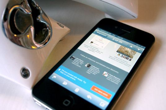
Rdio emails don't follow the usual design convention of a fixed 600px width. Instead their emails are fluid with a minimum width, so when viewed on a mobile, the content shown in columns simply shows in narrower columns. Usually this wouldn't work very well, but with the amount of content being small, the layout still remains intact and readable.
08. Size?
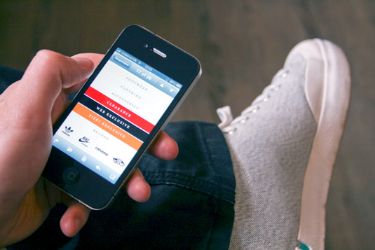
Emails from question mark-toting clothing store Size? already look simple enough for mobile use thanks to the use of large images and click-throughs. But that hasn't stopped the company from investing some time making the mobile experience that little bit better. The number of links at the top and the bottom of the email are reduced, showing only the most important ones, and any buttons are stretched to fill the width of the email, making them easier to press.
09. Mr Porter
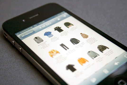
This email from clothes shopping site Mr Porter does not appear to be responsive or optimised for mobile, but because of its design that's not necessarily a problem. Large hero images and buttons in the top section are pretty standard for most email designs, but 28 items of clothing or accessories after that would usually be a bit much for a tiny smartphone screen. Not here. Mr Porter add short and sweet descriptions to isolated images which are perfect for fingertip pressing.
10. Tribe Latest
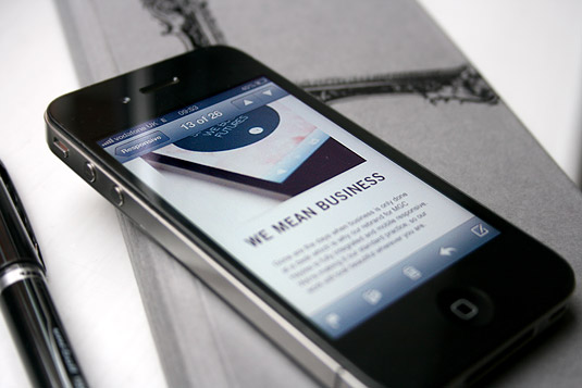
This might seem like a shameless plug for my own agency, Tribe, and it probably is - but we've also built our own responsive email, which alters from a variable two- and three-column layout on desktop machines to a single column layout, with larger text, on mobile using media queries. It's easy to read and links are large enough to press with a thumb or finger without having to zoom in.
Words: Mat Hayward
Mat is a digital developer and designer who lives in Nottingham and works for brand communication agency Tribe.
Liked this? Read these!
- 10 brilliantly responsive ecommerce sites
- How to build an app
- Download the best free fonts
- Brilliant Wordpress tutorial selection
Have you seen a great example of an email newsletter design? Let us know about it in the comments!

The Creative Bloq team is made up of a group of art and design enthusiasts, and has changed and evolved since Creative Bloq began back in 2012. The current website team consists of eight full-time members of staff: Editor Georgia Coggan, Deputy Editor Rosie Hilder, Ecommerce Editor Beren Neale, Senior News Editor Daniel Piper, Editor, Digital Art and 3D Ian Dean, Tech Reviews Editor Erlingur Einarsson, Ecommerce Writer Beth Nicholls and Staff Writer Natalie Fear, as well as a roster of freelancers from around the world. The ImagineFX magazine team also pitch in, ensuring that content from leading digital art publication ImagineFX is represented on Creative Bloq.
