18 brilliantly responsive ecommerce sites
Responsive web design offers huge opportunities to boost sales on ecommerce sites. Here are 18 websites that have grasped that opportunity.
Sign up to Creative Bloq's daily newsletter, which brings you the latest news and inspiration from the worlds of art, design and technology.
You are now subscribed
Your newsletter sign-up was successful
Want to add more newsletters?
Mobile use of the internet is exploding and it's expected to overtake desktop access by 2014. The disparate screen sizes and range of devices available is overwhelming, but it’s a challenge online retailers need to address.
Put simply, most of their customers will soon be purchasing goods from either a mobile or tablet device. Given the rapid growth of mobile in developing countries such as China, those who are agile may even be able to tap into new and very lucrative markets.
Design once, sell everywhere
While many larger retailers have introduced native apps to complement their website, this option is not usually feasible for smaller retailers. So the emergence of responsive web design - in which sites conform to the individual requirements of the device they are being viewed on - offers the perfect solution.
Article continues belowA lot of ecommerce sites suffer from unnecessary bloat and a responsive approach requires designers and retailers to trim the fat. This means better considering information architecture, streamlining checkout processes and optimising written and visual content for mobile.
Given the advantages of this approach, it's surprising that great examples of responsive ecommerce websites are few and far between. We've scoured the web though to seek out the very best. We hope they encourage you to utilise responsive web design for your next ecommerce project...
01. 8 Faces
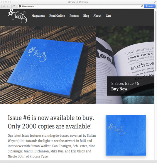
The online home of typography magazine 8 Faces was recently relaunched, with a new design courtesy of the team at Paravel Inc and Elliot Jay Stocks of Viewport Industries.
Featuring big images and even bigger typography, this ecommerce website is fully responsive and allows readers to buy the magazine, prints and back issue PDFs. We love the clever use of the jQuery Kinetic plugin to let visitors pan across the large hero image.
Sign up to Creative Bloq's daily newsletter, which brings you the latest news and inspiration from the worlds of art, design and technology.
02. Currys
Asked what we should include on our list, James Young, creative director at Offroadcode, put in a good word for UK retailer Currys. "It may not have what we consider to be the level of design a lot of agency and personal sites have, but it's the first truly large-scale ecommerce site I've seen to embrace responsive design," he says.
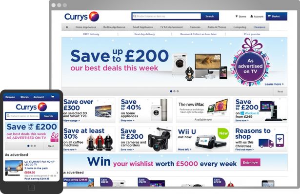
"It provides a good experience on a range of devices while dealing with a massive amount of content and products of all shapes and sizes, and includes an easy-to-use buying process – all within a single codebase that's clearly been well considered by the Currys web team."
03. Kershaw knives

Kershaw has been designing and manufacturing high-quality and affordable knives since 1974. With his team and Kershaw, designer/frontend developer Jordan Sowers created an ecommerce site with a clean aesthetic to showcase the products. "Learning how to present and organise the vast amount of information associated with an ecommerce site, while also being flexible, made us realise so much of responsive design is about good timing," says Sowers.
The product range benefit from the well-executed filtering system on the catalogue page. The list of filters is displayed across multiple columns on large viewports making the best use of the space. The filters translate to smaller displays, folding down into a horizontal, scrollable list with off-canvas list items that can be scrolled into view.
04. SALT

SALT is a collaboration between two surfers, Tyler Wolff and Nabil Samadani, who decided to bring well-crafted surfboards to the thriving scene they found in New York City. The website is arresting, its homepage featuring beautiful full-canvas photography. Delving reveals an inspiring aesthetic of considered typography, a purposeful grid and seductive product shots.
The use of full-canvas photography has its cost: the homepage is a hefty 1.3MB. Responsive image techniques can be fiddly to work with, but would pay dividends here. However, the minimal aesthetic of the internal pages offsets this somewhat.
05. A Book Apart
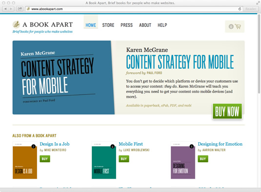
Whilst many ecommerce websites rely on large beautiful photography to sell their products A Book Apart instead use the block colour covers to vividly display their series of "brief books for people who make websites". This works especially well when displaying their entire collection of books, available as a bundle.
06. Hiut Denim
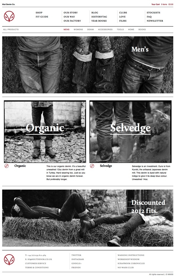
Designed by Stuart Hobday and developed by Jon Heslop, the site is fully responsive. Developed on the Shopify platform, it allows the team to publish more in-depth feature articles and for visitors to gain a greater insight into the inspirational fashion brand and the people behind the products.
07. Starbucks
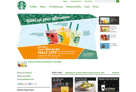
It's good to see that Starbucks has a responsive site. In terms of features, it has most things you would expect a modern coffeehouse to have: nice big videos on the homepage, along with news items listed vertically below.
The store locator is interesting, with the view taken up solely by a series of icons on mobile. It's pretty minimal - at times we had to think about what each icon represented - but it does the job, allowing for easy filtering for different coffee shop types, for instance. There seems to be a little too much similarity between some icons, too.
For core navigation, the mobile view condenses the header nicely, consolidating items into a single, now-almost-universal responsive menu icon, which shows and hides vertically when tapped. The richness of the menu items and their descriptions are maintained across the board, which is really good and feels sexier than most responsive menu degradations.
08. Kiwibank
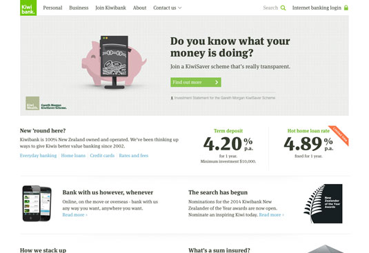
Banks aren’t the most likeable organisations, but we're developing a soft spot for Kiwibank, a New Zealand-based bank that competes against larger Australian-based rivals.
With mobile traffic pushing past 10 per cent, Kiwibank asked Springload to help them become device agnostic. Springload founder and director Bron Thomson says, "The fixed-width paradigm has run its course – last year we noticed that 20 people tried to join Kiwibank from their PlayStation 3."
The design rests heavily on good copy, beautifully typeset in Meta Serif. "Content is really important. We've banned Lorem Ipsum, and Kiwibank’s copywriting team work in our office a couple of days a week," says Thomson. Navigation on smaller screens is accessed via an 'off-canvas' menu that slides in from the right, similar to apps such as Facebook and Path.
09. Indochino
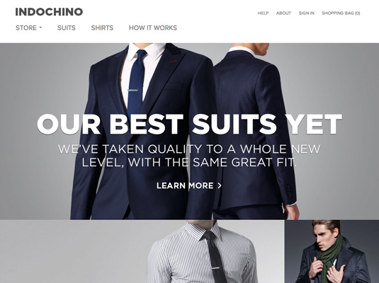
Indochino make high quality custom menswear and its responsive store features beautiful product photography combined with a minimal design aesthetic. While the whole site responds extremely well to various screen sizes, the way in which the product pages are handled is particularly worth noting.
10. Skinny Ties
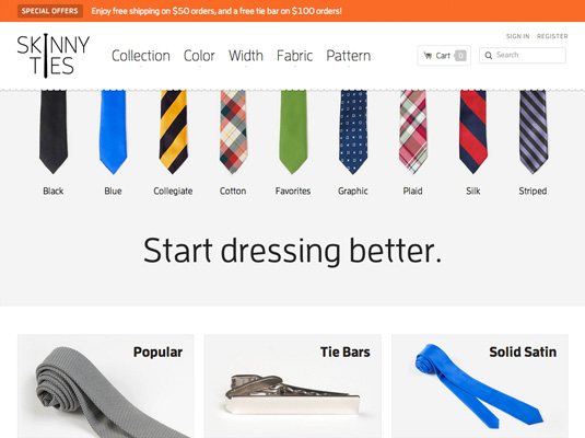
Skinny Ties is a niche online retailer that sells nothing but retro-style skinny ties and have been doing so since 1997. The layout of the site is carefully structured and complemented by the use of great product photography and concise and helpful information on the individual product pages. The site navigation also works seamlessly across a variety of screen sizes and allows users to quickly search for products via a variety of options, such as material and colour.
11. Stury
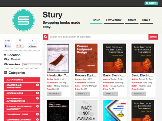
Stury is a site that allows people to swap books online. The way in which the vertical navigation and grid based layout condenses when viewed on smaller screens is particularly effective and a design pattern that would work well for many other sites.
12. Fit For A Frame
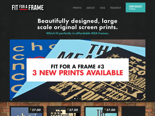
Fit For A Frame sells gorgeous prints created by talented designers and illustrators. Their online store features simple navigation and an equally simple layout, both of which condense beautifully for smaller screens. There are some interesting tricks on show here too, such as the way the prints on the brickwall background on the homepage switch to a vertical layout when viewed on a smaller screen.
13. United Pixel Workers
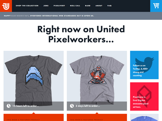
United Pixel Workers sells T-shirts and accessories created by the web design community and given the tech savvy nature of their customers, it's not surprising to see that their website is responsive. The site utilises a simple grid layout and large typography, which means it adjusts exceptionally well when viewed on smaller screens. The way in which the cart and menu buttons are arranged on narrower devices is particularly well thought out too.
14. Tattly
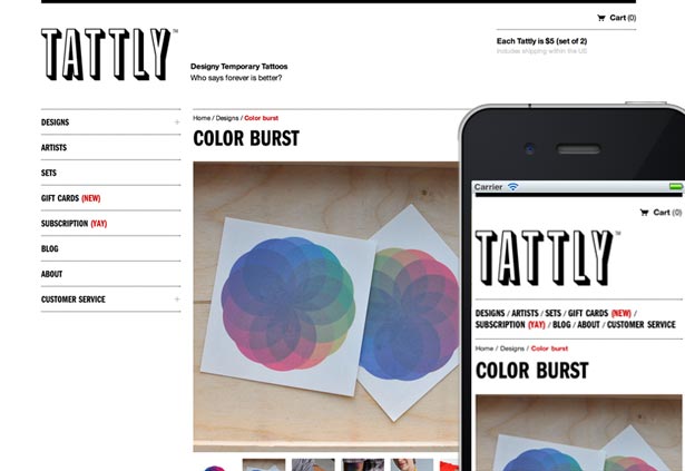
Tattly sell 'Designy Temporary Tattoos' created by leading designers and illustrators. Its online store utlises a simple grid structure throughout, which is complemented by a monochromatic colour palette, which prevents the UI from detracting from the products on show. The flexibility of the underlying grid means the layout resizes beautifully when the site is viewed on smaller screens.
15. Nixon
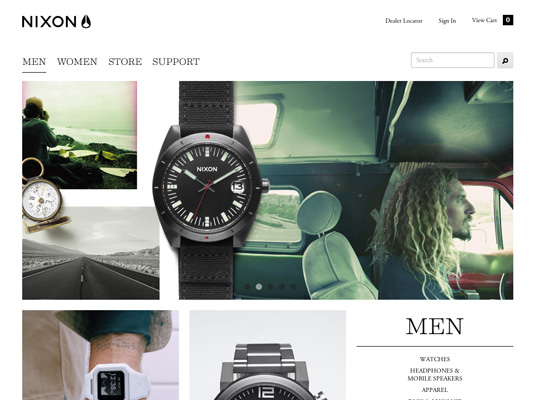
Nixon is one of the few established brands to have a responsive ecommerce store, and it’s exceptionally well done. It works so well due to the simple and minimalistic layout and like many other sites in this showcase, a grid structure is employed throughout. Nixon's great product and lifestyle images play a big part in pulling the design together. When viewed on a smaller screen the flyout navigation and checkout process works particularly well too.
16. Folksy
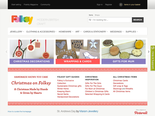
Folksy is an online platform for British designers and makers to sell their handmade wares online. While the layout is more complex than many of the others showcased here, the way in which it responds to the demands of various viewing environments is adeptly handled.
17. Five Simple Steps

Five Simple Steps is a small independent publisher of practical books for web design professionals. Its online store utilises a simple and minimal layout and interface that make it a delight to use.
18. SuitSupply

SuitSupply is an online mens fashion retailer whose responsive store design utilises a simple minimal layout combined with high quality product photography. The desktop site contains standard navigation and product filters, but interestingly they’ve chosen to either remove or simplify these elements when the site is viewed on smaller screens.
Words: Nathan Leigh Davis, Paul Lloyd, Jerome Ribot, Jordan Moore
Like this? Read these!
- Ecommerce web design: essential tips
- The most creative online contact pages
- Web design training: the top online resources
- Web design secrets to boost your skills!
Have you got a favourite ecommerce website? Tell us about it in the comments box!

The Creative Bloq team is made up of a group of art and design enthusiasts, and has changed and evolved since Creative Bloq began back in 2012. The current website team consists of eight full-time members of staff: Editor Georgia Coggan, Deputy Editor Rosie Hilder, Ecommerce Editor Beren Neale, Senior News Editor Daniel Piper, Editor, Digital Art and 3D Ian Dean, Tech Reviews Editor Erlingur Einarsson, Ecommerce Writer Beth Nicholls and Staff Writer Natalie Fear, as well as a roster of freelancers from around the world. The ImagineFX magazine team also pitch in, ensuring that content from leading digital art publication ImagineFX is represented on Creative Bloq.
