Get started with responsive web design
It's three years since the term 'responsive web design' was first coined - but what does it mean and how do you use it? Sam Hampton-Smith and Sush Kelly explain all in this essential guide for beginners.
Sign up to Creative Bloq's daily newsletter, which brings you the latest news and inspiration from the worlds of art, design and technology.
You are now subscribed
Your newsletter sign-up was successful
Want to add more newsletters?
Today marks the third anniversary of Ethan Marcotte's renowned article which coined the term 'responsive web design' and changed what web designers do forever.
Things have moved forward quickly since, both in the ways we deal with responsive design and the number of devices that now allow us to access the web. Finally, large companies like Starbucks and The Guardian are embracing the responsive ethos. Join the party as we explain how to get started.
We'll kick off by summarising the key concepts of responsive web design, so you'll be able to join in with all those RWD conversations down the pub with total confidence. We'll then go through the basic steps you need to start putting responsive web design into practice when you build websites.
Article continues below01. Key concepts
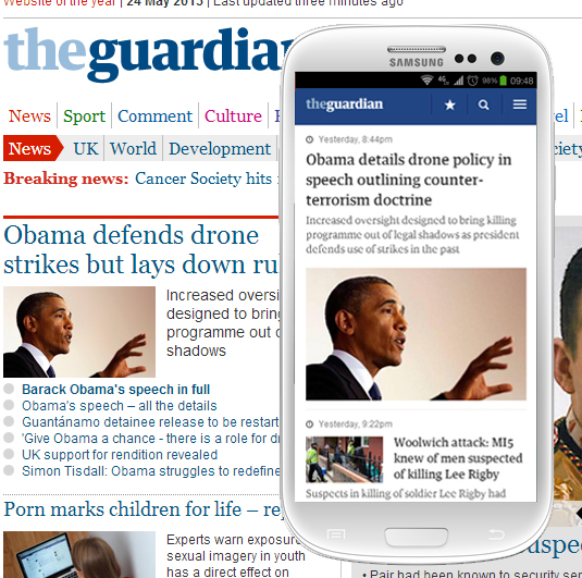
Responsive web design covers various techniques, both client and server side, that aim to make a website respond to the device it is viewed on. Despite what some people think, it ISN'T specifically a way of making a website change as you drag the browser window bigger or smaller (although as designers this is often the first thing we do when we see a new site). It's about a range of ways in which the website responds to different sized view ports and resolutions, in order to provide the best possible experience to the user, whatever device they're using.
In simple terms, responsive web design means you write one lot of code that means your website will adapt beautifully on every screen size, device and device orientation. For example, a three-column website layout on an iPad might become a two-column layout when the iPad is rotated, and a one-column width when viewed on a smartphone screen.
There are frameworks such as Bootstrap or Foundation that can help you develop responsive sites, but it is important to try and understand the basics before diving into frameworks.
The three main methods used are:
Sign up to Creative Bloq's daily newsletter, which brings you the latest news and inspiration from the worlds of art, design and technology.
- Media queries
- Fluid layouts and ems
- Device/browser detection to add performance to your site and reduce bloat
02. Where it all began
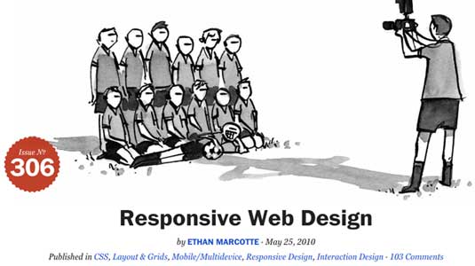
Ethan Marcotte wrote his A List Apart article in May 2010, describing and formalising an approach to website design that allows web page content to reformat to suit the device being used to view it.
The term 'responsive web design' was coined by Marcotte in homage to Responsive Architecture, an architectural movement that aimed to make buildings responsive to different users of a space.
In a similar manner, responsive web design aims to make a web page responsive to the device a user is browsing on - whether that's an Xbox, a desktop computer, an iPad or smartphone.
03. Why it's necessary
In the past web designers and developers have often created specialist, targeted websites aimed at particular classes of device. This meant that, for example, you might have a mobile version of your website served from mobile.yourdomain.com, and a separate desktop-orientated version at 'www.yourdomain.com'.
Aside from the issue of maintaining two different designs (and potentially having to maintain two separate sets of content), this approach requires a lot of duplication of effort. In addition, Ethan points out that it’s easy to fall in to the trap of creating device-class-specific sites each time a new device comes along, so you start with an iPhone site, then add an iPad site, a Google Nexus site, and very quickly you find you’re creating many different versions of essentially the same website.
04. Why it saves you time
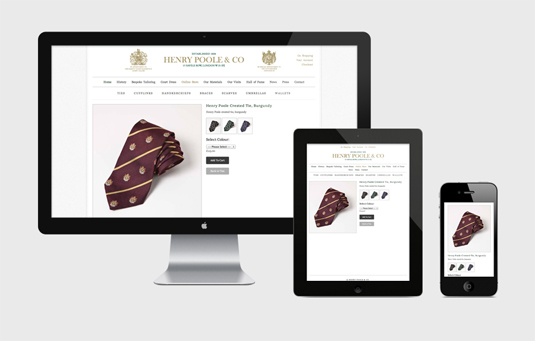
Responsive web design allows you to use the same basic HTML and simply style the content differently according to the characteristics of the device being used to access it. This allows you to generate your structure once, saving a lot of duplication of content and effort.
It also allows you to future-proof your design to a degree, making your content display in a flexible manner that isn’t tied to one specific screen resolution or orientation.
This is about more than simply making your designs flexible-width; it’s about considering legibility and accessibility of content, the overall layout characteristics, and what to show and hide.
05. How to make a website responsive
It's likely you're already familiar with the concepts of fixed-width and fluid-width websites. The former prescribes the size at which a website’s content is rendered (960 pixels wide being a common choice), while the latter allows the width of a site to expand or contract with the size of the window being used to view it.
Designers often confuse responsive web design with fluid-width layout. The two are not synonymous at all; it's perfectly possible to use fixed-width layouts with responsive web design, and just because a website uses a fluid-width layout, it doesn't make it responsive.
Media queries
The first step in making your design responsive is to make it adapt to the device being used to view the website. The primary characteristic that differs between devices, at least in terms of the way we interact with a website, is the screen resolution. In simple terms, smartphones typically have a lower resolution than a desktop computer (high-dpi smartphones pretend to have a lower resolution to retain compatibility).
We can use @media queries, part of the CSS3 specification, to help us target devices based on their physical characteristics, including the resolution they render at. These allow us to use a statement such as
<link rel="stylesheet" type="text/css" href= "smartphone.css" media="screen and (max-device-width: 480px)" />
to load a stylesheet that will only be applied to devices with a maximum horizontal resolution of 480px.
Different properties
You aren’t limited to the device width condition: there are many different properties you can test against using @media queries, including the device orientation, height, aspect ratio and resolution (expressed in dpi or dpcm).
As well as using @media queries in your <link /> tags, you can also use them directly in a stylesheet to conditionally apply styles to the document based on the same criteria. This works in exactly the same way:
@media screen and (max-device-width: 640px) and (orientation:portrait) {
/* Rules inside the @media condition only apply if the condition is met */
#mydiv {
display: inline-block;
}
}
06. Next steps

Now you know how to set up @media queries, you need to consider how a desktop layout might be adapted to work more successfully on a smartphone.
For example, if you have a three column layout defined in your desktop-orientated styles, it might be more appropriate to repaginate these columns to become a single column for a smartphone device
HTML:
<div class="col1">
<p>Etiam porta sem malesuada magna mollis euismod. Cras justo odio, dapibus ac facilisis in, egestas eget quam. Fusce dapibus, tellus ac cursus commodo, tortor mauris condimentum nibh, ut fermentum massa justo sit amet risus. Fusce dapibus, tellus ac cursus commodo, tortor mauris condimentum nibh, ut fermentum massa justo sit amet risus. Aenean lacinia bibendum nulla sed consectetur. Vivamus sagittis lacus vel augue laoreet rutrum faucibus dolor auctor.</p>
</div>
<div class="col2">
<p>Sed posuere consectetur est at lobortis. Curabitur blandit tempus porttitor. Morbi leo risus, porta ac consectetur ac, vestibulum at eros. Donec ullamcorper nulla non metus auctor fringilla. Aenean eu leo quam. Pellentesque ornare sem lacinia quam venenatis vestibulum. Curabitur blandit tempus porttitor. Nulla vitae elit libero, a pharetra augue.</p>
</div>
<div class="col3">
<p>Praesent commodo cursus magna, vel scelerisque nisl consectetur et. Donec sed odio dui. Maecenas sed diam eget risus varius blandit sit amet non magna. Vestibulum id ligula porta felis euismod semper. Vestibulum id ligula porta felis euismod semper.</p>
</div>
CSS:
@media (min-device-width: 641px) {
/* target devices with desktop sized resolution */
.col1, .col2, .col3 {
/* Float the columns to create a three-column layout */
padding: 2em;
width: 30%;
margin-right: 1em;
float: left;
}
}
@media (max-device-width: 640px) {
/* target devices with smartphone sized resolution */
.col1, .col2, .col3 {
/* Float the columns to create a three-column layout */
position: relative;
padding: 2em;
width: 90%;
float: none;
display: block;
margin-right: 0;
}
}
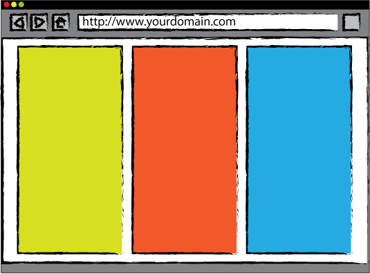

As you can see from the sketched rendering above, when the device used to access this page has a horizontal width of 640px or less, the second set of rules are used to render the content stacked one above the next.
On larger resolution screens, the columns are shown side-by-side instead. This is a good example of using @media queries to tailor the display of content to suit the device - responsive web design!
Layout and images
So far we've looked at re-paginating your content to make it adapt to the device being used, but there's a lot more you can do besides. The two primary techniques associated with RWD are the use of a fluid-grid layout, and fluid-images.
07. The Fluid Grid
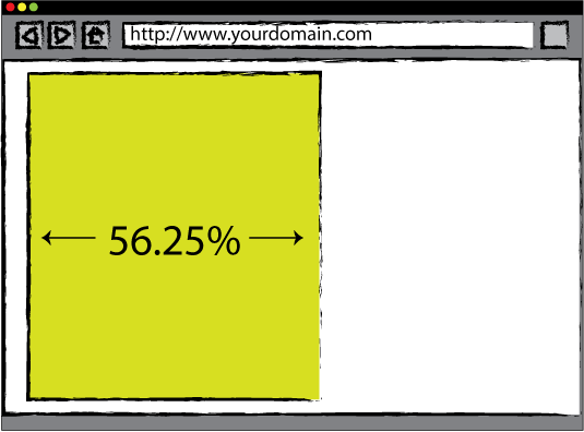
The fluid-grid layout approach allows you to define a layout grid, and prescribe the maximum width you'd like the grid to extend to, while allowing it to resize to fit a smaller-sized window, keeping everything in proportion and crucially retaining the underlying grid layout. This is easier to achieve than you might think!
If a design uses a 960px grid, and we want to adopt a fluid grid instead, we need to transpose those 960px into a relative measurement, while ensuring the page is never shown wider than the equivalent of 960px.
Do the math
If we assume the default font size of most web browsers is 16px (and it broadly is), we can calculate 960px as a number of ems by simply dividing the width by the size of 1em, which in this case is 16px:
960px / 16px = 60em
Thus we can set our container to have a maximum width of 60em, avoiding the need to explicitly set a width value:
#container {
position: relative;
max-width: 60em;
margin: auto;
}
Percentages
Now our container will resize with a window, while never growing bigger than the equivalent of 960px. Elements within your design can be calculated as percentages of their container from this point in, so if you have a 540px column, this would be calculated as 540/960 = 0.5625, or 56.25%:
#content {
float: left;
width: 56.25%;
}
Now the column will also resize with the container, making it responsive!
(Note: there are Ems calculators out there to help you with these calculations if needed.)
08. Fluid images
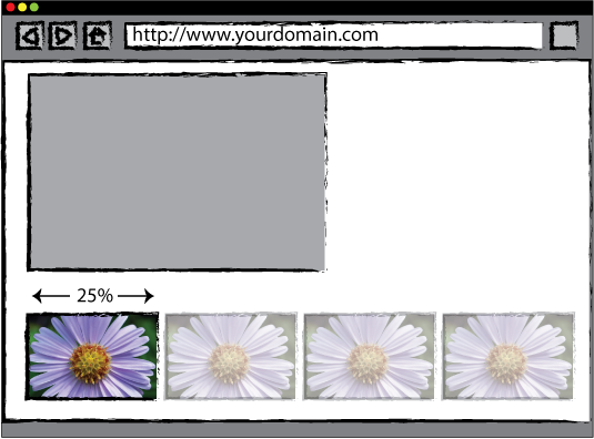
Fluid images are images that also respond to the width of the container. This is even easier to achieve. By adding a simple set of rules to images to prevent them ever being sized bigger than their native resolution, we can set their width using CSS as a percentage, just as we did for the column in the fluid grid:
img {
max-width: 100%;
width: 25%;
}
In taking this approach, we're allowing the browser to resize the image to fit within the grid, while never exceeding the size it was saved at. This makes images adapt to the screen size being used to view a website, and thus they're responsive!
09. Site performance
Once you have these methods down you can start to look at images, video and the performance of your site. After all, it's no good using media queries to make a site look great on an iPhone when the page ends up being 3MB and taking an age to download!
In other words, responsive web design is not just about what your website looks like on different devices. It's also about matching the size of assets, etc, to the device/browser's capability.
British newspaper The Guardian is flying the flag here and Matt Andrews recently did a talk at Port80 events explaining the processes they use. This is well worth reading - although note that this a way down range if you're just starting out experimenting with responsive web design.
10. An evolving discipline

Beyond Marcotte's original article, there is currently no specific best practice or set of agreed rules as to what constitutes a responsive design. Instead websites sit on a spectrum between 'responsive design' and 'fixed design', with the phrase 'adaptive design' often used to refer to a site that has some responsive elements and therefore sits somewhere in the middle.
Furthermore, the discipline of responsive web design is constantly evolving so you really need to embrace the subject and read (and follow) other designers and developers to stay ahead of the curve and hone your responsive skills.
This can all seem a bit overwhelming especially if you are new to web design in general. But you can break down the various methodologies so that you can still add value to your site whilst getting your head around the basics.
Conclusion
Responsive web design isn't complicated, and it's pretty quick to apply to an existing design. There are more steps you can take, but the three principal concepts are:
- use @media queries to re-paginate your content to suit the device being used to view it
- use a fluid grid to allow your content to react to smaller (and larger) browser windows
- use fluid images to ensure your images also react to the browser window width
Put simply, the best way to get started with responsive web design is to just go for it. People can get precious about 'proper' responsive design, but essentially anything you do to your website or future designs to make them more responsive is a good thing.
Responsive sites are increasingly becoming the norm, so getting to grips with it now will really help you in your current and future web creations.
Words and images: Sam Hampton-Smith and Sush Kelly
Sam Hampton-Smith is a freelance author, graphic and web designer
based in Inverness, Scotland.
Sush Kelly is a senior interactive designer at Imaginate Creative Ltd, a creative agency in Leamington Spa, UK. He also blogs at www.sushkelly.co.uk
Liked this? Read these!
- Brilliant Wordpress tutorial selection
- The best 3D movies of 2013
- Discover what's next for Augmented Reality
Do you use a responsive web design approach? Let us know your top tips in the comments below!

The Creative Bloq team is made up of a group of art and design enthusiasts, and has changed and evolved since Creative Bloq began back in 2012. The current website team consists of eight full-time members of staff: Editor Georgia Coggan, Deputy Editor Rosie Hilder, Ecommerce Editor Beren Neale, Senior News Editor Daniel Piper, Editor, Digital Art and 3D Ian Dean, Tech Reviews Editor Erlingur Einarsson, Ecommerce Writer Beth Nicholls and Staff Writer Natalie Fear, as well as a roster of freelancers from around the world. The ImagineFX magazine team also pitch in, ensuring that content from leading digital art publication ImagineFX is represented on Creative Bloq.
