Our Verdict
A significant editorial re-think and crisp design adjustments keep PORT ahead of the game.
For
- Future-friendly cover choice
- Spectacular new font
- Superb value for money
Against
- Can we go back to a quarterly?
Why you can trust Creative Bloq
When it launched seven years ago, Port’s proud subtitle – The Intelligent Magazine For Men – seemed a reasonable qualifier. In the trashy, dying days of Loaded and Maxim, the qualification made sense. But arriving in a #metoo culture wary of tainted male celebrity, the (assumed) gender exclusivity of PORT and indeed the very notion of a ‘men’s magazine’ seems more problematic.
Just what exactly is a men’s magazine? Port's smart new look can’t conceal an underlying editorial anxiety about its own identity.
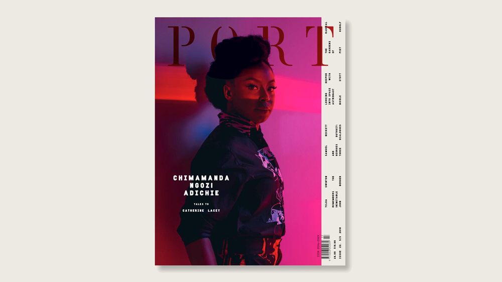
A frank editorial by founding editor Dan Crowe admits that it’s “time to make some changes around here", the theme of the new issue – freedom – firmly establishing Port's commitment to inclusivity. And the new cover does show the magazine breaking with the past.
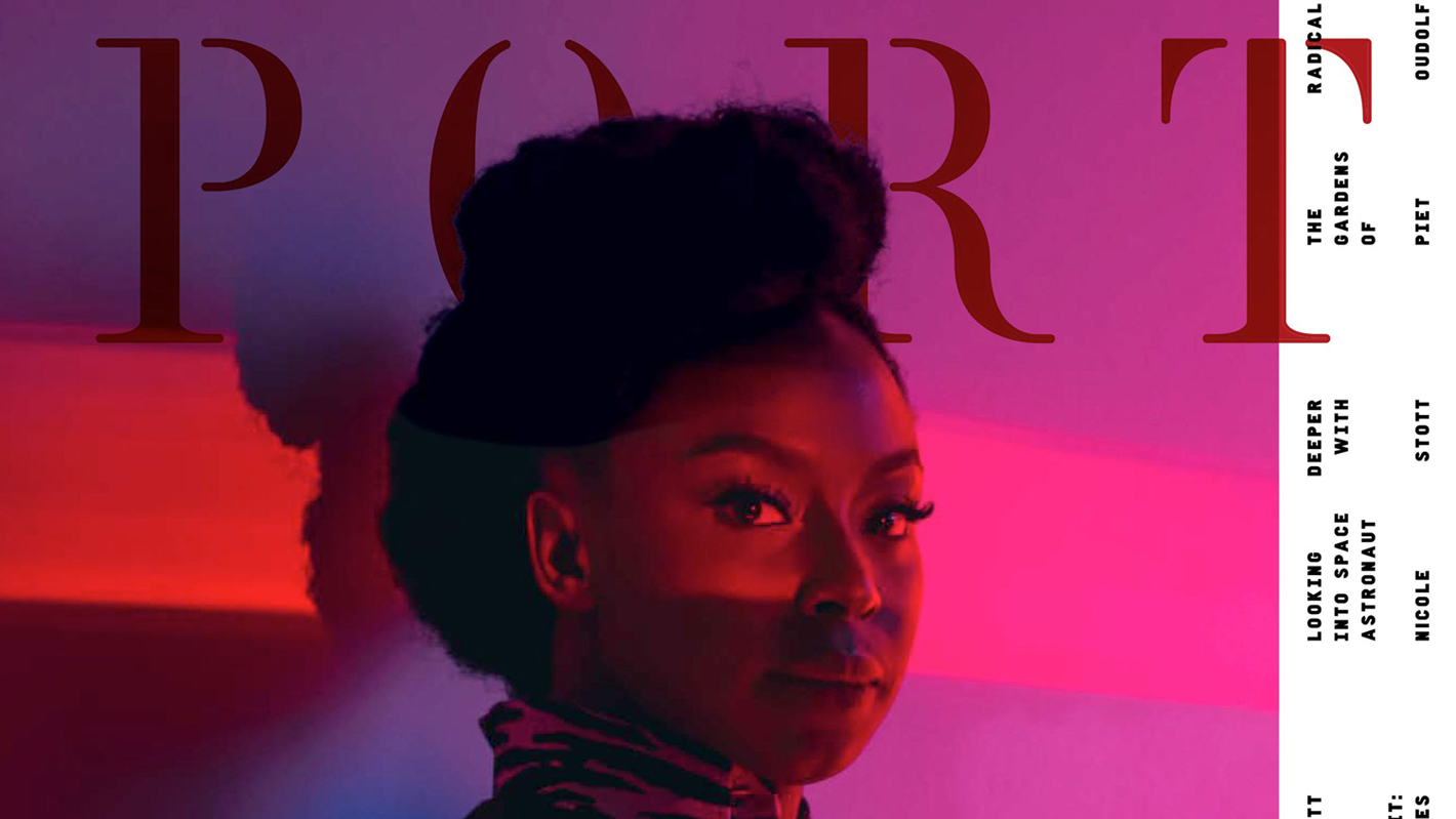
Its famously moody, mostly monochromatic covers of iconic men had increasingly teetered on the edge of Pour Homme parody, and despite a touch of revisionist self-indulgence when Crowe asks of himself “Do we always have to have a man on the cover? Who came up with that rule?” (er, you Dan?) issue 22 wisely sidesteps the issue of who’s toxic and who’s not, opting instead for a stunning photograph of novelist Chimamanda Ngozi Adichie.
Port's smart new look can’t conceal an underlying editorial anxiety about its own identity
It’s a beautiful cover. Woozy, narcotic, electric typography and, crucially, nothing to indicate Port's origins as a ‘Gentleman’s’ magazine. In fact the cover seems to suggest that maybe what interests men now is what women have to say about the world rather than traditional PORT-royalty like Daniel Day Lewis or (Mr) Steve Buscemi.
Adichie is only the second female cover star for PORT. Hollywood actress Juno Calypso shared a split-run cover with Ethan Hawke but that nod towards sexual equality might have been more convincing if Calypso hadn’t been naked in a bath for her cover whilst Hawke brooded full-clothed in a Dior Homme suit.
But that was then and this is now.
Sign up to Creative Bloq's daily newsletter, which brings you the latest news and inspiration from the worlds of art, design and technology.
Making Adichie – the Beyonce-sampled, award-winning writer and polemicist – the cover and centrepiece of the magazine clearly demonstrates Ports new willingness to adapt, and the interview allows Port to silently endorse and adopt Adichie’s liberal, all-inclusive manifesto as its own.
A welcome shift
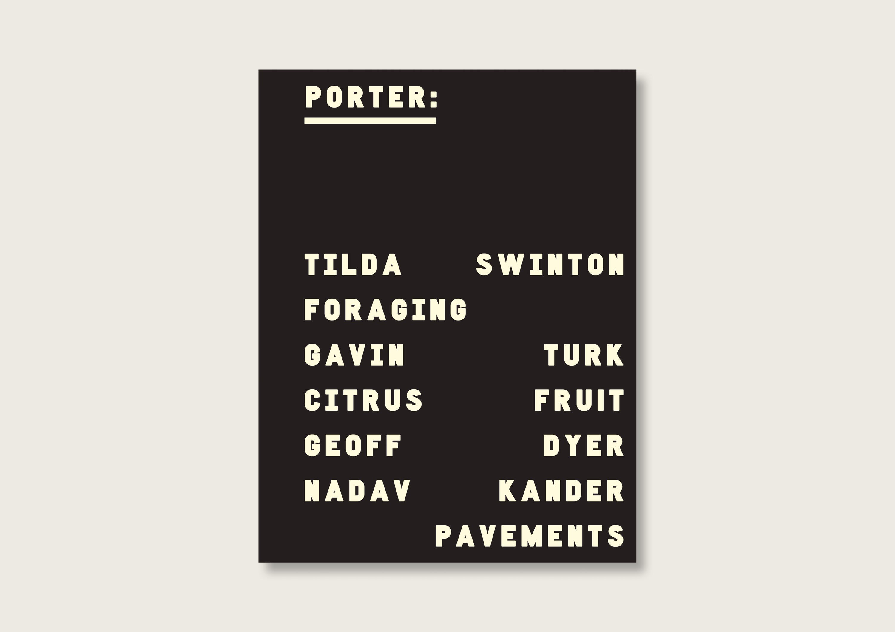
Apart from the welcome shift in tone, Port's cultural aspirations remain reassuringly high. The opening section – The Porter – is as erudite as ever, and any reader looking for sound bytes on the latest Manic Street Preachers album or a snappy appraisal of the latest Marvel movie may be disappointed to discover instead Tilda Swinton on writer John Berger, Geoff Dyer on photographer Garry Winogrand and an all-too-brief peek inside the studio of artist Gavin Turk.
The more old-fashioned diversions into traditional male tropes, such as a love letter to Havana cigars – “an hour of precious time that completely takes over your senses...” – are, thankfully, few and far between.
In the Details section, Port (maybe) pays its dues to its heavyweight advertisers in a lovingly-lit showcase of consumer porn. Canali sunglasses sit next to Bulgari watches and Prada clutch bags, with nothing as vulgar as a price anywhere to be seen. If you have to ask, etc. And the high-brow summit of the issue is a trio of 1949 conversations between Samuel Beckett’s and Georges Duthuti. It’s jarring, to say the least, to confront the lord of literary doom and gloom after 34 pages of glossy ads for the likes of Giorgio Armani, Prada and Louis Vuitton, but such are the culturally muddled times we live in, and all credit to Port for holding fast to its high-minded values and bringing in the ad revenue.
The rest of the magazine is just as good and impressively varied. Whilst many indie mags have burrowed ever deeper into their respective niches, PORT has become even more wide-eyed and ambitious, moving effortlessly between glossy, non-sensical fashion shoots and dense, brilliant essays without so much as a blink in tone or sincerity. If Port cover it, it believes it, and half the fun of a magazine so esoteric is finding yourself in places you might never expected to wind up.
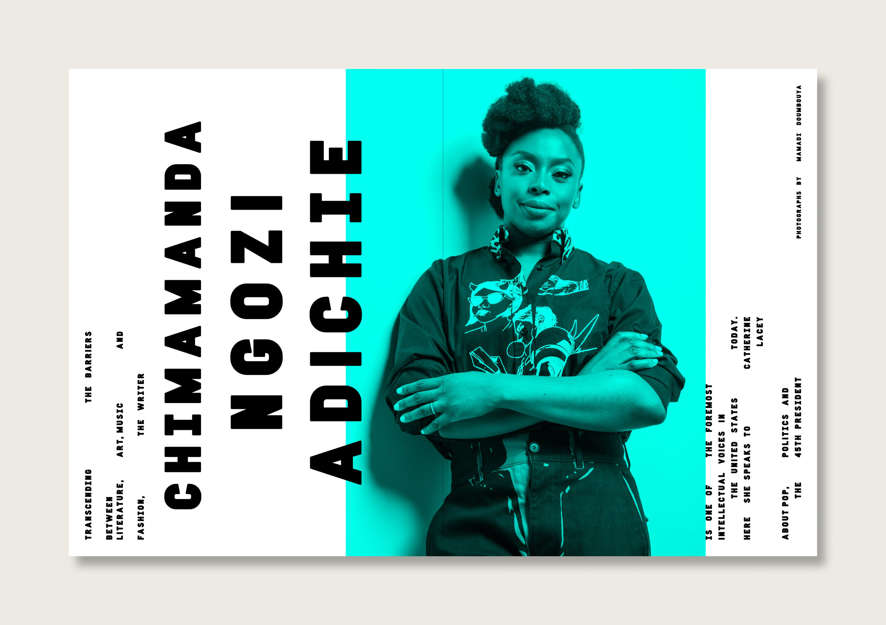
Ex-founding director Matt Willey has guest art-directed the new issue with a sensitive but sure touch. The design happily hangs between elegance and disorder, and nods towards modern graphic design trends with braver colours and extra brutalism. The idiosyncratic treatment of straps and quotes – oddly justified, randomly spaced words – can become a little wearing over time, and for a magazine so committed to the beauty of words, this design quirk seems a little out of place.
But the new bespoke typeface designed by Willey is a real triumph. Squat, aggressive, menacing; it adds to the heavier, punchier atmosphere and binds the magazine together.
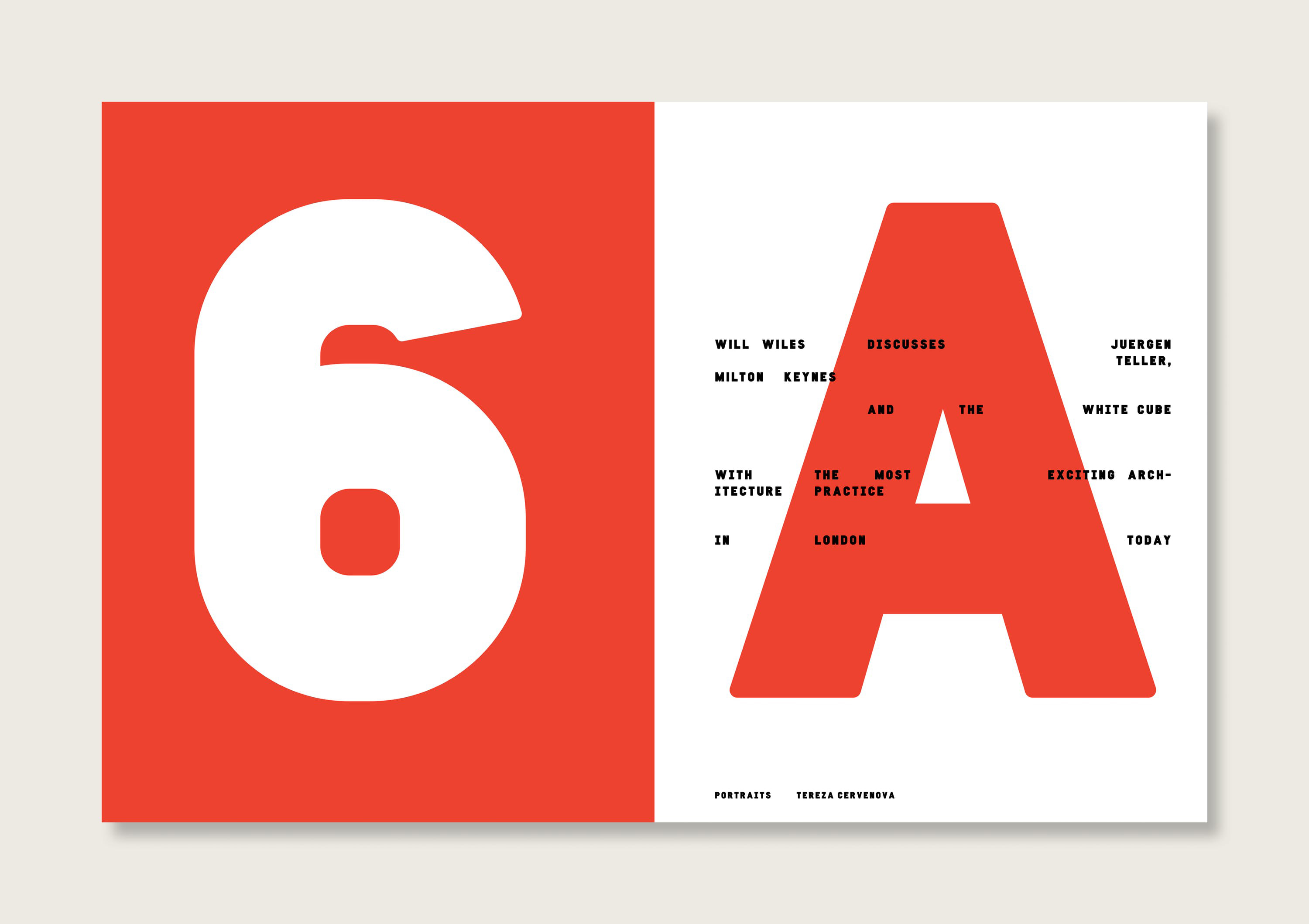
Overall, the new look is more of an upgrade than a major redesign – it feels as if Port's loosened its tie rather than actually bought a new suit – but hopefully the brave adjustments to its own agenda will reward it with a whole new audience. Treading higher ground than its mainstream rivals is hardly a challenging ambition (the latest issue of GQ deploys the term ‘manssential’ without any hint of irony whilst reviewing a £1,000 cigarette lighter), but Port really is in a league of its own, and only getting better with age.
- Buy PORT magazine here
- Also read: Eye on Design review
out of 10
A significant editorial re-think and crisp design adjustments keep PORT ahead of the game.

Mark Wynne is an art director and designer with more than 20 years' experience in the publishing industry. He's been responsible for art directing and rebranding several popular magazine titles, including Official PlayStation Magazine and cult videogame title EDGE, and he was also Art Editor for Computer Arts magazine. Mark is one of Creative Bloq's go-to experts for all things related to design and branding.
