How to make a magazine cover stand out
As the rules of engagement change, your magazine cover matters more than ever.
Sign up to Creative Bloq's daily newsletter, which brings you the latest news and inspiration from the worlds of art, design and technology.
You are now subscribed
Your newsletter sign-up was successful
Want to add more newsletters?
Designing magazine covers for newsstand titles is harder than it used to be, mostly as the declining industry is plagued with tumbling circulation figures and title closures.
Limitless digital content available in a split-second makes the monthly print cycle of magazines look ever more anachronistic and irrelevant, and the corresponding decline in revenue from print ads only hastens print’s downward spiral (despite these brilliant print ads showing that print advertising can still work).
The battle is no longer print versus digital. Digital has already won. The challenge for print is simply to co-exist and keep going, and the frontline of this battle is the cover of your magazine, which must somehow engage, cajole and convince readers that buying something written six weeks ago might somehow still be a worthwhile experience.
Article continues belowBut despite all the gloomy headlines announcing the death of print, there are still bold launches and thrilling innovations that suggest all may not be lost, and even Meghan Markle has got involved in cover design lately, meaning it must be back in vogue (pardon the pun).
And just as the book publishing industry defended itself against the assault of e-readers with more beautiful jacket designs that celebrated the physical properties of print, so magazine publishers and designers must remind their readers why print is different, not inferior to digital.
Click the icon in the top-right of each image to see the full-size version.
01. Beware the formula
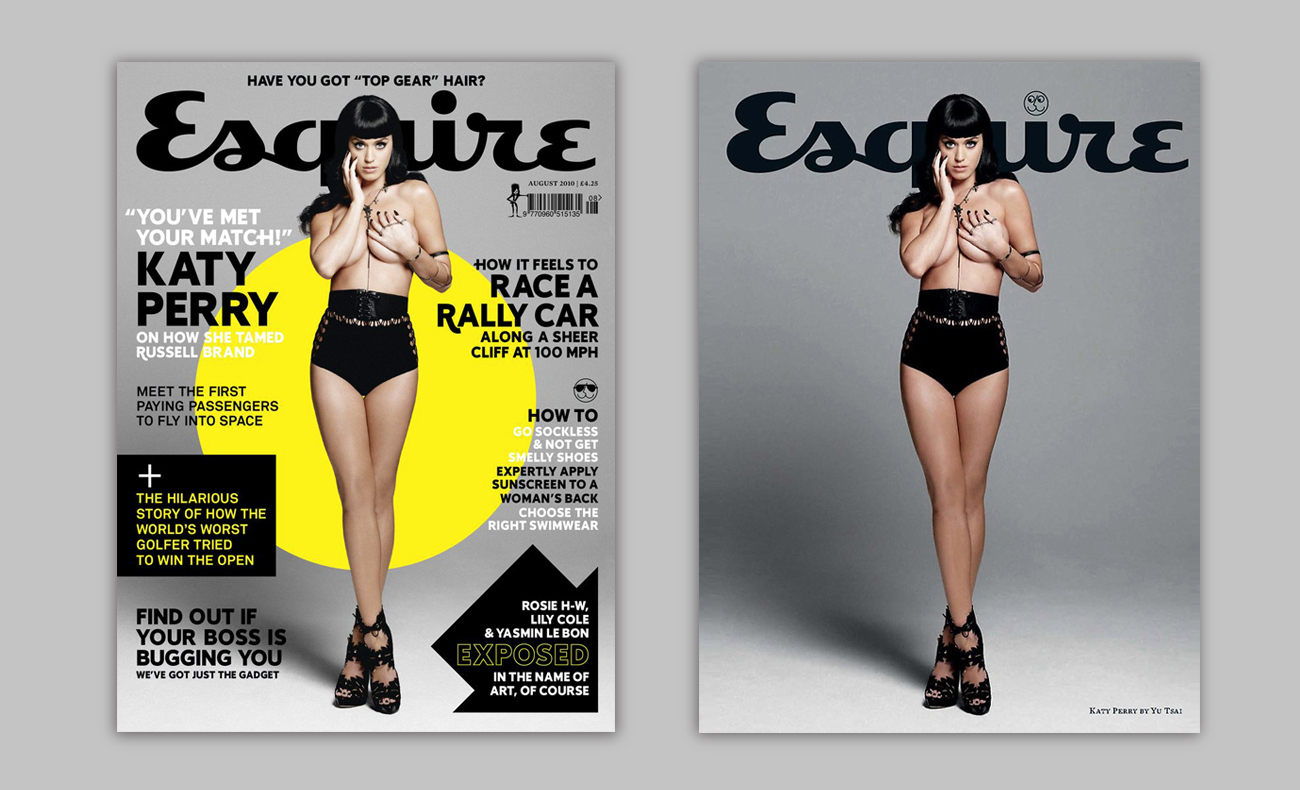
An exhausting checklist of unofficial best practices – The Formula – has accumulated over time. These guidelines include adding flashes in the top left quadrant (the hot zone of visibility), running sell lines above your masthead (to grab the browsers attention before they’ve even seen your logo design) and keeping the main cover hit in the top half of the cover (so it’s less likely to be hidden by other titles). The list’s endless: models should make eye contact; the colour pink is ‘feminine’; ‘green shouldn’t be seen’…
Sign up to Creative Bloq's daily newsletter, which brings you the latest news and inspiration from the worlds of art, design and technology.
The obvious problem with following The Formula is that nearly everyone else on the newsstand is doing the same thing. Browse any magazine shelf and you’ll see an exhausting repetition, a visual cacophony where every title is cancelled out by its identikit neighbour. And despite the apparent common sense behind some of these rules, common sense rarely makes for a truly thrilling magazine cover.
It takes courage to promise less and deliver more, but this is the essence of good design
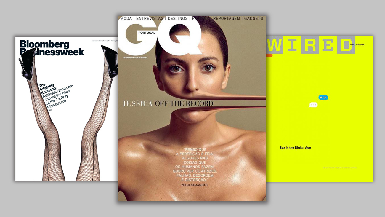
It takes courage to promise less and deliver more, but this is the essence of good design: make a beautiful image that attracts and engages the reader. Your cover is a (visual) tool to draw your reader to the (written) content. For that split-second when the reader first sees the cover, aesthetics must take precedent for the process of seduction to begin.
A text-heavy cover is shouting at a tiny, vanishing audience – the casual reader browsing a local supermarket or newsagent is all but extinct. If your cover is confident and clear, it will stand out in the crowd.
02. Own your cover image
Unless you’re lucky enough to commission original artwork every month, you’ll mostly be faced with making covers from supplied images. Sometimes you'll be sharing an image with another magazine and almost certainly the internet, so you need to make your treatment stand out.
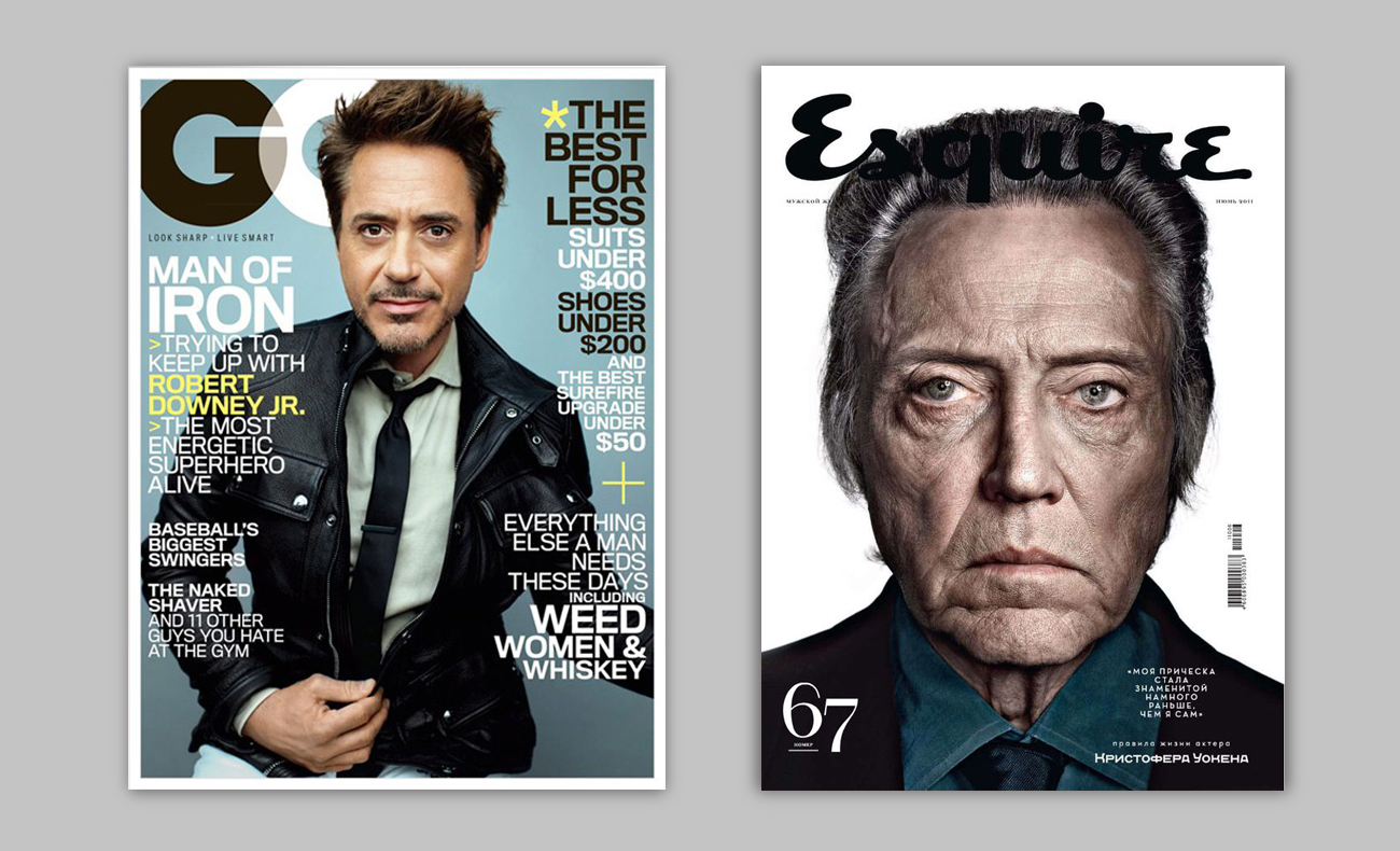
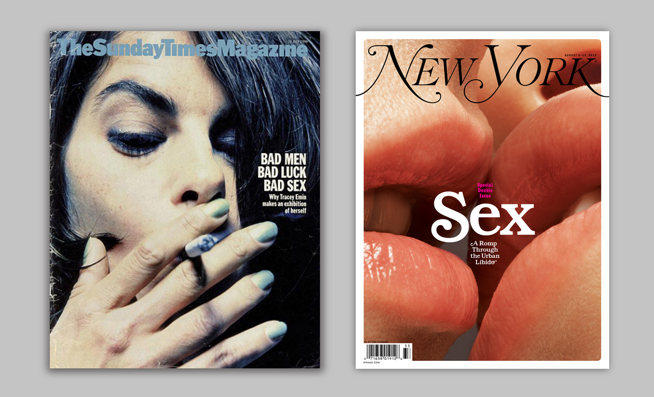
One of the most effective ways to take ownership is to crop the image differently.
Inexperienced designers will tend to use the source image unquestioningly as the cover composition, but experienced designers will look for different crops to make the cover unique.
Imagine having a head-and-shoulders portrait as your source image. The obvious solution would be to have the head roughly fill the available area – so the face is as large as possible – and position coverlines accordingly. But by changing the crop you can radically alter the tone and deliver a fresh editorial message.
Zoom in closer for a larger-than-life face, an instantly arresting image. Shrink or discard the coverlines to increase the cover star’s status, or type them on top of their face, so suddenly your story is more important than the star. Desaturate or even eliminate the colour to communicate a different tone. Or apply illustrations on top of the image to stamp your ownership.
03. Use special print treatments
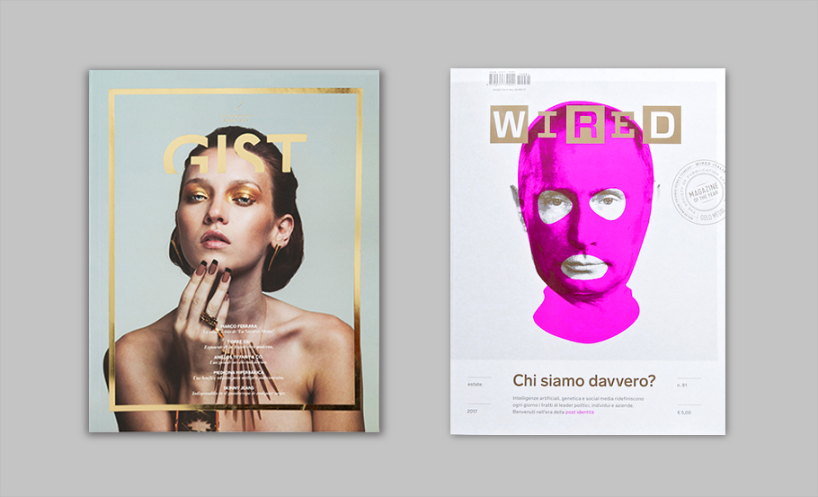
Foils and fifth colour Pantones (an additional plate to the default CMYK) are the most effective way of triggering the magpie instinct in readers. The powerful physical presence of foil instantly lifts it above flat colour printing: it reacts to the light, changes tone depending on how it’s displayed and carries a unique currency of quality and luxury with consumers (which is why it’s the de facto choice for so many cosmetics brands). There’s no printing technique as reliable as foil to lend desirability and opulence to your cover. (See our post on how to create special finishes in InDesign to learn how to create these print techniques)
As foils are costed according to the percentage of the cover area they’re applied to, you’ll see quite a few titles foil their logo, not so many that lavish it from corner to corner. But however you use it, impact on newsstand is guaranteed.
Pantone inks – especially fluorescents – are significantly cheaper and can radically weaponise your design. Explore the back catalogue of Wired (UK and US) for a thorough masterclass in fifth colour treatments.
Spot UVs, embosses, dies-cuts and bespoke cover stock finishes can all be applied to maximise impact, and the best way of finding out what you’d like (and can afford) is to visit your printer. They will be manufacturing a host of other products, from food packaging to corporate brochures, so explore what materials, techniques and treatments might be available. Your printer wants your (repeat) business, so negotiation is not uncommon.
04. Make your cover work on social media
Social media is likely to be your biggest promotional tool and first contact with prospective readers. Your cover design must work both at newsstand and at a radically smaller size.
Just as the music industry has embraced the miniaturisation demanded by the digital age, with album designs increasingly sparse and iconic, so magazine covers must work at different sizes and in different media.
Reduce. Simplify. Email your cover to yourself and look at it on your phone. If it looks cluttered at that size and minor hits are illegible, are they worth retaining? What does your cover communicate about you when compressed to little more than an icon? Does it project authority or chaos?
And use social media to promote your cover before it’s even on the newsstand. Create audience anticipation and give them a reason to look out for you. Post photographs of your best spreads, tag your illustrators and contributors, take advantage of the powerful reach of social media to make your cover (and issue) visible to the vast majority of people who aren’t in WHSmith that week. Don’t be afraid to use the internet to celebrate print. There’s no time to hold grudges.
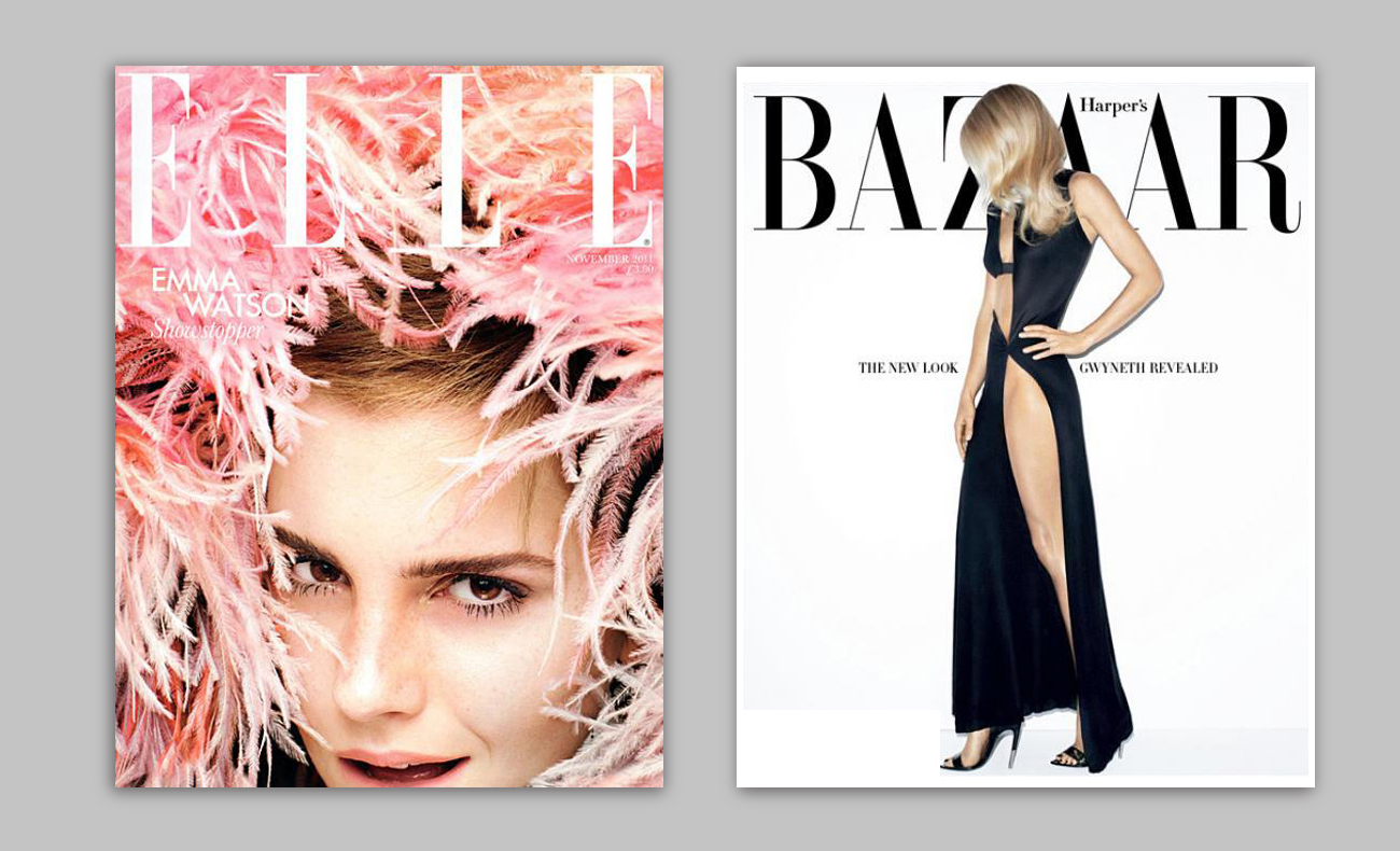
The two magazines above are so utterly confident in their own brands that they ignore any formula. Elle (left) brutally crops Emma Watson through her chin while eye contact is well below the midpoint of the cover. Even her name is essentially invisible, yet as a thumbnail, the white magazine logo condenses to be wonderfully clear. Bazaar’s cover (right) is equally bold, awarding Paltrow the entire cover but daring to hide her face. Both covers stand out on newsstand but work just as well as thumbnails.
05. Trust your reader (and your instincts)
Many magazines publish two different covers for the same issue: a regular, text-hit heavy newsstand version, and a subscriber covers, usually stripped of words and featuring a more daring crop. The logic is that the subscriber cover doesn’t need to work at newsstand, so the loyal subscriber is rewarded with the cover they'd prefer.
This practice reveals the low opinions many publishers have of the average reader, who they fear needs to be cajoled, hectored and bullied into parting with their cash. But are the two objectives (selling and looking good) really mutually exclusive? The best magazines dare to imagine that their readers are as smart as them, and design accordingly.
Design is no longer a mysterious art – the aesthetics of Apple’s new OS are discussed at the water cooler along with the new Game of Thrones episode – and simplification and decluttering have become synonymous with quality.
Similarly, trust your own instincts. If something seems wrong with your cover, even if you don’t know what it is, it’s still wrong. Take it all off and start again. Workshop as many different ideas as possible. Don’t waste time refining small details or honing type. Make it work as a whole, first.
And don’t be dismayed if your editor asks you to try something else. If your cover needs explaining, it’s a failure. No amount of polish will save a fundamentally flawed idea. A spontaneous, radical new direction can deliver a killer cover in less than a minute, while bad covers usually take forever because they are, ultimately, never finished. They just get sent to the printers when there’s no longer any time left...
Next page: five more ways to make your magazine cover stand out...

Mark Wynne is an art director and designer with more than 20 years' experience in the publishing industry. He's been responsible for art directing and rebranding several popular magazine titles, including Official PlayStation Magazine and cult videogame title EDGE, and he was also Art Editor for Computer Arts magazine. Mark is one of Creative Bloq's go-to experts for all things related to design and branding.
