How to make a magazine cover stand out
As the rules of engagement change, your magazine cover matters more than ever.
Sign up to Creative Bloq's daily newsletter, which brings you the latest news and inspiration from the worlds of art, design and technology.
You are now subscribed
Your newsletter sign-up was successful
Want to add more newsletters?
06. Mind your language
As the designer you should know the language and editorial tone of your magazine as well as your editor. Each word is as important as the image, every sentence is another opportunity to reinforce brand values. Design is communication and therefore essentially an extension of vocabulary. Great covers should exhibit a seamless synthesis of words and imagery.
For this reason, designer and editor should ideally work in unison on the cover. Designs batted back and forth between editorial and design are less likely to deliver a cohesive solution. That ‘what if?’ spark needs to be caught instantly and allowed to catch fire. The best editors will invariably have great instincts for design, and good designers will love words (or at least typography) as much as images.
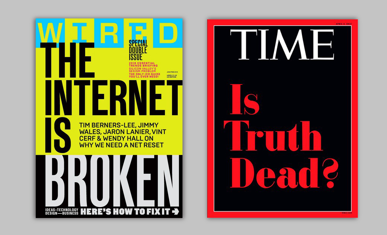
Type-only covers have become increasingly popular and the best examples demonstrate the art/editorial hybrid mind in perfect harmony. Provocative statements or urgent questions can engage the reader just as powerfully as an image, the subliminal message being: This is too important to waste time with a pretty picture.
Article continues belowType-based covers are difficult to pull off, but well executed treatments can make for powerful brand statements and inevitably stand out against cluttered competitors. If all else fails, do one thing and do it well: sell your cover line. And question the value of supplementary sell-lines. Additional hits should support and enhance the overall design, not exist for their own sake.
07. Be controversial
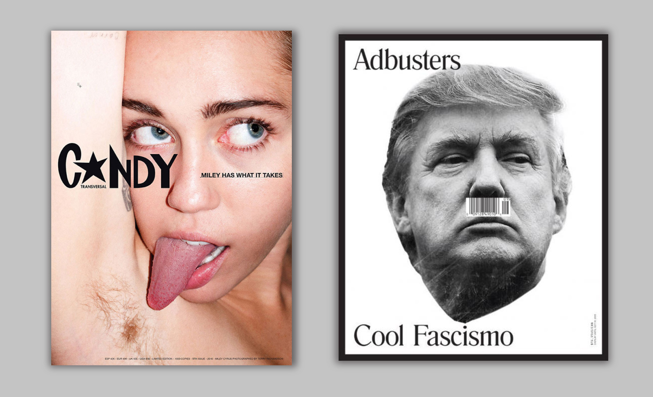
Grab the attention of the reader and you have achieved your primary purpose: making the magazine a purchase option. But shock tactics aren’t appropriate for all titles, and shouldn’t be deployed gratuitously. Readers will be suspicious of cynical or engineered controversy. Context is everything and provocative covers are meaningless if they doesn’t support a genuine message. However if the editorial team do have a daring idea to communicate, your duty as designer is to amplify it.
Of course, getting your magazine withdrawn from the newsstands is a very real danger. Magazines do get taken from the shelves and if you read your audience wrong, you’ll alienate them in the short term and damage trust in the long term.
Sex isn’t the only shock tactic: religion and politics are probably the riskiest subject matters, and cultural tastes are fluid. A sexually provocative cover in 2019 will fall under much greater scrutiny than it might have done pre-#MeToo. Politically sensitive subjects should be approached with maximum caution, although provocative treatments may evade censorship (and rancor) if tempered with sophisticated wit.
Sign up to Creative Bloq's daily newsletter, which brings you the latest news and inspiration from the worlds of art, design and technology.
08. Brand your own content
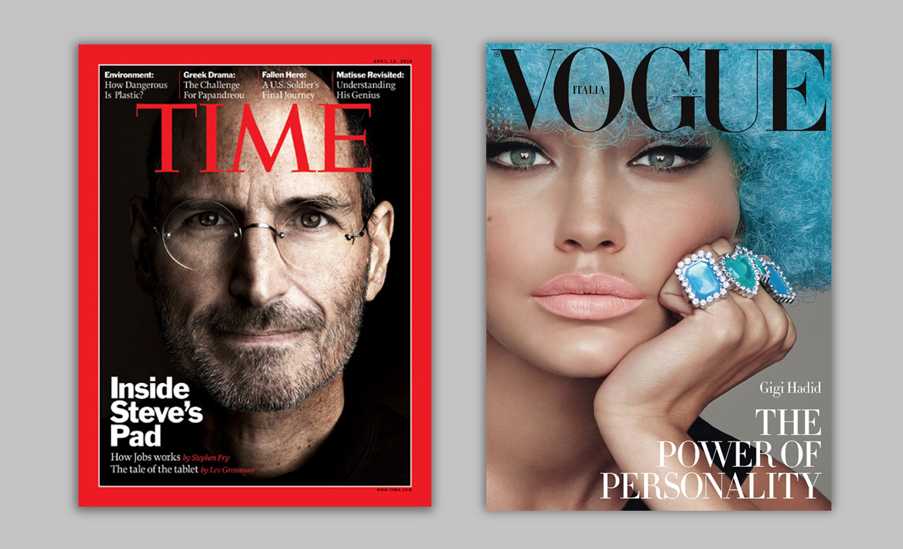
Your magazine is more important than your content. Whatever your cover, and however big a deal it is, your brand – the masthead logo, the identity, the values – are your primary concern. Your cover is more than just a billboard for your current issue, it is an ongoing advertisment of brand.
A film magazine with an exclusive on the latest Star Wars movie might be forgiven for sacrificing their own masthead legibility in favour of letting the cover image dominate, but by transferring brand collateral over to your cover star, you make a subtle statement of subservience.
During the design process, you should be constantly printing out your current cover and setting it against the previous half-dozen to see what, if anything, is happening with your brand. Over enthusiasm (or over-promising) can sometimes lead to brand-wounding cover treatments that weaken credibility and dilute authority.
So be prepared (with your editor) to push back over supplied imagery and/or resist commercial pressures. In an ideal world, you will only run covers that share your values. Remember, your brand and your cover subject are inexorably linked, and if there are early doubts over the merits of your cover subject, it's better to address them immediately (and find another cover) than be forever haunted by your own back issues page...
09. Make your cover an event
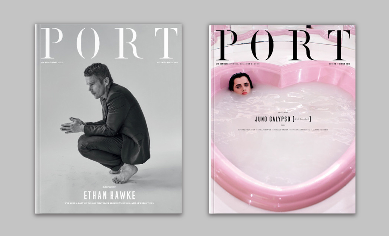
Split-run covers can be an effective and cost-efficient way to get attention on the newsstand and generate social media interest. It’s likely your cover is printed four-up – four covers on one sheet of paper which are then cut down and bound – so supplying four different designs can cost next to nothing. Suddenly your new cover is not just about your latest issue – it’s an event.
There’s something intrinsically satisfying about seeing variations on a theme. Simple transitions on social media of your different cover treatments engage reader attention and give an additional spin to your new issue narrative: which cover will you find on the newsstand?
Suddenly your new cover is not just about your latest issue – it’s an event.
And split-runs don’t have to even be for the reader’s benefit. They can be a valuable testing ground for new ideas or treatments. Why not print 75 per cent of your covers with a regular design, but put out 25 per cent with a more daring treatment, as a subtle piece of market research? Regular readers rarely have trouble expressing their preferences and audience feedback is always valuable.
Part of the pleasure (and torture) of magazine design is that however many colour proofs you make, when the finished magazine comes back from the printer, its physical presence will always be slightly different to how you imagined it. Publishing straight to the internet is a brutally efficient, digital exercise – what you see is what you get – but printing magazines is analogue, mercurial and magical.
10. Pay attention to indie mags
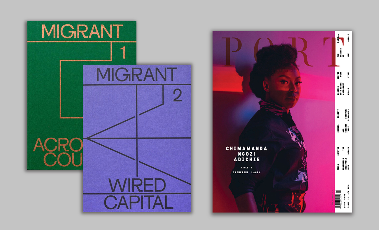
The success of the indie magazine market can be a source of anguish for mainstream magazine designers, who often look at their opulent production values and resolutely non-commercial cover treatments with hopeless envy. And whilst their largely subscriber-based/specialist shop distribution mean there are few practical lessons to be learnt from them, their energy, passion and enthusiasm offer a timely reminder of how magazines can still be valued as prestigious products to be celebrated on their own terms.
Recent successes like Migrant Journal and Mushpit both radically rethink how a magazine can look and read: the former presenting deep content with a clinical precision closer to an academic journal (albeit beautifully designed), the latter brattishly throwing every convention of ‘good design’ out of the window and reengaging with readers in a playfully aggressive fashion.
The (best) indies demonstrate the magazine format to be an infinitely mutable medium, capable of radical reinvention and continued relevance. It is the indie mags that have responded most readily to the challenges of existing in a digital world, championing the value of magazines in their own right. Adopting the (more often than not) wilful obtuseness of their cover designs is unlikely to translate to a mainstream, newsstand title, but there are underlying principles of audience engagement, brand-as-content and bold experimentalism that can be inspiring and instructive.
Mark Wynne is the art editor of Computer Arts magazine, the world's best-selling design magazine. Subscribe to make sure you don't miss his next cover.
Related articles:

Mark Wynne is an art director and designer with more than 20 years' experience in the publishing industry. He's been responsible for art directing and rebranding several popular magazine titles, including Official PlayStation Magazine and cult videogame title EDGE, and he was also Art Editor for Computer Arts magazine. Mark is one of Creative Bloq's go-to experts for all things related to design and branding.
