5 beautiful examples of illustrative typography
From ornate lettering to typographic experimentation, we present five examples of illustrative typography to inspire you.
Sign up to Creative Bloq's daily newsletter, which brings you the latest news and inspiration from the worlds of art, design and technology.
You are now subscribed
Your newsletter sign-up was successful
Want to add more newsletters?
When it comes to typography, there's no end to where your imagination can take you - and the line where illustration meets lettering can throw up some of the most amazing designs. Here are some of our favourites to inspire your own projects...
01. James Brown
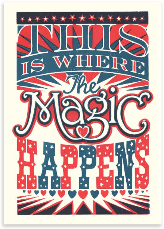
James Brown is a London-based Illustrator and printmaker working for a range of clients on commercial projects ranging from GQ to The Guardian. Aside from James's commercial commissions he has produced a series of typographic prints based on his interest in the 'typographic ephemera of pop culture'. We love the way this one uses circus inspired lettering to create a bright and optimistic feel, with a lovely use of Pop-tastic colour.
02. Johnny Hannah
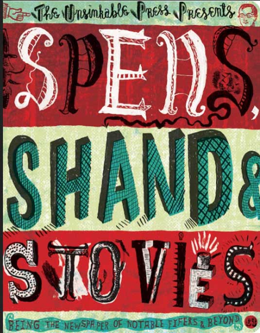
Hand rendered, illustrative type plays a central part in Johnny Hannah's work. Since graduating from the Royal College of Art he's worked for numerous clients including Vogue, The New York Times, English National Opera and he also produces a large amount of non-commissioned artists prints and paintings that have a wonderful evocative dark-edged folk feel.
Article continues belowTattoos, lighthouses, the sea and liquor all feature along with hand painted, eclectic and playful lettering. There's often a dark edge to this work, reminiscent of times gone by, with a lovely use of animated hand drawn type.
03. Sara Fanelli
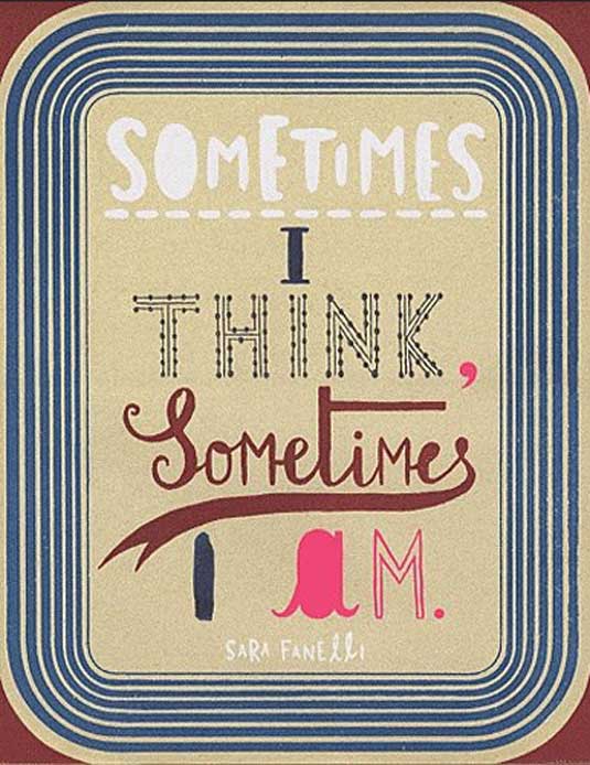
Sara Fanelli is an Italian artist and illustrator who's twice been awarded the V&A Award for Illustration. She illustrates children's books alongside working for a broad client base, a recent notable commission being a floor to ceiling wall of hand drawn lettering in the Tate Modern, depicting a timeine of 20c artists.
Drawn or painted hand rendered type is a consistent and integral theme throughout her eccentric and imaginative work. In her book 'Sometimes I think, sometimes I am', her use of type is highly experimental.
Fanelli composes and balances an eclectic mix of type and image, playfully combining multiple type size, colours and materials with upper case/lowercase lettering. The relationship between type and illustration never linear, turning the pages is an intriguing and curious experience, an embodiment of peculiar and eccentric world of her imagination.
Sign up to Creative Bloq's daily newsletter, which brings you the latest news and inspiration from the worlds of art, design and technology.
04. Steven Bonner
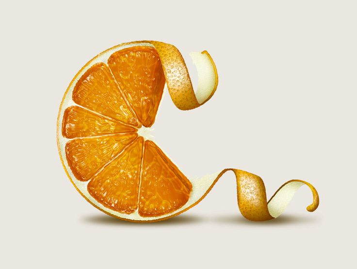
Award-winning illustrator Steven Bonner works for clients in the UK, Europe, USA and almost everywhere else, from his studio just outside Stirling, in Scotland. Here he worked with digital agency Work Club to design an illustrated animation and typeface for Ballantine’s 12 Year Old, a premium Scotch Whisky. Briefed to illustrate the seven main tasting notes - vanilla, cream, clementine, berries, oak, pear and honey - as illuminated letters, Bonner treated each as an “exercise in expressive drawing”, with each letter telling the story of its own flavour. See the whole alphabet here.
05. Chris Sandlin
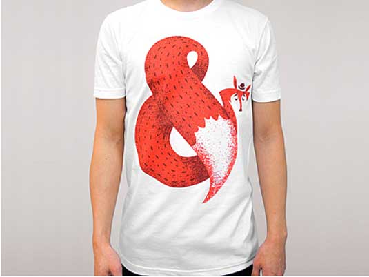
Born in Seoul and raised in Georgia, Chris Sandlin is a freelance illustrator working in the US. Inspired by illustration from the 1940s and '50s, his focus is on character design, specifically for independent apparel, but recently he has been working on some illustrative typography with lovely results.
His Fox Ampersand is part of a collection of 10 artists' original Ampersand screen prints. The animal is illustrated in Sandlin's usual simplified style using a limited palette of two colours. We love how the tail wraps round to form an effortless image that works both as character and Ampersand.
Words: Anna Wray
Anna Wray is an illustrator/author and a visiting lecturer on the Ba(Hons) Illustration at Cambridge School of Art.

The Creative Bloq team is made up of a group of art and design enthusiasts, and has changed and evolved since Creative Bloq began back in 2012. The current website team consists of eight full-time members of staff: Editor Georgia Coggan, Deputy Editor Rosie Hilder, Ecommerce Editor Beren Neale, Senior News Editor Daniel Piper, Editor, Digital Art and 3D Ian Dean, Tech Reviews Editor Erlingur Einarsson, Ecommerce Writer Beth Nicholls and Staff Writer Natalie Fear, as well as a roster of freelancers from around the world. The ImagineFX magazine team also pitch in, ensuring that content from leading digital art publication ImagineFX is represented on Creative Bloq.
