The secrets of Sawdust's incredible new typography for Wired
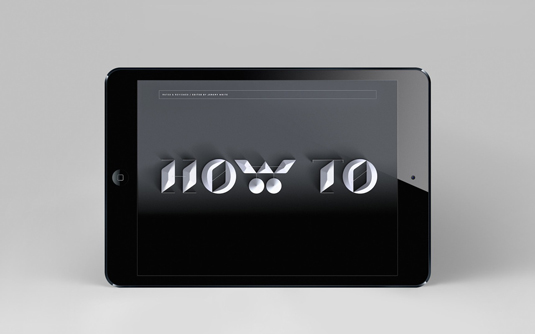
Rob Gonzalez and Jonathan Quainton reveal how they created typographic openers for the redesign of Wired UK.
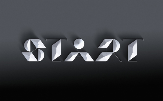
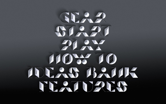
One of the most revered magazines on the UK newsstand (and indeed on the App Store), Wired UK is a title many designers turn to for design inspiration. For the latest redesign, award-winning creative director Andrew Diprose looked to reinvent the section headers of the magazine, and turned to UK design duo Sawdust -- aka Rob Gonzalez and Jonathan Quainton -- to design some exquisite bespoke typography. We caught up with them to discuss the brief, the creative process and the challenges.
How did the commission come about and what was the brief?
Rob Gonzalez: Andrew Diprose -- Creative Director at Wired UK -- had been in touch about the magazine undergoing a redesign and he wanted us to explore some typographic ideas for section headers that would run throughout the magazine. In his words he wanted something that was 'clever but readable'. We like how clients often emphasise 'readable' as a requirement when briefing us.
We like how clients often emphasise 'readable' as a requirement when briefing us
Jonathan Quainton: We have worked with Wired a few times now so we have a certain understanding of its values; cutting edge, innovative, progressive, exciting, daring, technological and forward-thinking -- strong qualities that we wanted to express through the typography.
Article continues below 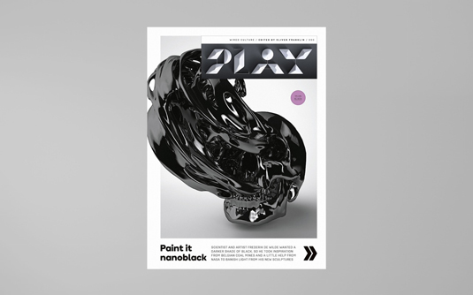
How did you design the type? What were the main techniques and what software was used in the process?
JQ: Designing the type was very much an exploratory process. Our goal, which is often the case, was to challenge convention and preconceptions around traditional letterforms whilst retaining clarity and readability.
RG: The brief referenced dimensionality so this is something that was at the forefront of our minds. This led to thinking about shapes that sit within an ethereal environment.
JQ: Stage one was to design the flat typeface and then later we applied the dimensionality that was drawn in Photoshop.
What was the inspiration for the type?
JQ: The typeface was strongly influenced by previous work for Fast Company and Playstation -- projects which were referenced during the briefing process. These projects contained very progressive and challenging typography so with this in mind we realised it was a great opportunity to produce something playful that would appeal to and entertain the readers of Wired.
Sign up to Creative Bloq's daily newsletter, which brings you the latest news and inspiration from the worlds of art, design and technology.
It was a great opportunity to produce something playful that would appeal to and entertain the readers of Wired
RG: We like to build on previous explorations where possible, particularly when it comes to bespoke typography, this helps us greatly -- starting from a blank canvas on every project doesn't always equal new and exciting outcomes.
What were the main challenges in this project?
RG: Without a doubt I'd say it was trying to balance readability with depth and dimensionality. It was paramount for the headers to appear daring, progressive and innovative but equally readers needed to understand the letterforms with minimum effort -- that was the main challenge.
JQ: Trying to create something that feels original is always difficult particularly when it comes to typography -- a challenge that we thrive on.
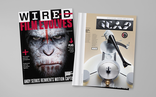
You can see Sawdust's stunning typographic openers in the latest issue of Wired UK, on sale now.

Rob is editorial, graphic design and publishing lead at Transport for London. He previously worked at Future Publishing over the course of several years, where he launched digital art magazine, ImagineFX; and edited graphic design magazine Computer Arts, as well as the Computer Arts Projects series, and was also editor of technology magazine, T3.
