20 websites with brilliant typography
Looking for typographical inspiration? These stylish modern websites can provide it!
Sign up to Creative Bloq's daily newsletter, which brings you the latest news and inspiration from the worlds of art, design and technology.
You are now subscribed
Your newsletter sign-up was successful
Want to add more newsletters?
While not as flashy as an HD photograph or the motion of animation, typography is nonetheless an integral part of any design.
Its effects can be subtle to draw attention to other elements on the screen, or they can be boisterous to make the message of the words dominant. In either case, one thing's for sure — typography enhances the design as a whole, one way or another.
The current trend in typography today is dramatic typography — typeface that draws attention rather than hides from it. This coincides with both the flat design and minimalism trends, whose simplistic layouts call for an extra boost to add excitement. The simpler the layout, the more typography affects over the site's mood and the screen's visual hierarchy.
Before we get into examples, let's dissect the fabric of typography into individual elements:
- Category — This typically refers to serif and sans serif. A "serif" is the superfluous little flag on the end of certain letter lines, and "sans" means "without."
- Stroke — A typeface's stroke is the width of the actual line. Bolding a typeface gives it a thicker stroke, and is a good way to add emphasis to a word.
- Size — The size of your typography will have an enormous impact on how it fits alongside the other elements on the screen. Naturally, bigger text will steal attention, while smaller text will fall more in the background.
- Colour — The colour of text influences its message, for example, a red word will appear more urgent and grab more attention. Furthermore, if a word's colour contrasts the background or surrounding colours, it will stand out more.
- Spacing — The spacing between letters, words, and lines is most important for legibility, although designers can play with it to take advantage of negative space — more space between words gives more emphasis, and can add a sense of elegance.
With these fundamentals in mind, take a look at 20 sites that show how typography enhances design.
For a more thorough analysis of modern typography, as well as 9 other current web trends, download the free ebook Web UI Design Trends 2015 & 2016. You'll find 166 handpicked examples and 100 curated resources to simplify your design process.
01. Pack
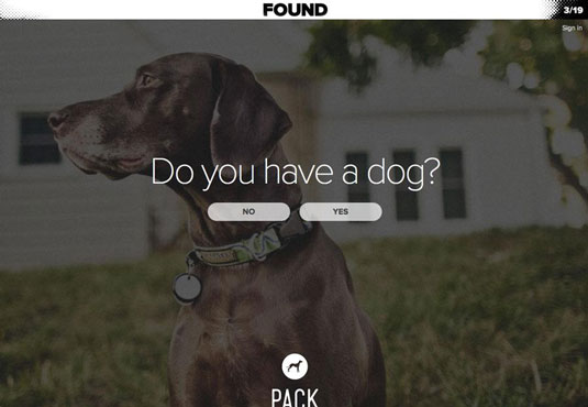
Typography should always reflect content. Pack's plain font is friendly and inviting, which makes a lot of sense for a site that caters to dog owners. Because the question is the focal point of the page, its size is bigger. Moreover, the background photo stays in the background with a slight fade that contrasts the white of the text.
Sign up to Creative Bloq's daily newsletter, which brings you the latest news and inspiration from the worlds of art, design and technology.
02. Wikipedia
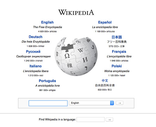
As one of the most popular sites on the internet, and one that relies heavily on textual content, Wikipedia pays close attention to its typography. It's not the most visually striking interface, but the unassuming typography and stripped-down interface do a great job at promoting findability and readability.
On the homepage (above), notice how each language selection has its own individual differences in size, colour, and style to differentiate the title, description, and number of articles, in order of importance.
Once you arrive at an actual page, notice how the well-balanced line space (also known as leading) makes the content easy to browse and read. An otherwise text-heavy interface becomes extremely usable.
03. Sendamessage.to
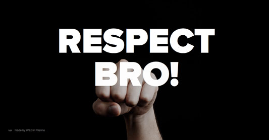
Sendamessage.to emphasizes the text of its message (the website is for sending such messages) with the most effective strategies: bold strokes, contrasting against the background, all caps, and superimposing it over the image.
04. Mikiya Kobayashi
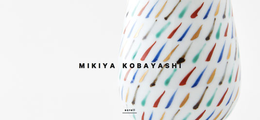
Mikiya Kobayashi takes a different approach than Sendamessage.to. The small size of the brand name lends attention to other, more important elements, in this case the product picture behind it. Notice that the text is still bold, all caps, and contrasted against the background — as the brand name, it still wants some attention, despite its size.
05. Anja Rubik
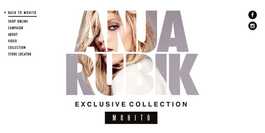
The site for Anja Rubik knows that typography is a great medium for adding creativity and personality to your site — as long as it's still legible. They've superimposed the type over an image of a model, but there's enough negative space around the person so that the letters aren't drowned out.
06. Maaemo
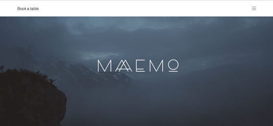
The customized "AA" for Maaemo's site both promotes the brand and has a nice aesthetic to it. Every letter has its own creative spin, and the thin strokes enhance the elegance that the minimalist composition started.
07. Vintage Hope
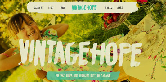
It's hard to compete with a picture of a smiling child, so Vintage Hope steps up its typography to something more attention-worthy. Notice the use of all caps throughout.
Of course, decorative fonts make a lot more sense for clothing brands. Be very careful when deciding if you'll use a decorative font since they normally should be restricted to headlines. As a collaborative design app, we ourselves veered far away from fancy typefaces (you can see on our tour page) since the clean aesthetic makes more sense to our audience.
08. Float
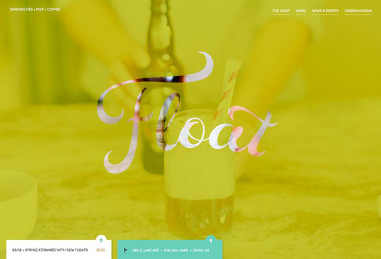
The main element of Float's landing page is its brand name, scrolled in an elaborate font, which works together with the background picture to create a memorable image.
09. Pop-Up Magazine
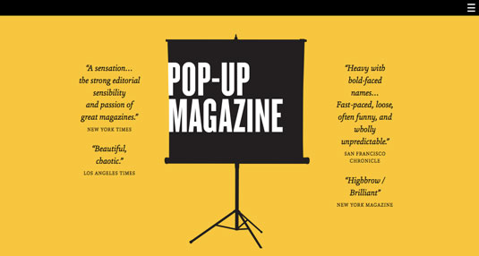
Pop-Up Magazine — which isn't a magazine at all, but rather a magazine-themed live show — uses colour, italics, and size to mimic and (even modernize) the typography of traditional print media. Notice the unsettling but catchy effect of the title's edge merging with the image's edge.
10. The Nation
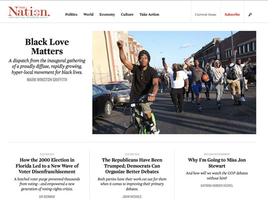
Mirroring print media, The Nation uses bold, italics, colours, and size to separate article titles, authors, descriptions, and categories.
Next page: 10 more websites with brilliant typography...

The Creative Bloq team is made up of a group of art and design enthusiasts, and has changed and evolved since Creative Bloq began back in 2012. The current website team consists of eight full-time members of staff: Editor Georgia Coggan, Deputy Editor Rosie Hilder, Ecommerce Editor Beren Neale, Senior News Editor Daniel Piper, Editor, Digital Art and 3D Ian Dean, Tech Reviews Editor Erlingur Einarsson, Ecommerce Writer Beth Nicholls and Staff Writer Natalie Fear, as well as a roster of freelancers from around the world. The ImagineFX magazine team also pitch in, ensuring that content from leading digital art publication ImagineFX is represented on Creative Bloq.
