20 websites with brilliant typography
Looking for typographical inspiration? These stylish modern websites can provide it!
Sign up to Creative Bloq's daily newsletter, which brings you the latest news and inspiration from the worlds of art, design and technology.
You are now subscribed
Your newsletter sign-up was successful
Want to add more newsletters?
11. Royal Drawing School
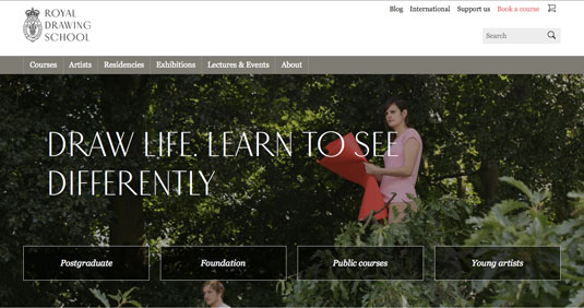
The innovative font of their slogan establishes the Royal Drawing School as an artistic institution. Notice how the italics in the ghost buttons set them apart from roman links in the top navigation bar.
12. Mister French
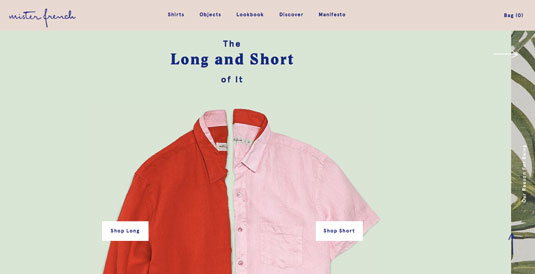
The clothing line Mister French has fun with typography, as you can see by the alternating serif and sans serif text, and the vivacious logo.
13. Cienne NY
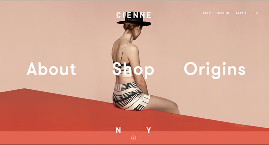
The simple and mainly lower-cased sans-serif typeface complements the site's minimalist design and puts focus (usually) on the photography.
14. Le Printemps du Polar: La Femme Fatale
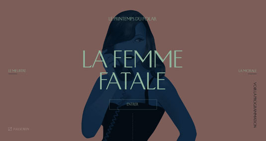
The stylistic font works in conjunction with the picture to create a noirish mood, and remains unchanged when it's resized for different breakpoints.
15. Sassi Holford
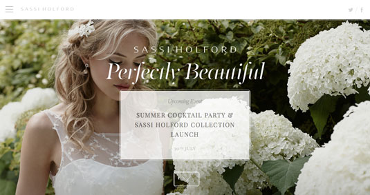
Sassi Holford's use of white, and grey — not black — against white backgrounds, furthers the elegant identity of the wedding photograph.
16. Tomas Bata University in Zlín
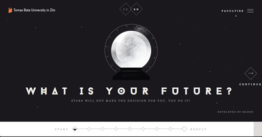
The bizarre font for the heading of the Tomas Bata University's home page enhances the mysterious future-predicting theme, but the site switches to something more legible for the important links.
17. Thankful
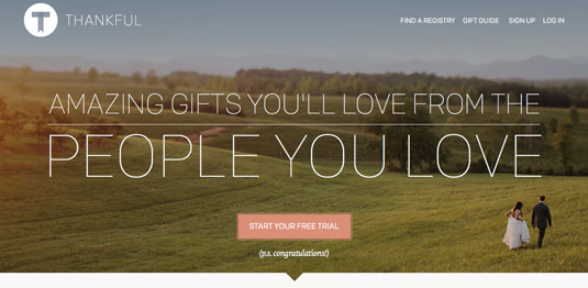
The line strokes of the superimposed title share — rather than steal — the photograph's attention.
Sign up to Creative Bloq's daily newsletter, which brings you the latest news and inspiration from the worlds of art, design and technology.
18. Aquatilis Expedition
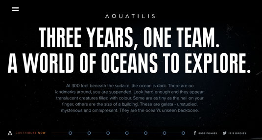
Aquatilis Expedition wildly varies the use of its typography, with a customized brand logo, loud header, and coloured body content that makes full use of the black background.
19. Two Arms Inc.
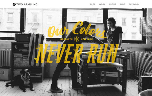
Aside from using interesting typography in general, Two Arms Inc. uses an old comic book trick to make the words "never run" visually suggest running.
20. Drexel University: Get Going
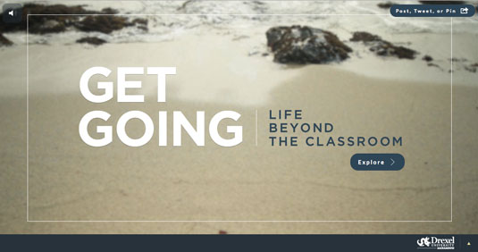
We'll end with Drexel University, whose typography seems simple but actually works on different levels. The site uses both the text's size and composition to create a visual hierarchy, gently guiding the user's eyes through the words and onto the call-to-action.
Conclusion
Since vision is our dominant sense, how a word looks is just as impactful as what it means. It might seem easy to neglect typography in favor of gorgeous background images or flashy animations, but doing so is neglecting an advantageous opportunity.
To start designing websites that are as visually stunning as the ones shown, feel free to start prototyping in UXPin. Once you start a free trial, the collaborative design app comes loaded with hundreds of typefaces, 1000+ custom elements, and dozens of rich UI libraries. No code required.
Words: Jerry Cao
Jerry Cao is a content strategist at UXPin — the wireframing and prototyping app — where he develops in-app and online content for the wireframing and prototyping platform.
Like this? Try these…

The Creative Bloq team is made up of a group of art and design enthusiasts, and has changed and evolved since Creative Bloq began back in 2012. The current website team consists of eight full-time members of staff: Editor Georgia Coggan, Deputy Editor Rosie Hilder, Ecommerce Editor Beren Neale, Senior News Editor Daniel Piper, Editor, Digital Art and 3D Ian Dean, Tech Reviews Editor Erlingur Einarsson, Ecommerce Writer Beth Nicholls and Staff Writer Natalie Fear, as well as a roster of freelancers from around the world. The ImagineFX magazine team also pitch in, ensuring that content from leading digital art publication ImagineFX is represented on Creative Bloq.
