5 website layout trends of 2015 so far
Here are some of the biggest website UI and layout trends this year.
In previous decades, we got used to landing on a website and experiencing pretty much the same thing. Oh, there has always been some diversity in colour, pictures, illustration and typography, but we always had a menu across the top and/or down the side, and other elements contained in boxes so that we can easily see them and follow the commands.
Gradually, over time, web designers, UI specialists and layout artists have experimented with designs, and each year new trends have emerged that take layouts to an entirely new level. As we look at 2015, a year that is already half over, we have seen some trends come to the forefront, creating dynamic and compelling experiences for users.
Designers are also beginning to combine tried-and-tested elements in creative and experimental ways. The following five trends, with examples, are presented individually but, in fact, many of these elements are combined in intriguing ways and will probably drive even new layouts for 2016.
01. Split screens
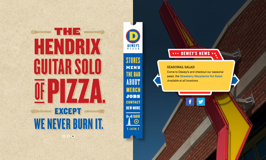
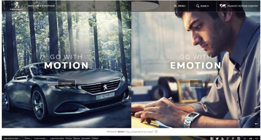
The split screen layout features a vertical divide that can present two elements. The reasons for this type of layout are two-fold:
- The business has two things to promote, and they are of equal importance, and the split allows users to select from the two.
- The business may want to promote the essentials of its niche on one side and present photos or media on the other half – perhaps to introduce staff or examples of products or services. A restaurant, for example, may want to put its brand identity on the left side of the screen and then have scrolling examples of dishes on the right. A clothing site will do the same thing, with scrolling images of some of its products on the right; still another business may want to introduce its staff through pictures and captions on the right.
Websites including PixelatingBits have already noted this trend, and below are two excellent examples of split-screen design:
02. Block grids
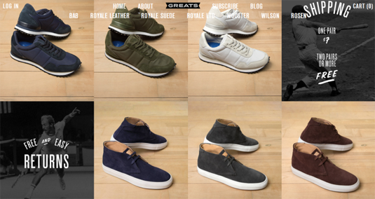
The page is divided into several blocks – symmetrical or asymmetrical. These blocks may be all the same size, if the elements are of equal importance, or different sizes, based upon the order of importance of the content that is displayed. These modules can be used on pages other than just the home page, and, as well are designed to be flexible, so as to change size to fit full PC screens or reduced to fit screens of mobile devices.
The first example below is for 'Greats', a company that markets men’s shoes primarily via its website. The website functions as its showcase or catalogue, and, because all shoes are of equal importance, the grid is in equal blocks.
Daily design news, reviews, how-tos and more, as picked by the editors.
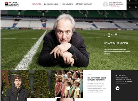
This second example is for a music school, and the elements are of unequal emphasis, the largest one of the director, and then smaller grid modules of student pictures. Both of these examples came from SitePoint.
03. No chrome
Decades ago, cars were large and encased, front and rear, by chrome embellishments. Today the term 'chrome' as it relates to site and page design, refers to all of the containers, headers, footers and borders that encase a page. Many layout designers believe that this chrome distracts the user, when the focus should be solely on the focal point of the page – the brand/product/service or image representing these things.
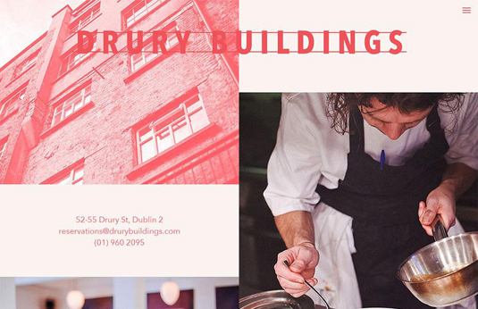
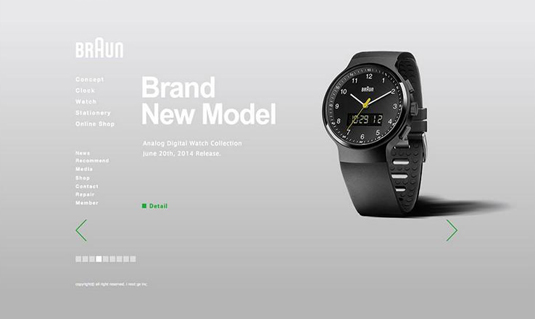
By eliminating all of these distractions, a nice clean effect is achieved, and the menus and links are inconspicuously placed on the page free of containers. As well, no border, header or footers pull the eye away from the desired focus. Here are two examples of sites with no chrome whatsoever, as outlined by WebDesignerDepot.
04. Single screen layout
As well as split screens, (ironically) single screens have come to the fore in 2015, too. These are unadorned screens that have the look of a television screen or a magazine-style opening image, often incorporating a scroll to 'open up' the site.
This layout provides a single image to capture a complete picture of the brand/product/service. The idea is to provide complete focus and utter clarity for the user. It is a pretty stunning effect, if the image or illustration is engaging and interesting for a viewer. Again, the clean design and absence of chrome mean no distractions.
05. Big backgrounds/parallax
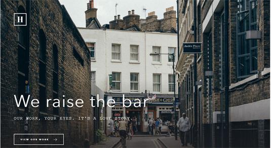
A final design trend is in the use of big backgrounds that can set the tone and mood of the site. If they are busy backgrounds, than the other design elements in the middle and foreground must be minimalistic; however, a more minimalist background will support busier middle and foreground elements. Here are two great examples of the use of background to set a mood:
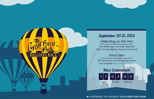
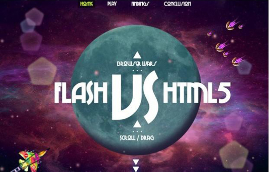
Design layouts of 2015 demonstrate diversity and experimentation, with blends of traditional layouts and unusual and unique new concepts. Indeed, site layout can easily be seen as a new art form that weaves photography, illustration, animation, typography, colour, form, and line for truly engaging effects.
Have you spotted any more 2015 trends? Tell us in the comments.
Words: Nicole Boyer
Nicole Boyer is a writer whose main topics of interest are web/graphic design and marketing. Currently, she work as an editor at AssignmentMountain service.
Like this? Try these…

The Creative Bloq team is made up of a group of art and design enthusiasts, and has changed and evolved since Creative Bloq began back in 2012. The current website team consists of eight full-time members of staff: Editor Georgia Coggan, Deputy Editor Rosie Hilder, Ecommerce Editor Beren Neale, Senior News Editor Daniel Piper, Editor, Digital Art and 3D Ian Dean, Tech Reviews Editor Erlingur Einarsson, Ecommerce Writer Beth Nicholls and Staff Writer Natalie Fear, as well as a roster of freelancers from around the world. The ImagineFX magazine team also pitch in, ensuring that content from leading digital art publication ImagineFX is represented on Creative Bloq.
