5 design tips for creating travel websites
Germaine Satia of Infinvision reveals how to design travel websites that are simple to use and beautiful to look at.
Sign up to Creative Bloq's daily newsletter, which brings you the latest news and inspiration from the worlds of art, design and technology.
You are now subscribed
Your newsletter sign-up was successful
Want to add more newsletters?
In this age when many designers are striving for minimalist designs, one industry that still suffers from cluttered websites and apps is the travel industry. But rather than focus on minimalism – which is often associated with a very sparse aesthetic – the objective when designing for the travel industry, should be on simplification.
Simplifying designs for travel websites and apps can often be challenging because of the amount of content that has to be displayed. Let's take a hotel website, for example:
- There is often a reservations interface, which usually involves multiple steps, over multiple screens. Not only do users have to input information such as dates and number of guests, but they may also need to compare rates for one room (and compare between rooms), as well as read up on cancellation policies, verify which amenities are free vs. paid, and much more.
- Because travel is a personal matter and the choice of 'best' hotel is subjective, hotels need to emotionally connect with travelers. This means storytelling. Using images and narrative to show what the hotel has to offer in terms of accommodations, activities, food, and if applicable, its history and philosophy.
Given these factors, one can very easily end up with a design that is visually noisy and functionally, inefficient.
After working with various travel brands and doing research on digital trends in the travel industry, we at Infinvision have identified five techniques designers use to simplify travel websites and apps, while still providing travellers with relevant information.
01. Flexibility with content blocks
Content blocks are a flexible and effective technique for displaying different types of information on a screen, while giving each piece of information its own "space" and identity.
For example, content blocks can:
- contain images
- contain text
- contain images and text
- include mini-animations and rollover effects resulting in colour changes, text or image changes, or callouts
- be presented as a basic grid, or in a staggered, collage style.
Each choice provides a different type of experience for users and deciding which choice to go with depends on the type of content that needs to be displayed, and the overall design style that you are targeting. To help inspire you, here are some examples of how content blocks are being used.
Sign up to Creative Bloq's daily newsletter, which brings you the latest news and inspiration from the worlds of art, design and technology.
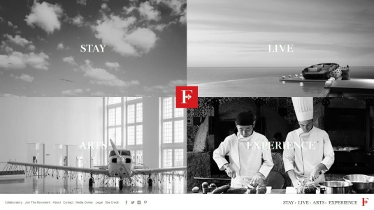
Simplicity on Faena's site is achieved mainly by the use of content blocks that make use of images and videos. On the brand's homepage, these blocks are very effective at highlighting the brand's main values: STAY. LIVE. ARTS. EXPERIENCE.

The content blocks also have the added advantage of acting as a navigational tool, giving users access to dedicated websites and content related to each brand value. For example, clicking on STAY takes the user to the websites for the brand's hotels.
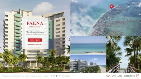
And as shown below, the hotel websites reuse the content block presentation that is a signature of this brand, allowing users to get a quick overview of the hotel and its location solely through the images.

The Marrakech-based El Fenn welcomes website visitors with a collage featuring eight content blocks.
Each block features vibrant images that capture the colour and vibrancy of Marrakech, essential for engaging potential guests who are visiting the website.

Mousing over each block reveals a topic – sleep, eat & drink, sun & swim, etc. – and users can click through to learn more about each topic and what to expect during their stay.
Once again, the content blocks are multipurpose here, serving initially as a photographic journey of the hotel, and then as a navigational tool and entry point for subsequent pages on the site. There is no unnecessary clutter because topics are revealed to users only when they seek it.
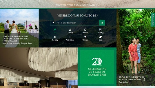
With hotels and resorts spread out across the world – from Asia to North Africa and South America – and with each property offering its own experience, Banyan Tree certainly has a lot of information to showcase. And it manages to simplify the presentation of all this information via the smart use of content blocks that allow users to both navigate the website and also discover the brand's properties.

The homepage contains several content blocks showcasing activities, events, accommodations and much more at their various properties. At the center of the collage, one of the blocks contains a search box and search results filter options. Submitting a new search or filter automatically updates the content blocks that are displayed.
There's no need for a separate search results page. These content blocks allow navigation, discovery, and content showcasing. A truly flexible and multipurpose use of content blocks for a very functional and clean design.
02. Subdued colours and fonts
Fonts and colours are basic design elements that significantly affect the "weight" of an interface. By going for a monochrome design, or by using very subdued and muted colours and fonts, you can soften up an otherwise cluttered interface.

With a main colour scheme defined by white and various shades of grey, Swissair's Android app (left) provides users with a light and agreeable interface.
Flight reservation screens and city guide screens, which are often very busy in most apps, are light and easy to navigate here.
By using very understated colours, content such as city and activity guides, are easier to read, while important information and main call-to-actions are better able to stand out in the interface (the choice of red to highlight main actions doesn't hurt either).
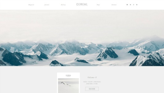
The website for the print travel magazine Cereal uses very understated colours and barely-there fonts to create a website that is quite pared down.

The font used is readable, yet could just as easily vanish before your eyes. This, combined with impactful yet soothing images creates a website that is so minimalist, you could swear it's whispering to you.
The travel packing list app, PackPoint, has a simple and easy to follow interface that uses mainly white, along with soft shades of green and grey.

These colour choices allow users to easily create packing lists, and visually identify how many items they have to pack.
Next page: more top design tips for creating travel websites

The Creative Bloq team is made up of a group of art and design enthusiasts, and has changed and evolved since Creative Bloq began back in 2012. The current website team consists of eight full-time members of staff: Editor Georgia Coggan, Deputy Editor Rosie Hilder, Ecommerce Editor Beren Neale, Senior News Editor Daniel Piper, Editor, Digital Art and 3D Ian Dean, Tech Reviews Editor Erlingur Einarsson, Ecommerce Writer Beth Nicholls and Staff Writer Natalie Fear, as well as a roster of freelancers from around the world. The ImagineFX magazine team also pitch in, ensuring that content from leading digital art publication ImagineFX is represented on Creative Bloq.
