5 key guidelines for visual web design
Jerry Cao explains some core lessons of visual design and how they apply to everyday web design.
Sign up to Creative Bloq's daily newsletter, which brings you the latest news and inspiration from the worlds of art, design and technology.
You are now subscribed
Your newsletter sign-up was successful
Want to add more newsletters?

What you see is not always what you get. The human eye is a complicated thing, and of course it has to be since vision is our dominant sense. But a lot of the human eye's behaviors can be quirky, curious, or downright weird.
What does this mean to a visual medium like web design? A lot. That's why we wrote and released our Web UI Design for the Human Eye series. The free ebooks cover the lesser known facts about how humans perceive visual stimulation – and what they means to web design.
The first 85-page book, Colors, Space, Contrast, examines the fundamentals of sight from a new perspective. Below, we'll dive into a few core lessons of the ebook that apply to everyday web design.
01. How you group elements suggests their function
Your visitors are using a lot of different sites per day, and that's a lot of different systems and instructions for use to keep track off. New users have it even harder, approaching sites with no prior knowledge of how they work.
So the less your user has to think, the better. For the sake of finding "shortcuts" to learnability, the Gestalt principles recommend paying attention to how you group your elements.
The Gestalt principles are the results of intensive psycho-scientific studies of human eyesight from the first half of the 20th century. Their research has proved indispensable to modern web design, and this book covers the most significant ones.
Concerning grouping, these principles show that grouping elements close together suggests they have the same function. The clearest example of this comes from Facebook:
Sign up to Creative Bloq's daily newsletter, which brings you the latest news and inspiration from the worlds of art, design and technology.
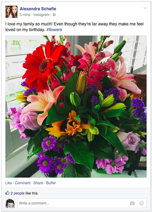
In this typical Facebook example, notice how the functions for "Like," "Comment," and "Share" are all grouped close together. If someone had never used Facebook before, they'd intuitively know that these elements are related, and after figuring out how one works, they'd know how they all work.
Furthermore, notice how the entire white post is boxed off from the gray background? This enclosure shows that all content within is related. That means there's no confusion over which post the "Like" option within the enclosure works with.
02. White space affects attention
The art of web design involves influencing where your user looks, and for this, one of your best tools is actually nothing. White space, also known as negative space, is simply the absence of other elements – it doesn't have to literally be white. Its power lies in its ability to attract or repel attention, depending on how you use it.
A basic guideline for using white space is this: the more white space around an element, the more it will attract attention. Less space means less attention. This rule is one of the fundamentals to the minimalistic and flat design movements on the web today – featuring less elements on a screen means the ones that remain are more potent.
White space is also used in conjunction with our first point about grouping. In order to create such groups, just the right amount of white space must exist both between the groups, and the elements within a group.
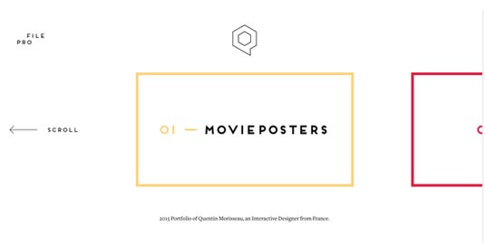
The portfolio site for Quentin Morisseau uses white space well. The user's attention is focused mostly on one menu option at a time because only one dominates the screen.
He smartly includes enough of the other options so the user knows they can scroll through – but not too much to detract from the first.
03. Clashing colors make elements stand out
Emptiness isn't the only way to influence your user's visual flow. Colors, specifically complementary ones, will also stand out on any given page.
Each color has a natural complement that contrasts it. A color's complement is the one directly opposite it on a color wheel like the one below. For example, red's complement is green, blue's complement is orange, and so on.
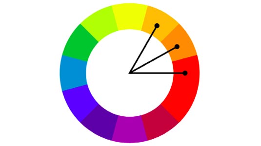
What this means in web design is that complementary colors can help draw greater attention, making them perfect for calls-to-action, promotions, or any other element you want your users to see.
This is seen quite commonly in call-to-action buttons – if your background is dominantly purple, a yellow button would be sure to be seen.
04. Consistency aids learnability
Visual consistency is not just something to keep perfectionists happy – it actually serves a very practical usability purpose.
The importance of visual consistency is that establishes a pattern that instructs your visitors on how to use the site. A consistent use of the same attributes – colors, typography, location, etc. – improves how quickly your users pick up on how your system works.
Take, for example, how you handle internal and external links. Like most sites, you might put links in blue and underlined, but how do you differentiate between in-site and off-site links? You might change to a different color, like Reddit below: external links are blue, while internal links are gray (both are underlined when hovered over to show they're clickable).

It doesn't matter so much how you separate your elements, so long as you stick with whatever method you choose. All blue text on Reddit is an external link, without exception.
When you maintain this kind of consistency site-wide, you begin to quickly and subconsciously "teach" your user how to use a site. After a few minutes on Reddit, users will know that the gray text in parenthesis next to the title, "(imgur.com)" in the example, will send them to another Reddit page, even though the context is clearly a link to the other site. The power of visual consistency is stronger than even logic – once a pattern is set, it's hard to break.
Compare a visually consistent site with one that isn't. If Reddit sometimes used red text for external links, the user wouldn't know what to think. They'd have to relearn the system in order to continue using the site – which means they'd probably say forget it and leave.
05. Each color has unique psychological effects
Colors are a direct gateway into people's moods, and in web design can be a quick and effective method for exhibiting a specific atmosphere or theme. The specific properties of each color is something artists have known for centuries, and their science of Color Theory is no less useful in web design.
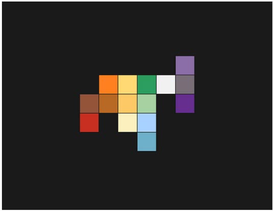
There's no one color that's generally better than others (although blue is quite popular for websites across multiple industries, given its friendliness and trustability). Colors can be used to enhance and encourage the right mood for whatever purpose your site serves – but first you need to know which colors do what.
Below we'll give a very basic overview of what characteristics the primary colors, when used dominantly, will lend to your site:
- Red – powerful, passionate, alarming
- Orange – playful, friendly, inexpensive
- Yellow – happy, alert, warm
- Green – natural, prosperous, balanced
- Light Blue – serene, inviting, refreshing
- Dark Blue – trustworthy, professional, secure
- Purple – luxurious, romantic, mysterious
- Black – sophisticated, edgy, oppressive
- White – clean, virtuous, simple
- Gray – neutral, formal, gloomy
These are merely an oversimplication. For more meticulous analysis of the psychological effects of colors, plus real site examples that use them well, check out Cameron Chapman's excellent piece.
Conclusion
Asking "What do you want your site to be like?" is not far off from "What do you want your site to look like?" Your users' perceptions are the reality, and visuals shape their perception. Designing a website without knowing the science behind human site is like building a table without knowing a thing about wood. Visuals are the materials web designers work with.
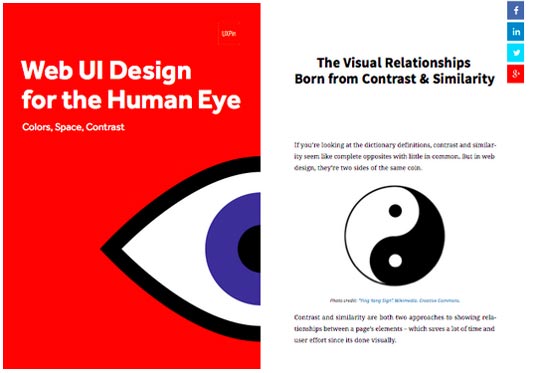
The Web UI Design for the Human Eye series aims to share the knowledge every designer should know about eyesight and how it relates to UI design. In the Colors, Space, and Contrast volume, we discuss:
- the essential Gestalt principles – how they work, and how to apply them to web design
- the elements of spatial design for web interfaces
- how to space out elements on a page in a way to optimize user interaction
- what "chunking" is and how it works inherently with human memory
- the different types of contrast and when to apply each
- the most crucial areas for visual consistency
- the psychological impacts of each color
- the most common color schemes for the web, and how to apply them
If the topic sounds interesting, feel free to check it out in UXPin's free library.
Words: Jerry Cao
Jerry Cao is a content strategist at UXPin — the wireframing and prototyping app. To learn more about how to create visually digestible interfaces, download the free e-book Web UI Design for the Human Eye: Colors, Space, Contrast.
Like this? Read these!
- 10 web design trends for 2015
- How to build an app: try these great tutorials
- Free graphic design software available to you right now!

The Creative Bloq team is made up of a group of art and design enthusiasts, and has changed and evolved since Creative Bloq began back in 2012. The current website team consists of eight full-time members of staff: Editor Georgia Coggan, Deputy Editor Rosie Hilder, Ecommerce Editor Beren Neale, Senior News Editor Daniel Piper, Editor, Digital Art and 3D Ian Dean, Tech Reviews Editor Erlingur Einarsson, Ecommerce Writer Beth Nicholls and Staff Writer Natalie Fear, as well as a roster of freelancers from around the world. The ImagineFX magazine team also pitch in, ensuring that content from leading digital art publication ImagineFX is represented on Creative Bloq.
