Build a static site with Material Design Lite
Discover the template that allows you to add a Material Design look.
Material Design Lite is a frontend website template that enables you to easily add a Material Design look and feel to your projects. MDL was designed for static websites, as we wanted it to be framework and toolset agnostic. However, this doesn't mean you can't customise it for your own website layout needs – MDL is just the starting point. In this tutorial we will be making a simple portfolio web site with a blog, About section and contact form.
Initial HTML setup
First, create a blank HTML page and in the <head> of the document, add <link> tags to the typeface Roboto, MDL CSS file and the MD icon font, starting with the typeface stylesheet.
<link rel="stylesheet" href="https://fonts.googleapis.com/css?family=Roboto:regular,bold,italic,thin,light,bolditalic,black,medium&lang=en">Next, add the MDL CSS doc, which contains all the styles we will use.
Article continues belowThe Material Design colour schemes are based on a primary colour and accent colours. These are specified in the CSS file name as follows: material.{primary}-{accent}.min.css. Our CDN hosts a number of combinations based on common Material Design shades. Here, we've used grey and pink:
<link rel="stylesheet" href="https://storage.googleapis.com/code.getmdl.io/1.0.6/material.grey-pink.min.css" />Icons are required for some of the components, so add a link to that here also.
<link rel="stylesheet" href="https://fonts.googleapis.com/icon?family=Material+Icons">The last file to link to is the JavaScript file. This should be added to the bottom of our HTML page, just before the closing </body> tag.
<script src="https://storage.googleapis.com/code.getmdl.io/1.0.6/material.min.js"></script>Finally, we need to include the <meta> viewport tag in the <head> of our page, so mobile devices will render correctly.
Sign up to Creative Bloq's daily newsletter, which brings you the latest news and inspiration from the worlds of art, design and technology.
<meta name="viewport" content="width=device-width, initial-scale=1.0">MDL Layout component
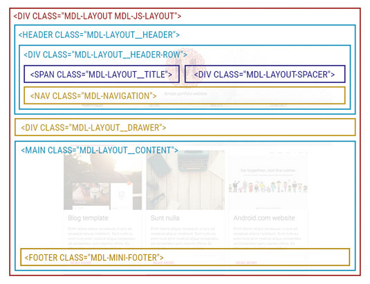
MDL has a number of different components, which can be used collectively or individually. The layout is considered a component that can be modified to suit your needs, and automatically adapts to different browsers, screen sizes and devices.
The basic structure of a page has a <div> with the CSS classes mdl-layout and mdl-js-layout. These classes contain all the data on the page. Inside the main container, add a <header> tag for navigation with a mdl-layout__header class. Finally, inside the <header>, write a <div> with a mdl-layout__header-row, which will contain the header content.
<div class="mdl-layout mdl-js-layout">
<header class="mdl-layout__header">
<div class="mdl-layout__header-row">
</div>
</header>
</div>
Next, add content to mdl-layout__header-row. Start by creating a div with a mdl-layout__title class and add the website title. Then add a nav tag with a mdl-navigation class and in here add a href tags for each of your links. Each link needs a mdl-navigation class.
<span class="mdl-layout__title">Simple portfolio website</span>
<nav class="mdl-navigation">
<a class="mdl-navigation__link" href="#">Portfolio</a>
<a class="mdl-navigation__link" href="#">Blog</a>
<a class="mdl-navigation__link" href="#">About</a>
<a class="mdl-navigation__link" href="#">Contact</a>
</nav>
Notice the navigation aligns to the left, next to the title. If you would like it to sit to the right, add a spacer <div> between the title and navigation.
<!-- Title -->
<div class="mdl-layout-spacer"></div>
<!-- Navigation -->
Finally, lets add the layout drawer. This will hold the slide-out content that appears on smaller screens and may be opened with the menu icon on any screen size. For this you pretty much replicate what we have in the navigation, except the spacer now needs to sit outside the <header> tag.
<header class="mdl-layout__header">
<!-- header content and navigation -->
</header>
<div class="mdl-layout__drawer">
<span class="mdl-layout__title">Simple Layout</span>
<nav class="mdl-navigation">
<a class="mdl-navigation__link" href="#">Portfolio</a>
<a class="mdl-navigation__link" href="#">Blog</a>
<a class="mdl-navigation__link" href="#">About</a>
<a class="mdl-navigation__link" href="#">Contact</a>
</nav>
</div>
If you already have content on the page, you will notice that on mobile screens the drawer button is floating on top of the content. This is to enable developers to define how much margin/padding appears above the content. To push the content down, you need to tell MDL that the header needs to be fixed by adding the mdl-layout--fixed-header class to the initial <div> container.
<div class="mdl-layout mdl-js-layout mdl-layout--fixed-header">
<!-- Rest of the HTML page -->
</div>
To finish up the page you need to add a <main> tag that will house all the primary content. The basic structure should look like this:
<div class="mdl-layout mdl-js-layout mdl-layout--fixed-header">
<header class="mdl-layout__header">
<!-- header content and navigation -->
</header>
<div class="mdl-layout__drawer">
<!-- drawer -->
</div>

<main class="mdl-layout__content">
<p>Hello world!</p>
</main>
</div>
The grid component
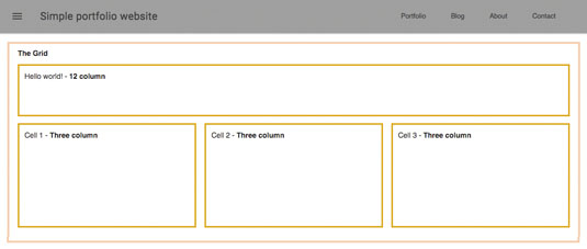
The MDL grid has been designed to reduce the usual coding burden required to lay out content for multiple screen sizes. The grid is defined and enclosed in a container element with the CSS class mdl-grid. It has 12 columns for desktop, eight for tablet and four for mobile, each size having predefined margins and gutters.
To use the grid, add a <div> inside your content container, with the mdl-grid class attached.
<main class="mdl-layout__content">
<div class="mdl-grid">
<p>Hello world!</p>
</div>
</main>
The cells/columns will be defined inside the grid. There are two CSS classes to add here: the general cell class mdl-cell and the mdl-cell--COLUMNS-col class, where COLUMNS specifies the cell width.
<div class="mdl-cell mdl-cell--12-col">
<p>Hello world!</p>
</div>
<div class="mdl-cell mdl-cell--4-col">Cell 1</div>
<div class="mdl-cell mdl-cell--4-col">Cell 2</div>
<div class="mdl-cell mdl-cell--4-col">Cell 3</div>
In this example, the first row "Hello world!" is full-width (12 columns) and the second row has four cells (three columns). This second row will stay as a three-by-three column grid until it reaches less than 480px.
You can target devices with specific classes here by adding the mdl-cell--COLUMNS-col-DEVICE class. If you want your tablet layout to look similar to a desktop layout, you should add these classes to make the last two cells appear as two columns with a full-width one before it:
<div class="mdl-cell mdl-cell--12-col-tablet">Cell 1</div>
<div class="mdl-cell mdl-cell--4-col-tablet">Cell 2</div>
<div class="mdl-cell mdl-cell--4-col-tablet">Cell 3</div>
Footer
There are two types of footer: a mega and a mini. In this example we'll use a mini footer, which has a content structure made up of left and right sections, with CSS classes for each (mdl-mini-footer__left-section and mdl-mini-footer__right-section respectively). Inside, we have a <div> for our logo/title and a <div> for our link list, which appears as a row.
Where we add the footer in the markup depends on the desired effect. If we would like to have the footer fixed, we need to to add it after the <main> tag. If we want it to scroll and appear after our content, we add it inside the <main> tag.
<footer class="mdl-mini-footer">
<div class="mdl-mini-footer__left-section">
<div class="mdl-logo">Portfolio website</div>
</div>
<div class="mdl-mini-footer__right-section">
<ul class="mdl-mini-footer__link-list">
<li><a href="#">Help</a></li>
<li><a href="#">Privacy & Terms</a></li>
</ul>
</div>
</footer>
Customising the layout
You can customise the layout by hiding the mdl-layout__drawer on desktop. To do that, add the mdl-layout--small-screen-only class to the drawer container. Afterwards, remove the mdl-layout-spacer from the <header>. To centre the title and navigation, place the nav in its own mdl-layout__header-row and then write some custom CSS.
.mdl-layout__header-row {
padding: 0;
justify-content: center;
}
To hide the navigation when scrolling down the page, you can now apply a waterfall technique to the <header> by adding the class mdl-layout__header--waterfall to the <header>. This way users can focus solely on the content (remember, this will only work when there is enough content to scroll).
The final structure should look like this:
<header class="mdl-layout__header mdl-layout__header--waterfall">
<div class="mdl-layout__header-row">
<span class="mdl-layout__title">Simple Portfolio Layout</span>
<div class="mdl-layout-spacer"></div>
</div>
<div class="mdl-layout__header-row">
<nav class="mdl-navigation">
<a class="mdl-navigation__link" href="#">Portfolio</a>
<a class="mdl-navigation__link" href="#">Blog</a>
<a class="mdl-navigation__link" href="#">About</a>
<a class="mdl-navigation__link" href="#">Contact</a>
</nav>
</div>
</header>
The card component
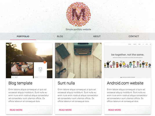
In this example, the portfolio page will feature each piece of design work via MDL cards. The card component is a virtual piece of paper that contains text, images and links.
The default grid for MDL is three cards in a row for desktop, two for tablet and one full-width for mobile. If this is the grid you're looking for, you won't need to add any mdl-cell--COLUMNS-col numbered classes. We can even add these column cell classes directly onto the cards without a separate <div> container.
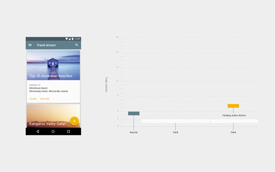
To add a shadow for the card, use mdl-shadow--2dp class. The dp number in the class ranges from 2 to 24, and it controls the depth of the shadow.
<div class="mdl-cell mdl-card mdl-shadow--4dp">
<div class="mdl-card__title">
<h2 class="mdl-card__title-text">Example Title</h2>
</div>
<div class="mdl-card__media">
<img src="../images/photo.jpg" border="0" alt="">
</div>
<div class="mdl-card__supporting-text">
Text
</div>
<div class="mdl-card__actions mdl-card--border">
<a class="mdl-button mdl-button--colored mdl-js-button mdl-js-ripple-effect">
Read more</a>
</div>
</div>
To add a max-width to the grid, you need to include some more custom CSS. The cards are responsive by default, so you can add the class to the parent grid and they'll adjust automatically.
.portfolio-max-width {
max-width: 900px;
margin: auto;
}
Individual pages
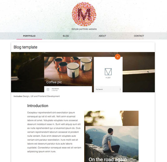
For the individual portfolio pages you can use the same card component as before, with full-width cells. In the code below, there's an additional grid for the copy and images, to break up each section, and a utility class no-padding to remove undesired space.
<div class="mdl-cell mdl-cell--12-col mdl-card mdl-shadow--4dp">
<!-- Title, photo and caption -->
<div class="mdl-grid portfolio-copy">
<h3 class="mdl-cell mdl-cell--12-col mdl-typography--headline">Introduction</h3>
<div class="mdl-cell mdl-cell--6-col mdl-card__supporting-text no-padding">
<p>Text</p>
</div>
<div class="mdl-cell mdl-cell--6-col">
<img src="PHOTO" border="0" alt="">
</div>
</div>
</div>
To add social share buttons to each post, use the tooltip component. The IDs should be unique, as they reference the container for each tooltip.
<div id="tt1" class="icon material-icons">share</div>
<div class="mdl-tooltip" for="tt1">
Share your content<br>via social media
</div>
The last page is the contact form. Let's look at the text field component, which is essentially an enhanced version of <input type="text"> and <input type="textarea">. There are some transitions you can apply to the text field (e.g. expanding the input when a button is pressed). You can also add a pattern attribute and value to the <input> and associated error message in a <span>.
<div class="mdl-textfield mdl-js-textfield mdl-textfield--floating-label">
<input class="mdl-textfield__input" pattern="[A-Z,a-z, ]*" type="text" id="Name">
<label class="mdl-textfield__label" for="Name">Name...</label>
<span class="mdl-textfield__error">Letters and spaces only</span>
</div>
The final component is a button for the form. There are many variations of this component, including raised, icon and flat buttons. Here we have a simple, raised submit button that shows a ripple effect when it's pressed. The different classes indicate the effects attached to the button.
<button class="mdl-button mdl-js-button mdl-button--raised mdl-js-ripple-effect mdl-button--colored" type="submit">
Submit
</button>
FIN
Now your layout is complete, you can start adding specific design elements to it. Alternatively, you can sketch a new layout first and try to recreate it using the grid. On the MDL website there are a bunch of templates you can refer to. There are many utility classes on the getmdl.io website for each component, so check there first before you start writing your own custom CSS. Now get designing!
The author has created an exclusive screencast to go with this tutorial:
This article originally appeared in issue 277 of net magazine; subscribe here.
Related articles:
