Design responsively with wireframes
Tom Green explains the concept of the content wireframe and how it can transform your responsive web design process for the better.
Sign up to Creative Bloq's daily newsletter, which brings you the latest news and inspiration from the worlds of art, design and technology.
You are now subscribed
Your newsletter sign-up was successful
Want to add more newsletters?
As I was leading my Responsive Web Design (RWD) classes between 2011 and 2012, I kept stumbling over the process of wireframing.
My students tended to focus on the wireframe as the end game in the planning process and then spent an too much time trying to wrestle their designs into the wireframes. They weren't understanding the simple fact that RWD focuses on how the user will access the content.
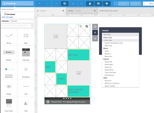
You can only imagine my relief when I happened to come across a video by Stephen Hay where he was speaking at the Beyond the Desktop conference in 2012 and there, in his RWD talk, he presented the concept of the Content Wireframe. This was a huge relief for me.
I just knew there was a step before the process got real but I couldn't articulate it. In this piece, I'll describe how to create content wireframes for responsive design and provide a quick tutorial.
If you'd like to learn more, feel free to check out the free Guide to Interactive Wireframing. I explain powerful techniques for creating static, interactive, and even animated wireframes.
The content wireframe
The content wireframe concept is rather simple to understand: Fall in love with the user, not the technology.
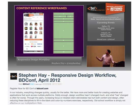
Content wireframes block out general content categories and force you, as Stephen so beautifully put it, to design from the content outwards.
Sign up to Creative Bloq's daily newsletter, which brings you the latest news and inspiration from the worlds of art, design and technology.
It really isn't complicated. In fact, it involves two steps:
- Create a content inventory.
- Create a visual hierarchy of the survivors of that list.
Do that and you have a potential deliverable for your client. What it tends to do is to pull the client's attention away from what "thing" goes where and focuses his or her attention on what is important: the flow of information.
It's not rocket science
The key issue around wireframes, for my students and other designers, is wireframes tend to take on unwarranted importance.
It is almost like the end of a renovation TV show where everyone "oohs" and "ahhs" as the client gets to walk through the project.
Not for me. I prefer the scene where the contractor, during a kitchen renovation, pulls out a piece of paper and a carpenter's pencil and sits down with the client at the kitchen table. Then he or she draws a simple outline of the room and says," How about we pull out this wall, put an island here and move the counter over there?"
The carpenter is laying out his "intent" around his approach to the project and the client is focusing on the important parts of the project rather than focusing on tiles, fixtures, paint and lighting.
In his book, Responsive Design Workflow, Hay calls these things Content Reference Wireframes because they "describe how the wireframes deal with content: they simply refer to it as opposed to depicting it."
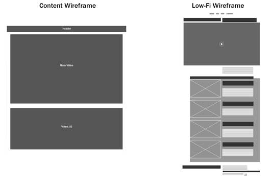
Content wireframes, like our contractor's sketch, depict placement – a wall, a counter, a header, a footer – and establish an information hierarchy and flow. Due to the fact these things are iterative, starting the conversation with a simple "How about …" rather than "Here's how …"
Once that is established, we can then move into the LoFi and HiFi wireframe development process. Let's see how how a Content Wireframe can focus the conversation by deconstructing a simple page.
Deconstructing This is Made by Hand

I visit This is Made By Hand on a regular basis. As the name suggests, the site celebrates artisans who actually make things by hand. The home page features a series of videos and ,when you first visit, it appears to be rather stark with very few flourishes. This makes sense because the films, not anything else, are the important content.
As I described in the free ebook Guide to Interactive Wireframing, the content inventory for the homepage is, understandably, rather basic consisting of:
- Header/nav
- Five videos (For the purposes of this article they will be labeled Main and Videos 1-4)
- Footer
Still, we can see there is a definite information hierarchy at play here. The list is a bit vague, but once you understand the plan is to create a series of videos highlighting a craftsman, the priority of each piece of content establishes itself:
- The Main video
- Videos 1-4
- The footer
- The header/nav
It may strike you as a bit odd to see the Header/Nav content at the bottom of the stack. Actually, the whole purpose of the page is to get users to watch the videos and, if they like them, to subscribe to regular notifications about new content. The Header/Nav content is simply there to provide easy navigation around the site.
In many respects the old adage – "Content is king" – which is generally attributed to Bill Gates – drives this site. The important content is a collection of videos and nothing else. This raises an important point: A content reference wireframe establishes content precedence, not page flow. With that list in hand you can move on to actually creating the Content Reference Wireframes.
Content Reference Wireframes in UXPin
Though Stephen Hay is a big proponent of creating these content reference wireframes using a code or text editor such as Coda or Abobe's Brackets, for those of us who are, shall we say "code challenged", a visual editor such as UXPin is a good choice.
Here are my personal reasons why:
- The Responsive feature let's you start with a "Mobile First" approach and, using preset or customizable breakpoints, you can quickly build out to a desktop version.
- Customizable grids allow for consistency of design.
- Notes and comments allow you to communicate your intent to the team and the client, making collaborative design much simpler.
Let's look at how each of these features helps create a Content Reference Wireframe.
Mobile-First content wireframes
For this quick tutorial, we'll take a mobile-first design approach to help us focus on just the most important content. To get an idea of what we're creating, you can take a quick glimpse at the finished content wireframe.
01. When you first create the project you are taken to a default surface.
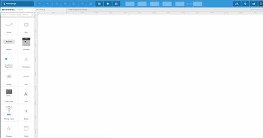
02. UXPin has an Add responsive version menu item. Click it and a pop down containing a number of presets will appear. I started with the iPhone 320 px option.
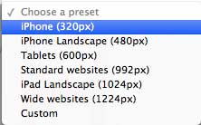
03. Next, I deleted the Default canvas. This left me with just a mobile canvas which was what I needed.

04. I then added a Box and a Text element to the design surface. When you add an element, the Properties for the selected Element open in a dialog box.
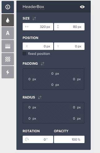
05. For the box, I filled it with a dark gray and set its width to 320 pixels. The text was set in a bold Arial , centered in the text area and colored white. For a Content Reference Wireframe that's all you need because you only want to Reference Content.
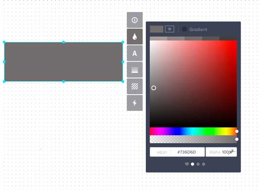
Everything else to be added to the page was simply a variation of this theme.
06. Instead of "reinventing the wheel", with the Shift key held down, I selected both the box and the text and then, using the Click- Option-Shift- Drag technique (PC users can substitute the Alt key for the Mac's Option key), dragged a copy of the header into place. I changed the text to "Main Video" and , to stress this element was at the head of the hierarchy, changed the box height to 320 pixels. I repeated this step for the next four boxes but changed their height to 255 pixels.
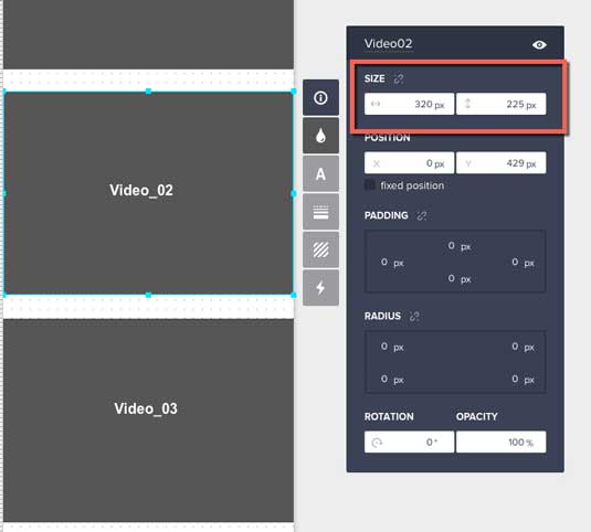
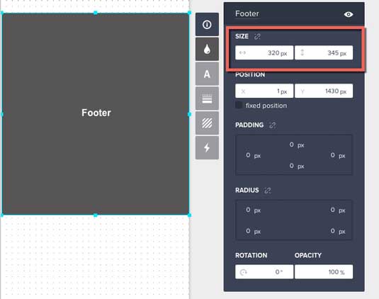
07. The Footer was also important. To make it noticeable and to accommodate the eventual inclusion of a Subscribe feature, I changed the Box height to 345 pixels.
08. Adding the iPad version was a breeze.
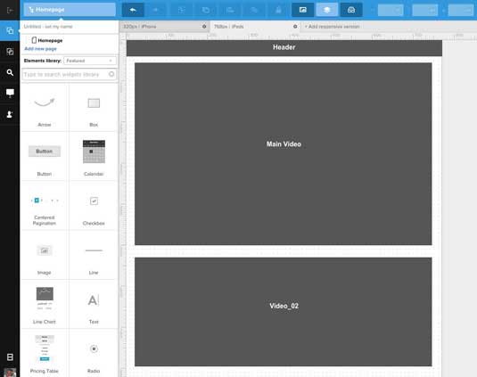
I clicked the Add responsive version link, selected the iPad 768 pixel version and, in the dropdown, selected the iPhone (320) option to copy all of the boxes from the iPhone page to the iPad version. From there it was strictly a matter of rearranging and resizing the elements to reflect the priorities set earlier.
Customizable grids for content wireframes
Now that I've created the rough layout, I'll add some grids to maintain alignment. I am not a huge fan of using "Mark One Eyeball" to place stuff on the canvas.
Though UXPin gives me a number of options – None, Dots and Grid – for the background, I much prefer a Grid with columns to help with content placement.
For the iPad layout I chose to work with a 4-column grid. To access this, you click on the Settings button (which looks like a gear) on the Toolbar. This opens a dialog box that allows me to set numerous grid options and, as shown below, to turn the grid on and off and to place it above or under the content.
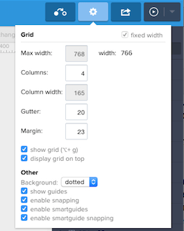
The really useful aspect of the grids is there can be a separate and different grid for each breakpoint. For example, the wide page breakpoint uses an 8-column grid and the 1400 breakpoint uses a 12-column grid.
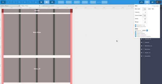
On the surface this may look to be rather basic … and it is. The key takeaway here is the boxes just "reference" the content. We aren't concerned with anything but where the content may be placed. Thus the real use of a grid here, is to ensure the boxes are roughly where they are supposed to be on the page.
The key word is "roughly". The boxes will evolve from their rough form to interactive prototypes as decisions regarding content, colours, typography and so on are made and refined. Still, the boxes used in the Content Wireframe through their position and size will start the process of determining the project's information hierarchy.
Collaborating with clients and the team
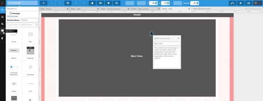
Click anywhere in the page and you can add a short description to the resulting Comment. Once you click the Close button, a pushpin icon indicates the location of a note.
These notes are both visible in both the design and preview modes of UXPin. To open a note just click the push pin.
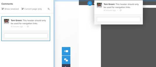
When the page is being viewed in the browser or Preview mode, the team and even the client can also add comments or notes.
When a page is open in a browser, clicking the Comment mode button changes the cursor to a + sign. Click it, add the note and drag to its location. When a Comment is attached to a page, it will be identified with a small numbered red dot. Click it and the comment will open. From there the reader can choose to reply.
Next steps
As you have seen in this piece, there is no big reveal or other excitement around the creation of Content Reference Wireframes. They are in a place in the workflow between the Content Inventory and the LoFi wireframes. This is because their purpose is to simply establish an information hierarchy and, if the client is involved, to get him or her, to think more about the "concept" of content and information flow than the actual content itself.
These things are a part of an iterative process that can and should change. As I pointed out right at the top this entire process is more of a "How about …" conversation than a "Here's how …" conversation. Once everyone is in agreement the next iteration of the project will involve pouring actual LoFi content into the boxes that make up the Content Reference Wireframes.
If you'd like to learn how to take the next step and start wireframing interactively, check out the free Guide to Interactive Wireframing. I help explain how to create lo-fi, interactive, and even animated wireframes using simple techniques and tutorials.
Words: Tom Green
Tom Green is Professor, Interactive Multimedia, through the School of Media Studies at the Humber College Institute of Technology and Advanced Learning in Toronto.
Like this? Read these!
- The best wireframing tools
- Create wireframes that work for you
- How to build an app: try these great tutorials

The Creative Bloq team is made up of a group of art and design enthusiasts, and has changed and evolved since Creative Bloq began back in 2012. The current website team consists of eight full-time members of staff: Editor Georgia Coggan, Deputy Editor Rosie Hilder, Ecommerce Editor Beren Neale, Senior News Editor Daniel Piper, Editor, Digital Art and 3D Ian Dean, Tech Reviews Editor Erlingur Einarsson, Ecommerce Writer Beth Nicholls and Staff Writer Natalie Fear, as well as a roster of freelancers from around the world. The ImagineFX magazine team also pitch in, ensuring that content from leading digital art publication ImagineFX is represented on Creative Bloq.
