Free ebook on content wireframing for responsive design
This guide for faster multi-device UI design is free to download.

Free e-Book: Content Wireframing for Responsive Design is a quick guide for faster multi-device UI design.
The dominance of mobile browsing is triggering an evolution in all areas of web design, and wireframing is no exception.
Content wireframes refer to the on-screen content without actually depicting it. They focus on creating "blocks" of content categories that designers can reshape easily for various breakpoints and percentages.
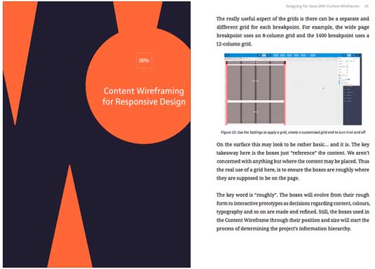
Content Wireframing for Responsive Design explains everything a designer needs to know about content wireframing, a best practice for structuring responsive design. The book is written by Adobe-certified author Tom Green, who also serves as a Professor of Interactive Media at Humboldt College.
Tom Green explains how to wireframe multiple content categories, and the three-step process for creating responsive wireframes yourself. This e-book, part of the free design library from the prototyping app UXPin, discusses:
- 3 useful wireframing processes (and how mockups and prototypes fit in)
- How to create a content inventory, assign priorities, and carve out a visual hierarchy for responsive design
- Design teardown in which a popular site is rebuilt with mobile-first wireframes
- How to make your own content wireframe in 8 steps, with screenshots
- How to create a customizable grid to organize content across multiple screen sizes
Liked this? Try these...
Sign up to Creative Bloq's daily newsletter, which brings you the latest news and inspiration from the worlds of art, design and technology.

The Creative Bloq team is made up of a group of art and design enthusiasts, and has changed and evolved since Creative Bloq began back in 2012. The current website team consists of eight full-time members of staff: Editor Georgia Coggan, Deputy Editor Rosie Hilder, Ecommerce Editor Beren Neale, Senior News Editor Daniel Piper, Editor, Digital Art and 3D Ian Dean, Tech Reviews Editor Erlingur Einarsson, Ecommerce Writer Beth Nicholls and Staff Writer Natalie Fear, as well as a roster of freelancers from around the world. The ImagineFX magazine team also pitch in, ensuring that content from leading digital art publication ImagineFX is represented on Creative Bloq.
