How to design a low-fi wireframe
Lo-fi wireframes will save you time and heartache by helping you structure your site content effectively. Tom Green explains how to create them.
Sign up to Creative Bloq's daily newsletter, which brings you the latest news and inspiration from the worlds of art, design and technology.
You are now subscribed
Your newsletter sign-up was successful
Want to add more newsletters?
Lo-fi wireframes help you decide how to structure your site content. In this piece, we explore the entire process and suggest that it's also worth adding interactivity to lo-fi wireframes.
You'll be able to start the process of interaction design, which adds context to the usual boxes and arrows.
Let's get started by distinguishing between content wireframes and lo-fi wireframes, then we'll explain wireframe fidelity and adding interactions. Our goal is to give you a practical understanding of how to move between the stages of wireframing.
From content wireframe to lo-fi wireframe
Although a content wireframe is a good first step in the UI/UX workflow, it is nothing more than a rough map that shows landmarks on the page. Content wireframes are the first step of wireframing since you block out large chunks of space for different categories of content.
Once you've done that, you can further carve out what each content section looks like in a lo-fi wireframe.
Here's an example of a content wireframe:
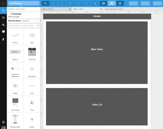
As described in the free Guide to Interactive Wireframing, if the content wireframe shows the location of where things are, then lo-fi wireframes provide the context for what is there. Think of a lo-fi wireframe like a zoomed-out version of Google Maps – you can see more context (state boundaries, major cities, highlighted geographic features), but not every person or car on the road.
Sign up to Creative Bloq's daily newsletter, which brings you the latest news and inspiration from the worlds of art, design and technology.
Lo-fi wireframes are the blueprint for design. They connect the underlying structure (or information architecture) to the surface (or visual design) of a website or mobile app.
Here's an example of a lo-fi wireframe:
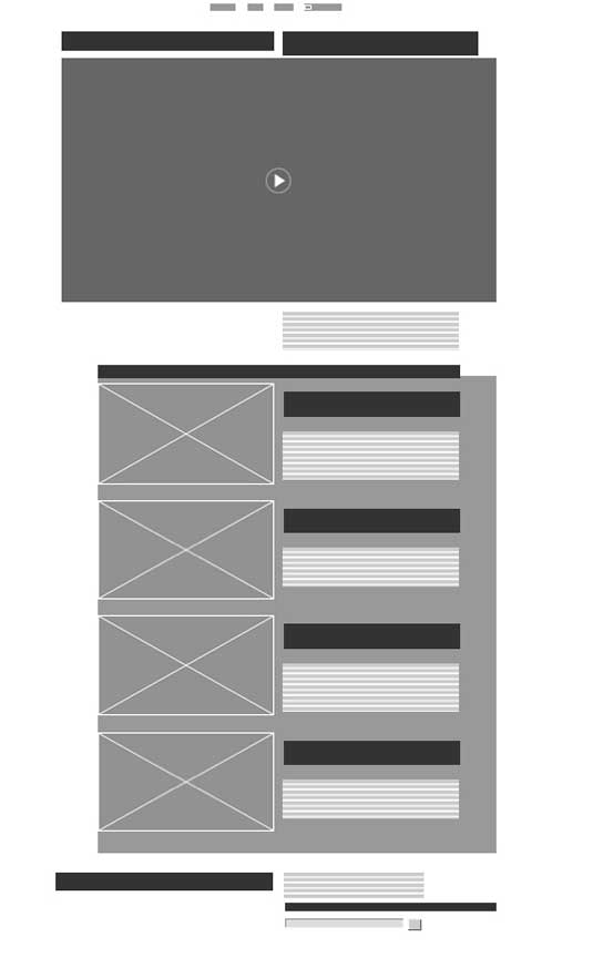
More specifically, lo-fi wireframes communicate the following details to everyone on the team:
- Structure – How will the pieces of this site be put together?
- Content – What will be displayed on the site?
- Informational hierarchy – How is this information organized and displayed?
- Functionality – How will this interface work?
- Behavior – How does it interact with the user? And how does it behave?
Lo-fi wireframes do not represent the visual design or convey the brand or identity.
What you can gather from this is, as Sergio Nouvel so succinctly put it in UX Magazine, "lo-fi wireframes are meant to communicate a visual idea and explore possibilities rather than document a design".
The value of content wireframing
Lo-fi wireframe add context to all the blocks in the content wireframe. It answers the inevitable question: "What's in those grey boxes?"
In modern design processes, lo-fi wireframes force you to step away from overcommitting to static designs. Because wireframes are a stepping stone to prototypes, the more visual detail you add to a wireframe without testing with users, the more time you've spent working on a design that might not even work.
To learn how to see in low fidelity, Wirify by Volkside is an excellent tool for designers of all experience levels. Wirify is a Firefox widget that reduces a web page to a lo-fi wireframe. Just open a web page, click the Wirify link on the Bookmarks toolbar and the site is reduced to its page structure by hiding the content and showing a lo-fi wireframe in its place.
Of course, Wirify won't actually help you build your own wireframe. But it is an excellent reference for understanding the right level of detail for lo-fi wireframes.
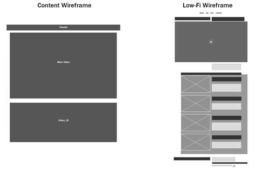
In the above example, you can see how we carve a content wireframe into a low-fi wireframe.
The content wireframe helps 'section off' parts of a site. Since you can quickly create content wireframes, you can move these sections around like large puzzle pieces. Once you feel comfortable with the rough visual hierarchy, you can flesh out the structure of each section (at this point, the wireframe becomes a lo-fi wireframe).
In this case, the content wireframe helps us understand how we'd lay out a page to support a main video and secondary video. As we then sculpt it into a low-fi wireframe, we further define the primary/secondary visual hierarchy – we've now iterated the layout to support up to 4 secondary videos along with text descriptions.
The content wireframe helps us play with space, while the lo-fi wireframe helps us make that treatment sustainable across a whole site.
How low should you go?
For lo-fidelity wireframes, you can get away with greyed out boxes, X-ed out images, and repeated lines to represent text.
In the lo-fi Wireframe we showed before, we carved the content blocks (Header, Main Video, Video 2) into a clearer visual hierarchy. What we don't need to know yet is what text, what photos and which videos will be used (as well as other details like fonts, colors, etc.). They just add unnecessary detail which is best left to the mid-fi wireframe described in Guide to Wireframing. Nonetheless, we've still identified where all these items will go.
Let's think about this as if we were building a house. The lo-fi wireframe is the point where the contractor opens his laptop or tablet and presents the floor plan. The conversation is , "I see a fridge here. The stove here. A window here…" What you don't see is paint color, appliance make and model, countertop material or anything else that makes up a kitchen.
Even the use of color in the wireframe should be kept to a minimum since they add detail, (which can distract or even add confusion).

A frequent issue I've seen with wireframes and prototypes is the variety of colors or grayscale shades, line weights, font types, and element sizing or layout – all without much thought, if any.
This adds confusion as you don't know whether these slight variations should translate to variations in the end-product and, if so, what they will communicate. It's as if someone did graphic design without a style guide, or some-one spoke the English language without ever reading a page of the Oxford English Dictionary.
For lo-fi wireframes, the goal isn't depth so much as breadth – you're creating a skeleton of the site, but don't forget to include all the important bones.
Annotating wireframes
It never ceases to amaze me how, in a digital universe, that we revert to a flat, non-interactive medium when it comes to lo-fi wireframes.
Wireframes are a communication vehicle. It's even better if they communicate behavior, which means showing how the wireframe interacts or behaves with the user. Once we move from the sketch to computer, there is no reason why interactivity can't be added to a lo-fi wireframe. At the minimum, you should annotate how the interactions might work.
For example, if you see a button or hyperlink on a web page, you know it allows for clicking. The jog controller on the YouTube player allows for sliding. When elements are polished, their functions are clear.

But when you're working in a flat medium, annotations help ensure that these functions are crystal clear. They can get misinterpreted at times.
For example, in UXPin (which is the tool that I'm most familiar with), you can add tooltips that are tied to mouse events. Let's assume a user moves a mouse over an image placeholder in a wireframe.
You could add a tool tip explaining, "This is a poster frame from a video." One other advantage to using tooltips is they can be used as the Annotations commonly seen in lo-fi wireframes without the confusion of lines and legends.

In the case of a 'Home' navigation button, added in UXPin for example, you can create the box with the text and add a tooltip that explains what the button does. From there you would turn off the visibility of the tooltip and, using the Properties for the button element, add a rollover event that makes the tooltip visible and a click event that navigates to that page in the project.
When tested in a browser (see above) the user not only sees the text in the tooltip but there is a visual clue – the cursor changes to a Pointer Finger – indicating interactivity.
Now let's take this a step further. Once you've actually built out the homepage, you could then click on the 'Home' button and add an interaction so that the button actually works in your wireframe. You wireframe is now interactive with a backup annotation (in case some additional explanation is required for non-designers on your product team).
Interactivity is not a dirty word
Adding interactivity to a lo-fi wireframe may strike some as being 'overkill'. Others may feel it's pointless because the interactive elements are not as robust as they will become in the high-fidelity prototyping phases of the project.
These are valid objections but what they also do is avoid answering the inevitable question,"How does this work?" The answer can only be provided by adding 'light interactivity'. By that we mean very simple code that moves the user from page-to-page or answers questions such as "What does this do?".

A lo-fi wireframe is also a great opportunity to establish 'how' the user will interact with the content. At this stage, light interactivity is all that is needed. Even so, the importance of adding 'light interactivity' can't be understated.
Intrinsic to 'how' interactivity is applied is the story around 'what' happens when interactivity is triggered. You might ask yourself the following questions:
- Is there a color change?
- Is there a dialog box?
- Does the interactive element grow or shrink in size?
There are dozens more questions that can be asked and, depending on the complexity of the project, the lo-fi wireframe stage of the process is a great place to start exploring them with interactions. These interactions could be added to:
- Navigation menu items
- Call-to-action buttons
- Pop up windows or modals
- Alert or dialog boxes
As an iterative process you have the freedom to play low risk "What if …" games as the story around that interactive element changes or is refined. Once that story is locked in at the end of the lo-fi process, you can refocus to make the interactive experience deeper and richer.
Conclusion
Lo-fi wireframing is no longer a 'rough idea of where stuff goes'.
By concentrating solely on what is required, what goes where on the page, and the information hierarchy, the lo-fi wireframe allows the basic layout of the pages to become the skeleton upon which the project will be constructed.
At the same time we are concentrating on the content, we also need to start the process of addressing interactivity and user experience. There are some pretty powerful tools that allow us to add 'light interactivity' and to communicate to the entire team the purpose of an interactive element in the wireframe.
Keep in mind that lo-fi wireframing is an iterative process. Iterating interactivity, therefore, is just as important as iterating content placement because you start exploring how the user will interact with the content at the start of the process rather than making it up as you go along.
If you'd like to learn how to take the next step and start wireframing interactively, check out the free Guide to Interactive Wireframing. I help explain how to create lo-fi, interactive, and even animated wireframes using simple techniques and tutorials.
Words: Tom Green
Tom Green is Professor, Interactive Multimedia, through the School of Media Studies at the Humber College Institute of Technology and Advanced Learning in Toronto.
Liked this? Try these...

The Creative Bloq team is made up of a group of art and design enthusiasts, and has changed and evolved since Creative Bloq began back in 2012. The current website team consists of eight full-time members of staff: Editor Georgia Coggan, Deputy Editor Rosie Hilder, Ecommerce Editor Beren Neale, Senior News Editor Daniel Piper, Editor, Digital Art and 3D Ian Dean, Tech Reviews Editor Erlingur Einarsson, Ecommerce Writer Beth Nicholls and Staff Writer Natalie Fear, as well as a roster of freelancers from around the world. The ImagineFX magazine team also pitch in, ensuring that content from leading digital art publication ImagineFX is represented on Creative Bloq.
