Very few artists begin work directly on canvas without any prior preparation. Thumbnailing for value and colour is one of the most important painting techniques and is widely practised among artists. It helps to provide an idea of how to paint the image and can save a lot of time while working on commissioned assignments.
The process of thumbnailing involves breaking down of the image into shapes and then dealing with the principles of design with respect to the light and dark portions of the design.
Working in colour could be looked at as an extension of working in value. An image can work and be effective to a certain limit, as long as the values are in place and the design works at the thumbnail level.
Working in colour could be looked at as an extension of working in value
The colours would, at this stage, add to the design by giving it a sense of mood and timing. Colour should always be looked at in relation to value, because every colour has a value and it can be very helpful if the eye is trained to look at colours in terms of the greyscale.
I approach colour by thinking of the colour wheel and how various colours appear in relation to one another. I usually make between four and 10 very quick colour thumbnails, about three inches in height to understand the different colour combinations. Then I choose either the best one or a combination of two for the painting.
01. Idea and Graphite Sketch

This is a sketch for a scene from the science-fiction book, Ender's Game. In the scene, Ender is having a telepathic conversation with the queen bugger – an insectoid alien invader. I've taken quite a few liberties to keep the detail simple. I usually start off very loose, trying to find the right pose and composition. Graphite works best at this stage for me.
02. Value Thumbnails

While planning for a painting, take colour out of the equation and solve composition and value problems on a black and white level. The idea is to create pleasing light and dark shapes, and then fill in the corresponding colours in those shapes. Here I want a cool light against his black hair to create a focal point and hence a lot of my design decisions are made from that.
03. Colour Wheel and Colour Schemes
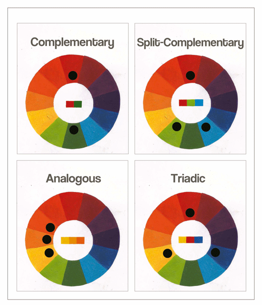
The colour wheel can be simplified to warm colours and cool colours. Combinations of these colours can be used effectively by applying colour schemes and studying the colour wheel in depth. I've highlighted four basic schemes here, each of which can help convey a different mood and effect.
Complementary
These are pairs of colours on opposite sides of the colour wheel. When placed together they have the highest contrast and attract the viewer's eye.
Split -Complementary
This uses colours on the opposite sides of the wheel, but instead of one colour, you use the two on either side of it. This is a personal favourite of mine.
Analogous
Any three neighbouring colours on the wheel. This makes for harmonious and fluid pictures and are great to create an ethereal and dreamy quality.
Triadic
Three colours that are equidistant to each other. They can stand apart from each other in an image while retaining harmony.
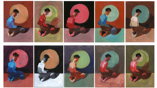
04. Colour Thumbnails
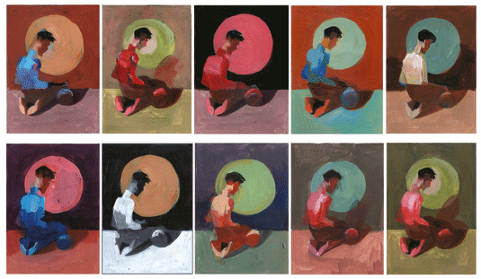
I create thumbnails for the Ender's Game piece, based on these colour schemes. Each of these follows the values that I fixed earlier in step two. It helps to set one colour as the dominant one and then support it with the other colours in the scheme, depending on where your focal point is.
05. Colour Study Before Starting the Piece
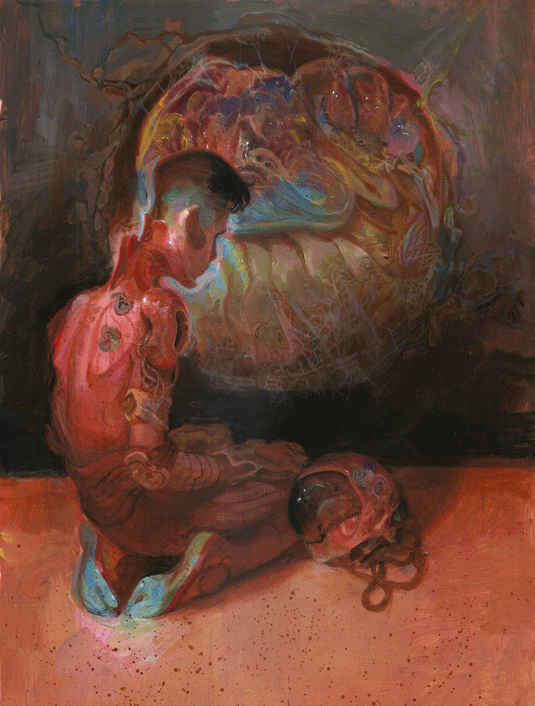
A more refined colour study helps iron out the kinks in your final design. I usually improvise at this stage and at the final stage, just to keep the painting process more engaging. Here you can see that I am using a split-complementary colour scheme with Red-Green-Blue with muted greys to support it. Reds are dominating the picture with accents of blue at the point of highest contrast.
This article was originally published in ImagineFX magazine issue 132.
