Build a portfolio with CSS3 transitions
Build a modern, interactive portfolio page using CSS3 transitions to replace jQuery animation and HTML5 markup, with Andrew Markham-Davies.
Sign up to Creative Bloq's daily newsletter, which brings you the latest news and inspiration from the worlds of art, design and technology.
You are now subscribed
Your newsletter sign-up was successful
Want to add more newsletters?
- Knowledge needed: Basic CSS and jQuery. Experience with jQuery animate() function is a bonus
- Requires: jQuery, Modernizr, a browser and your preferred editor/IDE
- Project Time: 1.5 – 3 hours
- Support file
What are CSS transitions? The W3C draft states: “normally when the value of a CSS property changes, the rendered result is instantly updated, with the affected elements immediately changing from the old property value to the new property value. This section describes a way to specify transitions using new CSS properties. These properties are used to animate smoothly from the old state to the new state over time.”
As simple as this may sound, what it means in the real world is that using CSS transitions is a great way to add interactivity to a modern website. While they’re not supported in all browsers, support is improving, and by using old friends such as Modernizr and Feature Detection, we can use jQuery fallbacks so that older, less supportive browsers need not miss out.
Here we’re going to build a modern, interactive portfolio page using CSS3 transitions to replace jQuery animation and HTML5 markup. We’ll be looking at vendor prefix issues and adding fallbacks for less supportive browsers.
01. The basics of CSS transitions
If you’ve not heard of CSS transitions before, think of them as being native functionality for effects that previously were only achievable in JavaScript or jQuery. If you can do it with jQuery’s animate() function, you can achieve the same effects with CSS transitions – for instance sliders, lightboxes and more.
Both CSS transitions and jQuery animate() essentially do the same thing, which is to transition from one style to another, over a set period of time. The syntax for a transition is:
Article continues belowtransition-property: height;
transition-duration:3s;
transition-delay: 2s;
transition-timing-function: linear;
Or for you lovers of shorthand CSS:
transition : {transition-property} {transition-duration} {transition-delay} {transition-timing-function}
We can also group multiple transitions together if we separate with a semicolon. For example:
Sign up to Creative Bloq's daily newsletter, which brings you the latest news and inspiration from the worlds of art, design and technology.
transition: height 200ms 50ms linear;
width 400ms 500ms ease-in-out;
color 600ms 0ms ease-in-out;
Note that you can also put multiple values on longhand properties. So now we know the syntax, let’s do a simple example, a hover effect on the button/trigger element. Here’s some HTML:
<div class="button">
hover over me
</div>
And some CSS:
div.button{
padding:2px 20px;
height:30px;
width:100px;
line-height:30px;
text-align:center;
border:2px solid #878787;
background-color:#c0c0c0;
border-radius:10px;
margin:20px;
cursor:pointer;
}
Now let’s say we want it to look different on hover, so we add some more CSS on hover:
div.button:hover{
background-color:#ff0000;
padding:40px;
border-width:4px;
border-color:green;
color:#ffffff;
}
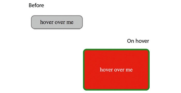
Hover over the button element and the style switches instantly. While this is nice, it could still be better. To take things on a level, let’s add a transition to the hover class:
transition:padding 2000ms 0ms linear;
Wow! Now when we hover, the padding changes slowly, exactly like with a jQuery animation effect, but the other styles just change instantly. That’s because only styles with a transition have the effect; everything else is instant. You’ll also notice that the changes are instant again when you roll off the button element.
Change the CSS. Remove the transition from the hover class, and to both CSS rules add:
transition:all 2000ms 0ms linear
The all denotes that we want all properties to have the transition effect. So now try it out. You will instantly notice that it looks great, and no jQuery animation functions have been used at any point in the process.
02. Why use transitions?
If CSS transitions can achieve the same effects as jQuery’s animate(), why not save yourself the trouble of learning something new and stick to using jQuery? Why use something that isn’t fully supported?
Well, because support is generally good across vendors, the effect on older browsers preserves the same functionality (they switch instantly from one style to another, ignoring the transition rules), and of course then there are the performance benefits:
- Smaller file size Less JavaScript will mean a smaller script file and a lighter site, leading to a faster load time and less blocking when loading script.
- Less scripting work on the client The more we can do with CSS, the faster and more responsive a site will feel, improving user experience.
- Lowers the use of JS libraries, such as jQuery When a jQuery method is used, there are several other functions that are called as part of that. You may think the animate() function is just one call, but its several, and they soon add up. Using CSS to lower calls to the jQuery core improves the performance of your sites and web apps.
- Non supportive browsers retain functionality More on this later. Now consider this jQuery:
$('#element').mouseenter(function(){
$(this).animate({
'style':'value',
'style':'value',
'style':'value'} 600, 'ease-in-out'
);
}).mouseleave(function(){
$(this).animate({
'style':'value',
'style':'value',
'style':'value'} 600, 'ease-in-out'
);
});
While this is not a huge amount of code, having several similar effects will add weight to a JS file – plus there’s the added weight of the jQuery library in the first place. The same can be achieved with CSS transitions. Simply input:
element{
'style':'value';
'style':'value';
'style':'value';
Transition: {values here}
}
element:hover{
'style':'value';
'style':'value';
'style':'value';
Transition: {values here}
}
CSS transitions can also benefit from hardware acceleration when used in some browsers that have this enabled. This offers even more performance benefits over using jQuery’s animate(). It’s also good to consider mobile. With less JavaScript, native effects and hardware acceleration to run, the performance benefits will really add up.
So let’s start with some examples of what we can do, then we’ll put it all together to build a slick application that you could use for portfolios, blogs, image galleries or anything else you’d like to try.
03. Let’s get started
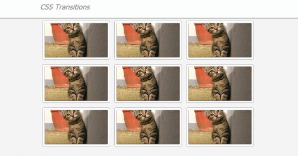
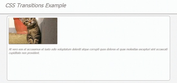
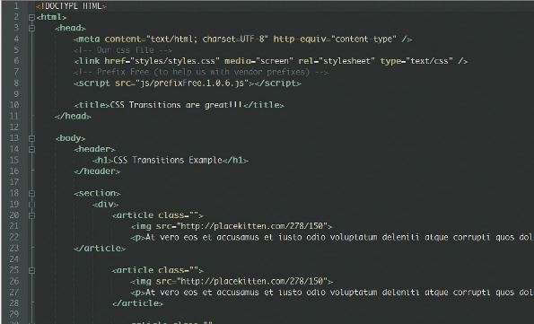
We are going to build some containers, which will show an image relating to a piece of work in our portfolio. The container will have a hover over state that will show a short description, and a click state that will show the full portfolio. We will be using jQuery to change the class on the container, and using CSS transitions to handle all the animation. Here’s our container:
<article class="">
<img src="http://placekitten.com/278/150">
<p> some ipsum here <p>
</article>
The containers are quite simple, with just an image and a paragraph in our example. But you could replace the image for a title/heading, or have any other HTML elements you like. We are using an image here, to give an idea of what the content is about. Think of it as a thumbnail for the full content.
You can find the markup for the full page in the supporting files for this tutorial: just view the source for demo.html.
As you can see, I’ve used some placeholder images from www.placekitten.com, and some ipsum to add the text, but feel free to add anything you want. Just make sure you adjust the height in the CSS.
04. An obvious but often overlooked tip …
I see a lot of sites where the developer has used a form of normalise/reset CSS. While in itself that’s certainly no bad thing, they often paste the CSS where it contains lots of style for tags/markup that aren’t even in the site.
Removing unneeded CSS makes for lighter CSS files and a faster loading page. Try helium.js. It’s a small JavaScript file that scans your site and highlights any CSS your site doesn’t use. You’ll be surprised how much you can safely remove. Here is the complete set-up CSS:
/*
** HTML CSS shiv/fix [Here I’ve used only the elements needed]
*/
article, header, section{display: block;}
/*
** [Some styles to add colour and context to the demo]
*/
html{font-size:100%;text-size-adjust:100%;background-color:#f0f0f0;fontfamily:
Tahoma;font-style:italic;color:#878787;}
body{margin:0;padding:0;height:700px;}
header{height:80px;background-color:#fbfbfb;border-bottom:2px solid
#878787;}
header h1{width:960px;margin:0 auto;font-weight:normal;padding-top:
10px;}
/*
** [Some styles used to create the CSS transition effects]
*/
section{width:960px;margin:0 auto;position:relative;}
section div{float:left;width:318px;}
So we have set the CSS for the article to have opacity:0, when we add the class live it will give a nice fading in effect. The CSS for the live class is:
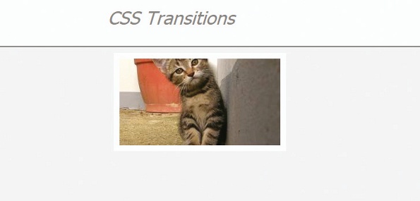
article.live{opacity:1;width:278px;height:150px;}
We then need a :hover state, which will show the short description when the mouse is over each item. The CSS is:
article.live:hover{height:270px;}
Now the CSS is set, we need to add the all-important CSS transition styles. The complete CSS code with transitions is:
article.live{opacity:1;width:278px;height:150px;transition:all 2s;}
article.live:hover{height:270px;transition:all 1s;}
So now all the CSS is in place. However, if you check the page in your browser you won’t see anything. The reason for this is that we need to add the live class to all the portfolio elements on page load. To do that we use some jQuery.
$(function(){
$("article"). addClass("live");
});
At this point we have a nice load effect and a hover effect. What we need now is a click event to show the full portfolio item. We also need a class to hide all the other items, so the focus is on the item the user has selected. We use a full class and a gone class. The CSS is:
article.full{z-index:1;left:0;width:915px;opacity:1;height:350px;transition:
all 4s;}
article.gone{opacity:0;transition:all 1s;}
And the jQuery to add it is:
$("article").click(function () {
$('section div').toggleClass('hidden');
$("article").not($element).toggleClass("gone");
$("article").not($element).toggleClass("live");
$element.toggleClass("full");
$(this).toggleClass("live");
});
We’ve used jQuery to add the CSS classes to the elements, but have avoided calling jQuery animate functions, and have the benefits that fewer JS function calls bring. You could also go further and use pure JavaScript to add the click events and class toggles, to optimise the page even more and make it lighter
Its important to notice that CSS transition means we can use less scripting to create great effects. But until we get a CSS
we’ll have to use some.

05. The polish
So the basic work is done, and it looks very nice, if perhaps just a little plain. So let’s now add a little extra CSS and JavaScript to spice things up.
To begin, when adding the live class I’ll add a random delay on page load. This means the items will load in randomly. To do this, we’ll use a randomly generated number from a preset list of times. This way we can guarantee some noticeably different load times (rather than a totally random number, which could give us values such as 450 and 480: this wouldn’t be very noticeable when converted to milliseconds). Let’s make a function to add a random time delay:
function addDelay(elements) {
var timeArray = new Array(200, 600, 1000, 1400, 1800, 2200, 2600);
for (var count = 0; count < elements.length; count++) {
setTimeout('$("article").eq('+count+').addClass("live)', timeArray[parseInt(Math.random() * 6)]);
}
}
Then call it with our collection of items:
addDelay($(‘articles’));
Then a little extra CSS to smarten up the look. The full CSS is:
article{height:150px;z-index:0;position:relative;overflow:hidden;opacity:0;
margin:10px;padding:10px;float:left;border-radius:10px;backgroundcolor:#
fbfbfb;border:1px solid #878787;transition:height 1s;}
article.live{opacity:1;width:278px;height:150px;transition:all 2s;}
article.live:hover{height:270px;transition:all 1s;}
article.full{z-index:1;left:0;width:915px;opacity:1;height:350px;transition:
all 4s;}
article.gone{opacity:0;transition:all 1s;}
article img{box-shadow:0 1px 2px #000;cursor:pointer;}
06. Now for the older browsers
We now have a slick-looking portfolio page, with animations handled by CSS transitions. So now we arrive at the issue of non-supported browsers – but first let’s take a moment to clarify what I mean by non-supportive. If a browser doesn’t support CSS transitions, the world won’t end. You’ll still get all the style changes that you were after, but they will be instant, much like they were in the first example that we did.
The great thing about this is that you will lose no functionality as a result of non-supportive browsers. The only problem is that it just won’t look quite as slick as in the latest Chrome and all the other posh new browsers.
You could argue against bothering to put in the fallback when functionality remains the same; however, it’s easily added using jQuery, and can be a sticking point with clients who want a consistent user experience. The main non-supportive browsers that you are likely to come across include Firefox 3.5 and lower, as well as Internet Explorer 9 and lower.

We’ll use a Modernizr conditional to check for transition support, adding the jQuery event handlers if it isn’t supported.
Here is the fallback code:
function fullySupported(){
/* we move all our functional JavaScript here, for supported browsers */
}
function nonSupportive(){
/* here is where you fall back would go */
/* fold IE and pre Firefox 3.5 browsers */
}
if(!Modernizr.CSStransitions){
nonSupportive();
}
else{
fullySupported();
}
Then we just need to add some JavaScript for the non-supportive browsers:
$("article").click(function () {
// cache the clicked item
var $element = $(this);
if(!$element.hasClass("full")){
$("article").not($element).animate({'opacity':0},1000);
$element.animate({
'width':'915px',
'height':'350px',
'opacity':1}, 4000, function(){
$(this).addClass("full");
});
}else{
$("article").not($element).animate({'opacity':1},1000);
$element.animate({
'width':'278px',
'height':'150px',
'opacity':1}, 4000, function(){
$element.removeClass("full");
$element.addClass("live");
});
}
});
07. Conclusion
After following these instructions we’ll find ourselves with a slick and modern looking portfolio page that could have several additional uses too (try using it in a WordPress theme and lazy load your blog posts, for instance). It also has fallbacks to preserve functionality and style across a variety of browsers.
Go forth and use CSS transitions. As I’ve already said, if you can do it with jQuery animate(), you can do it with transitions – in fact more so, as you need a plug-in to animate() colours.
Until it’s fully supported you will have to consider using a fallback, whether that’s a little jQuery code to achieve the same effects, or if you’re happy to have an instant change of style with no transition on IE and older browsers. But it won’t be too long before all transition effects are done with CSS transitions, and benefit from the many advantages that they bring.
This article first appeared in issue 233 of .net magazine – the world's best-selling magazine for web designers and developers.
Thanks to Chris Mills for his peer review of this tutorial
Andrew is senior developer at integrated marketing agency Turn Key: www.atmd.co.uk
Liked this? Read these!
- Free graphic design software available to you right now!
- Discover what's next for Augmented Reality
- Download free textures: high resolution and ready to use now

The Creative Bloq team is made up of a group of art and design enthusiasts, and has changed and evolved since Creative Bloq began back in 2012. The current website team consists of eight full-time members of staff: Editor Georgia Coggan, Deputy Editor Rosie Hilder, Ecommerce Editor Beren Neale, Senior News Editor Daniel Piper, Editor, Digital Art and 3D Ian Dean, Tech Reviews Editor Erlingur Einarsson, Ecommerce Writer Beth Nicholls and Staff Writer Natalie Fear, as well as a roster of freelancers from around the world. The ImagineFX magazine team also pitch in, ensuring that content from leading digital art publication ImagineFX is represented on Creative Bloq.
