Creative advertising for burger joint features tasty type
Charlie Smith Design have been working alongside Byron Burgers to produce some of the most creative advertising we've come across.
Sign up to Creative Bloq's daily newsletter, which brings you the latest news and inspiration from the worlds of art, design and technology.
You are now subscribed
Your newsletter sign-up was successful
Want to add more newsletters?
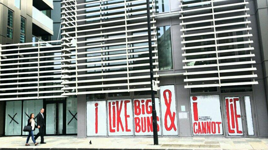
Grabbing the glances of busy London commuters is a hard task for any advertising agency. Whether it's some must-see billboard advertising or some clever print advertising, it has to make an instant impact. Design agency Charlie Smith took to the streets for their work with London based restaurant Byron Burgers.
"We've been working with Byron Burgers for a few years now and have worked on all of their recent new restaurant openings, both hoardings and signage," explains Charlie Smith project manager Hannah Buswell. "For the Shoreditch restaurant [pictured above], we commissioned Jean Jullien."
"The brief was to create a visual that could be applied easily to glass, eye catching and not interupted by the different panes." We love their quirky and humourous approach to advertising and with typographer Jean Jullien at their beck and call, they've caught our eye.
Article continues below 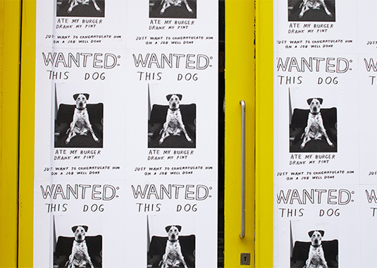
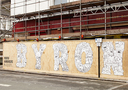
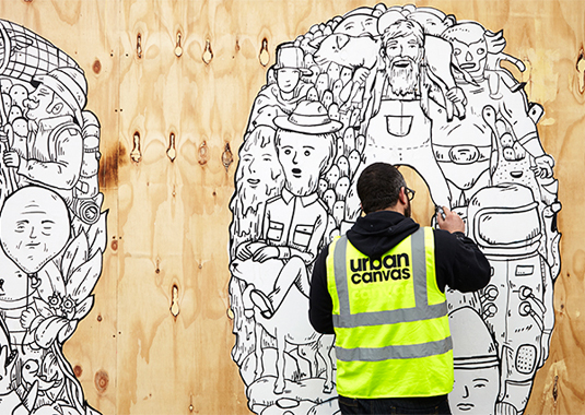
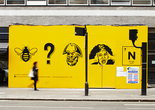
See more examples of their brilliant work on the Charlie Smith website.
What do you make of this particular project? Let us know in the comments box below!
Sign up to Creative Bloq's daily newsletter, which brings you the latest news and inspiration from the worlds of art, design and technology.

Sammy Maine was a founding member of the Creative Bloq team way back in the early 2010s, working as a Commissioning Editor. Her interests cover graphic design in music and film, illustration and animation. Since departing, Sammy has written for The Guardian, VICE, The Independent & Metro, and currently co-edits the quarterly music journal Gold Flake Paint.
