How to automate your Sketch handoffs
Design handoffs usually require multiple assets, developer walkthroughs, and even tedious redlining for every element. It’s a lot of work that risks misinterpretation.
With the right tools, however, you won’t just automate redlining — you’ll also be able to hand off a single prototype with all the interactions, specifications, and documentation developers need to reference. No more scattered assets or documentation. Just one single source of truth for development to match design.
In this tutorial, we’ll explain how to synchronize design and development using Sketch (for creation) and UXPin (for prototyping, specification, and documentation).
Article continues below01. Create your design
Whether you’re building an app or a website, you can create a design either in Sketch or in UXPin itself. Here, we’ll create a quick confirmation message inspired by Material Design.
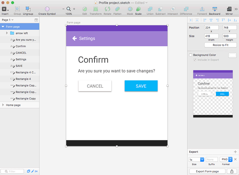
If you created your work in Sketch, import it into UXPin. The process is simple:
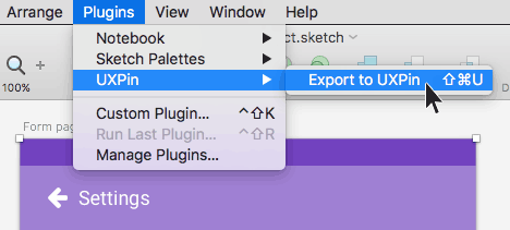
1. Select an artboard and find the UXPin Export function in Sketch’s Plugins menu.
2. Then drag the resulting file from your computer into a UXPin project folder. The system will create a prototype automatically.
Sign up to Creative Bloq's daily newsletter, which brings you the latest news and inspiration from the worlds of art, design and technology.
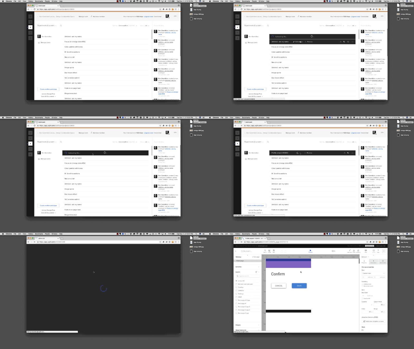
Once you’ve imported the design, you could leave it static and move straight to steps three and four below to generate your documentation and specs. A prototype, however, is always more useful for communicating system behaviour to developers.
Now let’s explore how to transform your static file into a lifelike prototype.
02. Make it an interactive prototype
Prototyping is key to communicating ideas before spending time in code that, frankly, might follow the wrong path. Designers should always plan their prototype, share it with their peers, and review it with stakeholders, before handing it off to developers for implementation.
Even the humble call-to-action button needs careful consideration. Should it match the rest of the page’s color scheme, or should it stand out? Does green always mean “submit” or “save changes” to the intended audience? Should it have an icon? What size should it be? What size should its text be? Should it have rounded corners? The list goes on.
And, of course, there’s the interaction. In this case clicking the “save” button will take users back to the dashboard view.
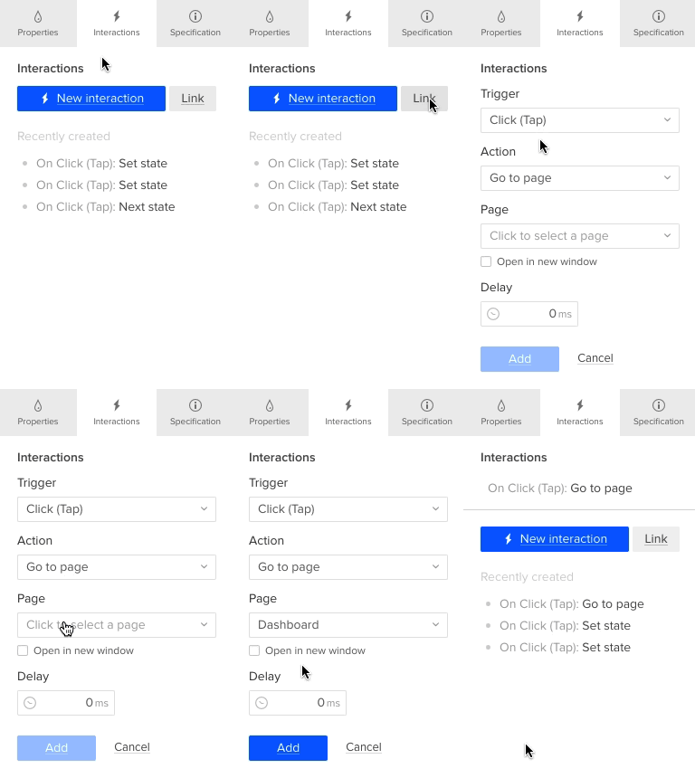
Only after designers answer questions about its functionality and appearance should they write the right code behind that creates it.
03. Add permanent documentation and snippets
The prototype shows how the design should look, feel, and behave. The documentation and code snippets explain how to get there.
Luckily, you can assign custom fields (like code snippets or descriptions of use cases) to individual layers in UXPin. That lets you communicate the context of the designs while helping your team to follow code standards.
Code snippets
If you imported the design from Sketch, never fear: the export plugin preserves all your layers.
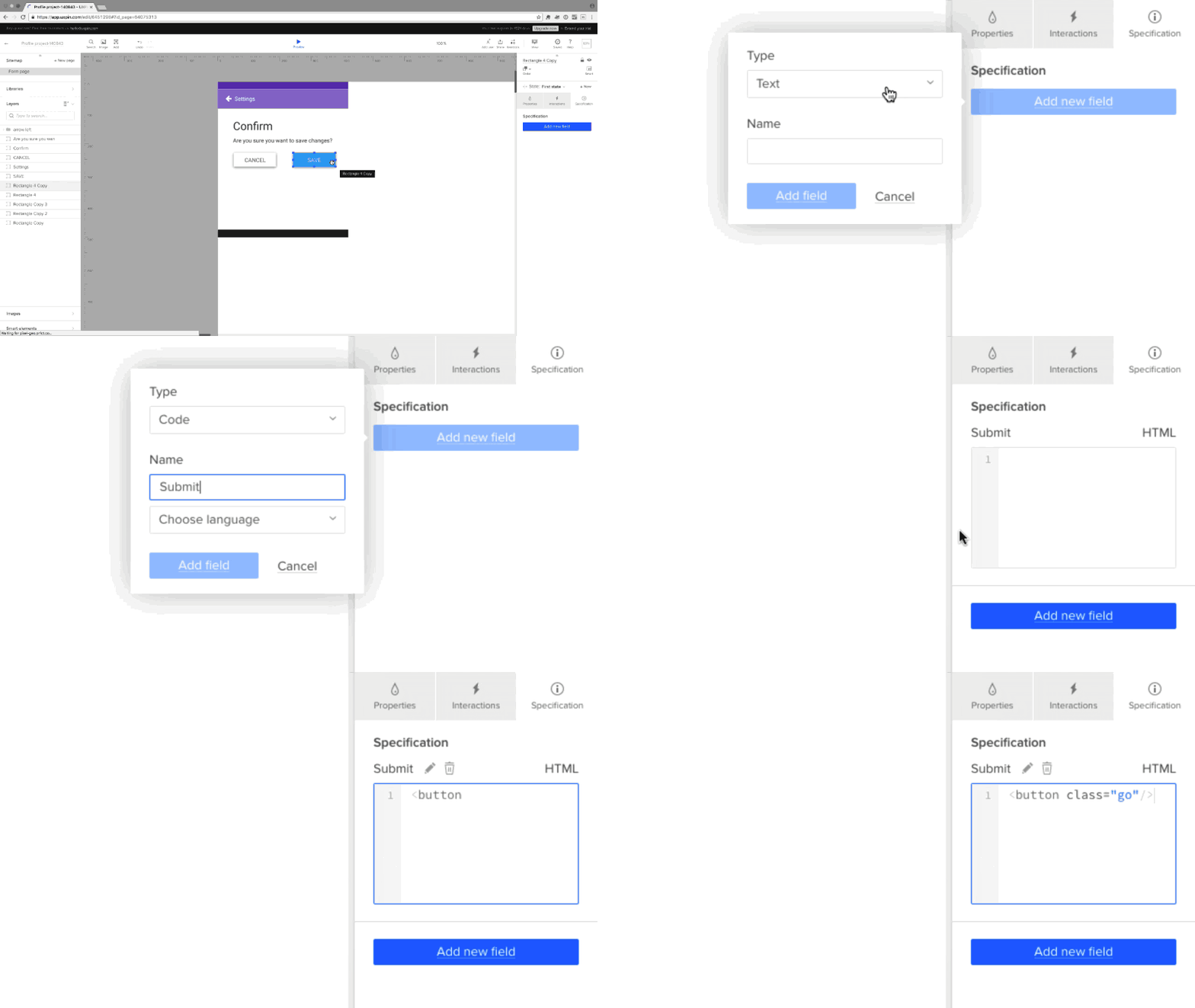
You or the developer can add custom code snippets:
- Click “Specification” on the right
- Click “Add new field.”
- Choose “Code” as your type of field
- Insert snippets from a language that follows your code standards (like HTML, Javascript, or CSS).
- Now that code snippet is permanently attached to your element. Anytime you reuse that element (e.g. in a repeating navigation), developers can see the right code snippets to use. Repeat the process with different languages, if necessary.
Use cases
Tricky interactions sometimes require further clarification. In that case, text fields are the perfect choice for adding use case descriptions.
- Click “Specification” on the right
- Click “Add new field.”
- Choose “Text” as your type of field
- Describe the context of the design element or notes on implementation. For example, “Use the @include button for primary actions. This will generate the styling for the button.”
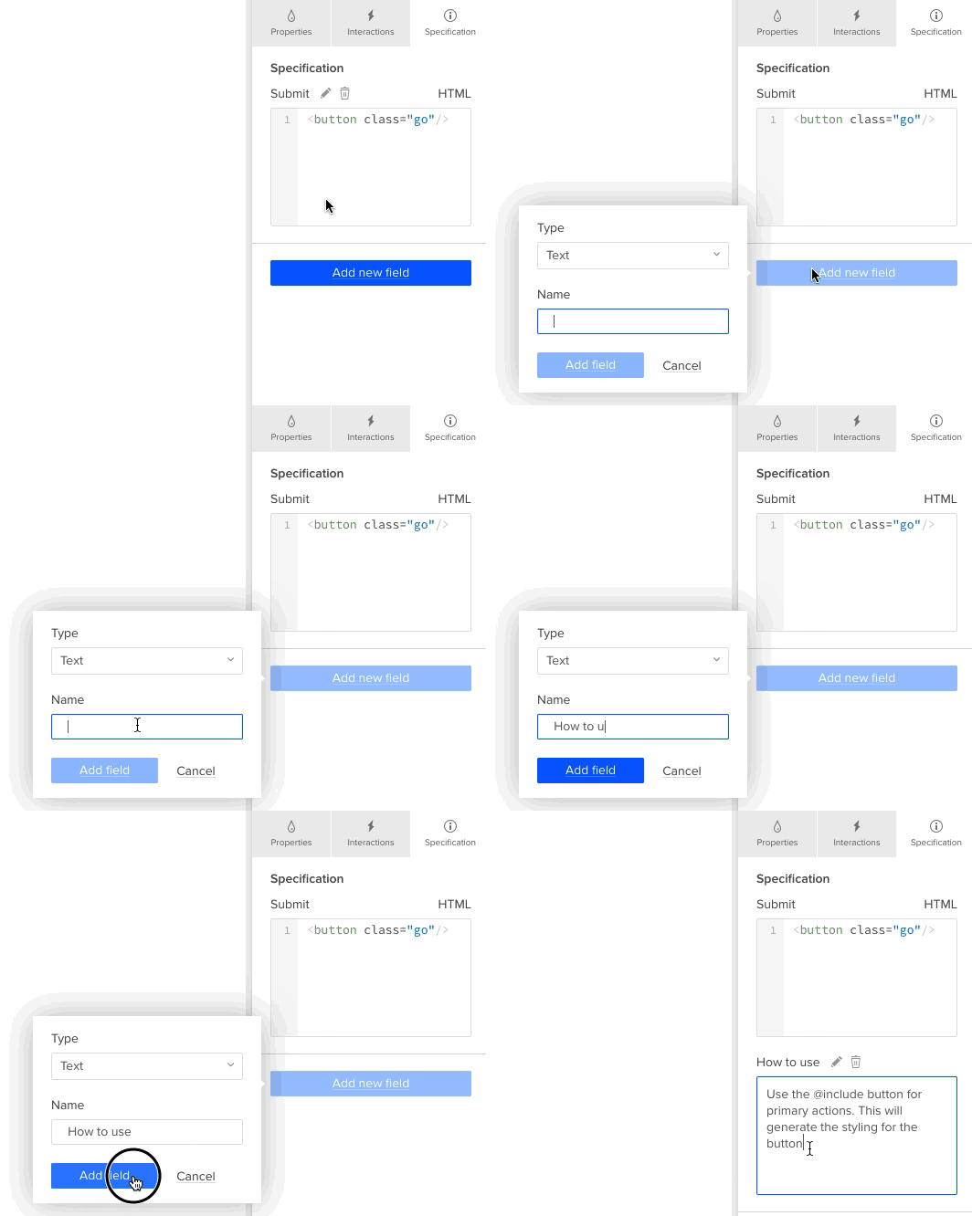
Of course, you can add any custom fields you’d like — we just described two of the most common types.
04. Auto-generate your specs
Now we can automate the most tedious part of the handoff process: the redlining.
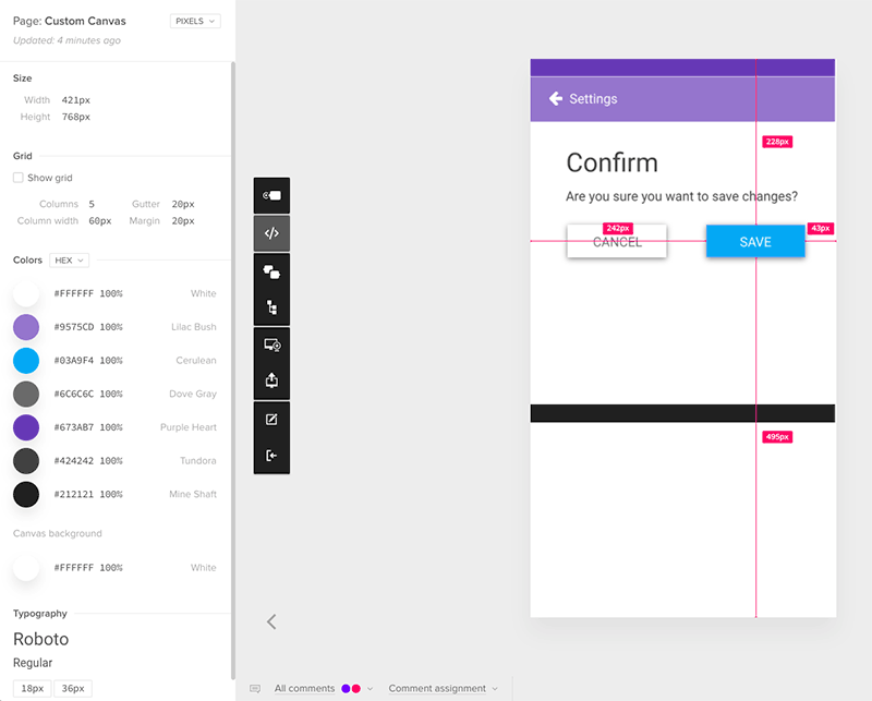
First, switch to Preview. Then, click on the “>” icon for Spec Mode to reveal pixel-level specifications for:
- Dimensions of all elements
- Borders and radiuses
- Grids, margins, gutters, padding
- Colors (in HEX and RGB)
- Typefaces, font families, font sizes
You can see all of the above in pixels, points, Retina, LDPI, MDPI, or HDPI. Every asset is also downloadable so developers can easily grab an image, icon, or whatever they need.
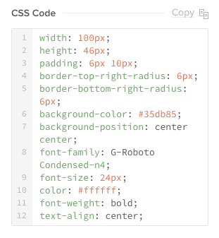
On top of all the specs, you’ll also get automatic CSS snippets for every element.
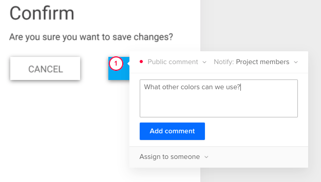
At this point, if anyone on the team has questions, they can simply drop in their comments and everyone will get notified. Resolve issues before they come up in development.
Next steps...
That’s it! Now your whole team can work off the same design and code standards, down to each snippet and pixel. In one place. Together.
If you want to try Spec Mode yourself, go ahead and start a free UXPin trial.
Jerry was a content strategist at wireframing and prototyping app UXPin, where he developed in-app and online content. Sadly, he passed away in April 2018.
