Web design layouts from scratch
When approaching a fresh site design, what’s the best way to tackle layout and ensure a guaranteed win? Elliot Jay Stocks shares his best web design tips
Sign up to Creative Bloq's daily newsletter, which brings you the latest news and inspiration from the worlds of art, design and technology.
You are now subscribed
Your newsletter sign-up was successful
Want to add more newsletters?
Ah, the blank canvas: probably my favourite part of the design process. What I love about it is the multitude of opportunities it represents: free rein to create without being encumbered by any of the restrictions that come into play further down the line. Anything can happen!
There are a number of ways to approach this stage. Some like to jump straight into Photoshop (or their layout tool of choice), but personally I try to stay ‘analogue’ for a while and work with good ol’ paper and pens.
Such tools are far more freeing than using a mouse and computer screen. They enable us to throw down ideas as soon as they come into our heads and be as expressive as possible, having absolutely no concern for things like neatness, which – at this stage, at least – just get in the way of creativity. If you haven’t worked this way before, give it a try: it’s extremely liberating.
To get further outside of your comfort zone, try doing your sketches in a completely different environment to where you do your more finished designs. If you’re not using a computer then you can travel light and not worry about things like electricity, so use it as an excuse to get outside. If it’s a sunny day, find a patch of grass. If it’s raining, revel in the hustle-and-bustle of your local coffee shop.
The sketchpad
My weapon of choice at this stage is my trusty A5 pad, which is just small enough to carry around easily but just big enough to fit in plenty of ideas. I prefer a blank one myself – because it feels the most ‘free’. Many designers favour the Moleskine. Later, when you’re getting ready to neaten up your sketches (obviously it’s impractical to continue down the path of freeform messiness forever), using square gridded paper can be a great way of deciding on your own grid structure, but more on that in a moment.
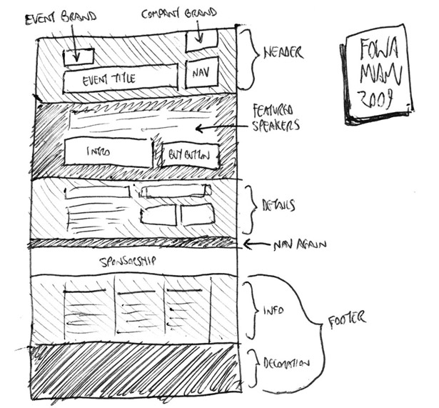
If sketching is a new concept to you and you’re not sure of the best way to approach it, try this exercise. Look at an existing website – ideally, one created by a designer you admire – and re-create it as a rough sketch in your pad. Firstly, this will help familiarise you with the relationship between sketch and finished product. Secondly, with long pages that have lots of content, it’ll help clarify how an entire page fits together – that is, the full height of any given page rather than just the bits we see in the limited browser window.
Sketching is a handy way of coming up with ideas, and refining your sketches before jumping into Photoshop means you can sort the good ideas from the bad quickly, without wasting time in an actual layout app. However, there’s no point in refining sketches too much, because detailed design is best saved for the medium in which it will eventually be experienced: the screen. Personally, I sketch in my pad until I become frustrated enough that I’m not working out the technicalities in Photoshop. At that stage, it’s time to start blocking out elements using wireframes.
Sign up to Creative Bloq's daily newsletter, which brings you the latest news and inspiration from the worlds of art, design and technology.
Wireframes and grids
Wireframes can mean different things to different people, and even vary from project to project. Some designers or clients like wireframes to go into great detail and define exact proportions of the grid that the site will eventually follow. Others treat them as nothing more than ‘neatened up’ versions of the most refined sketches. In reality, there are no hard and fast rules to live by, except to say that wireframing should enable you to see how the website will be laid out before any of what I call ‘the pretty stuff’ gets added on top. As I said in last issue’s article about working as a solo web designer, this is why it’s a good idea to separate out the wireframe and aesthetic stages of design: although they’re both parts of what you could liberally call ‘the design phase’, they focus your client’s attention on different aspects, one part at a time. Very loosely, you could say that wireframes enable them to think about layout from an interaction point of view, and aesthetics let them concentrate purely on the emotive experience.
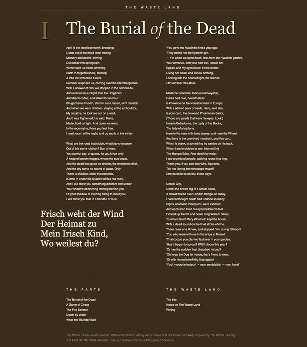
Whether you decide to define your exact grid during the wireframe stage or later, when you approach the ‘proper’ design, is an important decision. A popular grid is the 960 Grid System, which – at 960 pixels wide – can be divided into many different inner widths, such as 16 or 12 equally wide columns with gutters. However, it doesn’t really matter which grid you use, be it your own or one created by others, because ultimately it should be one that suits the content and provides you (the designer) and others (the site’s maintainer) with a guide that allows for the aesthetically pleasing alignment of a variety of different page elements. Carried across a site’s various pages, this considered alignment helps create a visual consistency. In his presentation ‘Walls Come Tumbling Down’, designer Andy Clarke reminds us that for large sites with a lot of dynamic content, we’re designing a system, not a page. (Andy is also a big fan of creating your own bespoke grids that are dictated by the site’s content. A number of his experiments with varied grids can be found here).
For more on grid-based theory and how principles from the art world can assist with our layout choices – such as using the Rule of Thirds or the Golden Ratio to define your relative widths – see Mark Boulton’s book A Practical Guide to Designing for The Web or my own recent book, Sexy Web Design.
So, with our sketches informing our wireframes and our wireframe helping to formulate the grid on which we’ll base the actual design, it’s time to move into the meatiest part of the project and start turning our ideas into something that resembles a functioning website.
My tool of choice for this task (and the wireframing stage before it) is Photoshop which, although not perfect, is a powerful program that enables me to visualise what I have in my head in the quickest and easiest way, at least in the first part of the design phase. Others prefer Fireworks, which was created for the specific task of designing for the web. But again, the tool is not important: it’s what you do with it that counts!
Designing in the browser
As time goes by, I find more and more that there isn’t really one tool to do all the jobs I need, and I find myself increasingly turning to the browser and treating it as a design tool in itself.
There’s one easy-to-spot reason why designing in the browser makes a lot of sense: it’s where the site, once finished, will be viewed. There are a variety of other reasons, but for me typography is one of the biggest ones – I’ve yet to find an application that can accurately simulate the way type appears in the browser, and as text is rendered differently in different browsers and on different operating systems, there’s no one true ‘correct’ rendering anyway.
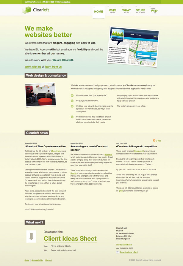
Designing in the browser is also a massive time-saver. Changing a line or two of CSS to affect something like column width or line height across an entire test site will often be much quicker than making the same changes in a mock-up, where the change would need to be made across several elements, re-exported and so on. It also means testing to see what works and what doesn’t can be done in seconds. Consider a 20-page site where each page has 10 divs containing text. If you have a mock-up for each page, it would be a huge job to change the gutter width between each text block from 10 to 15 pixels. But with a browser, you only need to open your stylesheet, change something like div.text { margin:0 15px } and you’re done. Just hit Save and then refresh your browser!
37signals is known for favouring browser-based design. In his post ‘Why We Skip Photoshop’, Jason Fried explains why the company jumps straight to HTML and CSS: “You can’t pull down menus in a Photoshop mockup, you can’t enter text into a field in a Photoshop mockup, you can’t click a link in a Photoshop mockup. HTML/ CSS, on the other hand, is the real experience.” My opinion is that this approach should be used where appropriate. I still do 80 per cent of my design in Photoshop and use browser-based design for tweaking and making the more intricate decisions about typography, for instance. Photoshop is a necessary tool for graphics-heavy sites (something I tend to produce rather a lot) but is understandably not as necessary for a company like 37signals, as its products use less imagery and favour simple blocks of colour and text-heavy elements such as multiple form fields. Once again, it comes down to choosing the most appropriate tool for the job.
However, another reason it’s worth considering browser-based design is that it will instantly show you how your site appears, not only on multiple browsers but also on multiple device.s. No designer can ignore the increase in demand for mobile compatibility, and while that has been made a little easier with the popularity of the iPhone and Mobile Safari’s desktop-like experience, there are still key differences.
With difference comes broken layouts, so it makes a lot of sense to see if and where they’re happening as soon as possible.
Working with fixed layouts has always been the easiest option, but with elastic and fluid layouts it’s a different matter. This adds an extra layer of uncertainty, as more parts of the design are allowed to move, so multiple scenarios need to be considered. And how do you show these changes in a flat mock-up? There’s no question about how awkward this is to do in Photoshop, where you’d need to create multiple versions of the page, rendered at different widths. If you’re creating elastic or fluid layouts, designing in the browser is worth doing as soon as possible in the process.
Layout constants
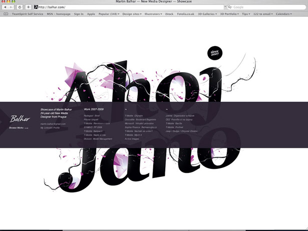
I’m a big fan of trying to design sites that break from convention and do something a little more interesting than all of the other clones out there. However, innovation is only effective when it’s balanced with conformity and let’s face it, sometimes we’ve just got to conform! Hence there are some elements in web design that appear time after time, and why not? Take the humble header: it’s hard to come across a site that doesn’t have one. But a clearly defined header adds some site-wide branding and consistency, and when it contains navigation, it gives users a guaranteed base to which they can return and find their way around. Headers needn’t actually be at the top of the page, either: I think of them more as a point of focus. Take balhar.com for instance: the ‘header’ is actually a strip that appears vertically centred in the middle of the screen.
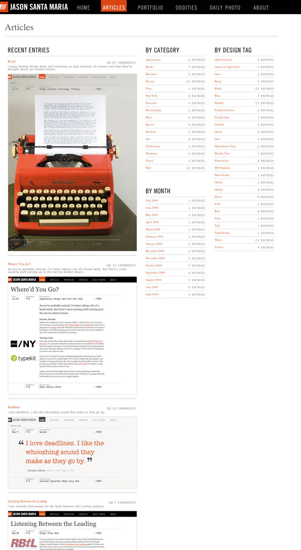
Huge footers seem to be all the rage these days, and for good reason. If you consider the common sidebar, a regular feature on blogs especially, there’s a lot of information there that sits alongside the actual content (which, on blogs, is usually the post). The trouble is this that the sidebar often contains elements that don’t necessarily relate to the post itself: think of the search box, generic category listings, links to recent comments on other posts, etc. Why clutter up your page with these things that detract from the main article being read? Sure, there are valid reasons to give prominence to these elements, but often we throw these things together without even thinking. Not so with the big footer: it’s a way of presenting large amounts of disparate information (such as blogrolls, social network links and daily bookmarks) without interrupting the flow of reading the main article.
Art direction
If there’s one area in web design I find exciting right now, it’s the concept of art direction being injected into the way we approach layout: something that, until recently, was sadly lacking in our online world. Popularised by Jason Santa Maria’s approach to his blog entries, the mantle has now been picked up by a number of designers who are aiming to treat their blog posts with the amount of care usually reserved for offline magazine articles. The key thing is that each post has a unique design, or variation on the ‘base’ design, and is thus a unique experience in itself. Rather than succumb to the rigidity of templates (something we’re all guilty of), each article gets designed according to its content. Dustin Curtis’ site is a great example: apart from the nav bar and footer, every single page looks completely different. Greg Wood’s site is another example in a similar vein, with even fewer constants. Each article has a distinct personality and looks absolutely beautiful.
Of course, art directing every single page isn’t something that can be applied to all websites. In fact, if we’re being honest, the number of sites that would be suited to this approach is relatively small. But it goes to show that layout on the web is finally growing up and we’re starting to achieve something that print design has enjoyed for years. Even if this only serves to impart a subtle influence on other sites where full-on art direction is unsuitable, it’s undoubtedly a great thing, and a sign that web designers are no longer afraid to do what they do best – design!

The Creative Bloq team is made up of a group of art and design enthusiasts, and has changed and evolved since Creative Bloq began back in 2012. The current website team consists of eight full-time members of staff: Editor Georgia Coggan, Deputy Editor Rosie Hilder, Ecommerce Editor Beren Neale, Senior News Editor Daniel Piper, Editor, Digital Art and 3D Ian Dean, Tech Reviews Editor Erlingur Einarsson, Ecommerce Writer Beth Nicholls and Staff Writer Natalie Fear, as well as a roster of freelancers from around the world. The ImagineFX magazine team also pitch in, ensuring that content from leading digital art publication ImagineFX is represented on Creative Bloq.
