How to create mood in your illustrations using Photoshop
Take your art to the next level with Eugenia Vi as she talks through vital techniques for setting a mood in your work.
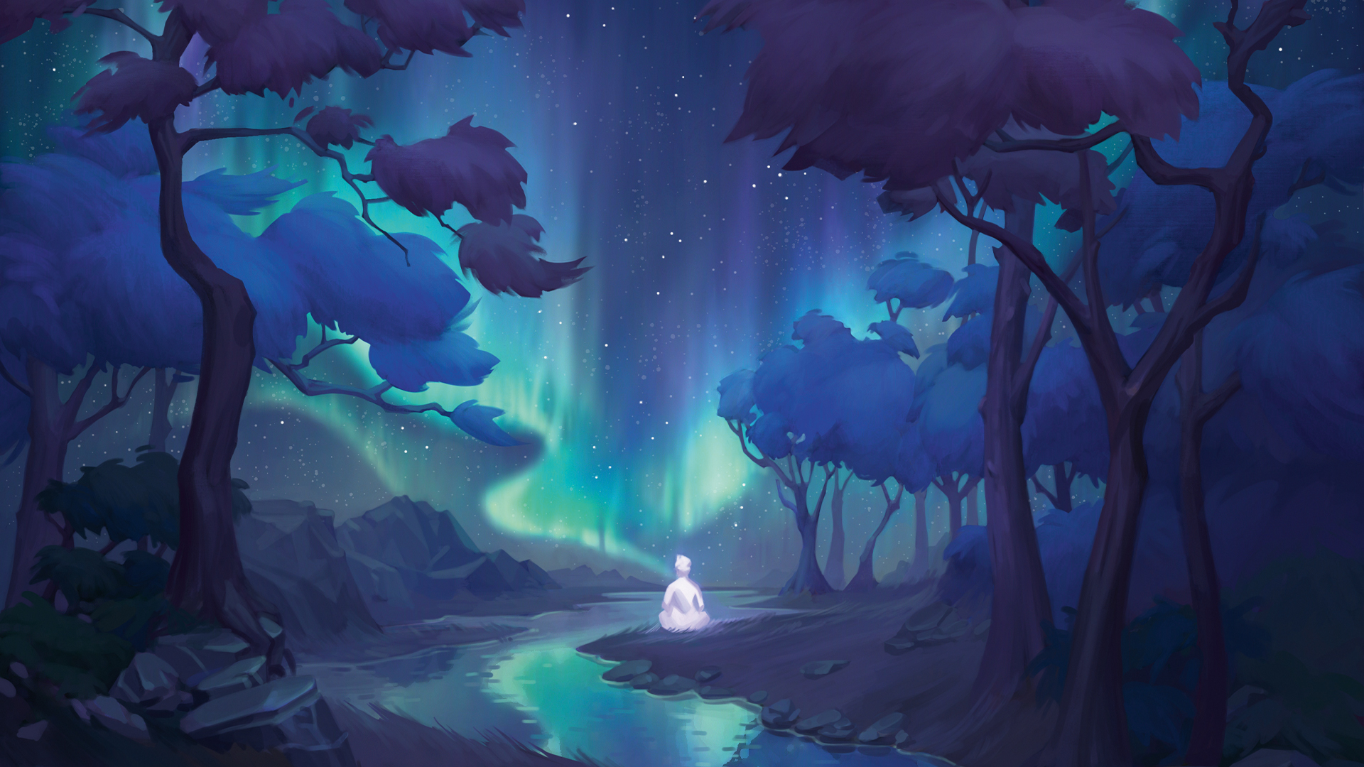
Every illustration is a harmony of many aspects, which can be a difficult task to bring together. One of the most difficult aspects of illustration to get right is the atmosphere. With it, we can understand not only the vibe of a piece, but also the feelings and emotions that arise in the viewer when looking at the illustration.
Because of this, each new artwork begins with some fundamental questions: what story do I want to tell? What feelings should it evoke in the viewer? It’s understanding the answers to these questions that underlies the choice of atmosphere and its depiction through the basic tools of any artist in composition, colour and light.
The purpose of this workshop is to show an approach to creating an atmospheric illustration, which we’ll talk through step by step. To start off I’ll explain my own ideation process, sharing some pointers to help find your initial inspiration and a fundamental idea. We’ll also talk about building up the image, from laying down values to adding colour. Finally, we’re going to take a look at the final stages, adding in details and adjusting the final composition to create a unique piece that displays the mood we set out for.
Article continues belowMy artwork went for a peaceful atmosphere, but the same concepts can be used to create any mood. If you're looking to upgrade your setup, check out our guide to the best digital art software to bring your creativity to life.
01. Find inspiration and start searching for an idea through your sketches
The world around you is amazing and multifaceted. When you’re searching and studying the vast amount of visual material on the internet – for example on sites such as Pinterest, Flickr and 500px – you can take in a
lot of interesting ideas. Photos can be a great source of inspiration for paintings and atmospheric sketches.
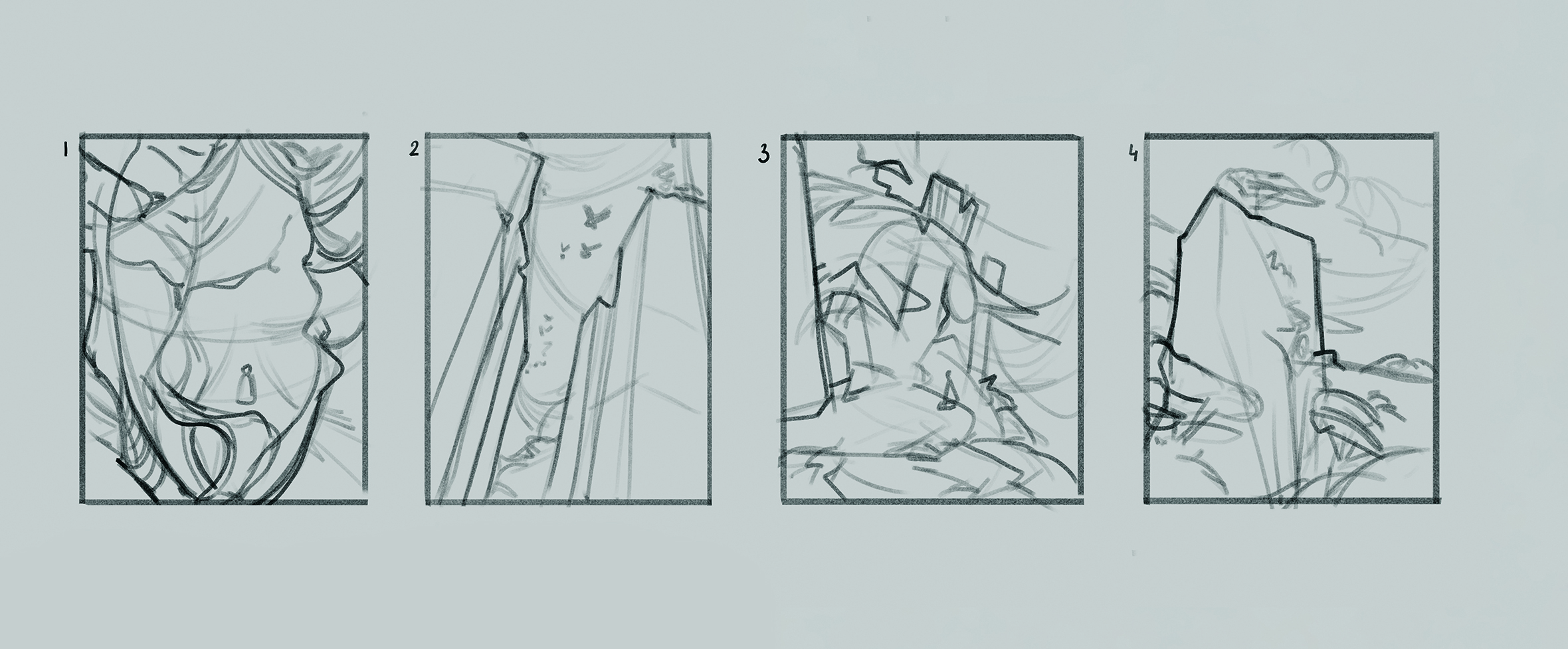
When you start working on an illustration, it’s a good idea to begin by creating a selection of thumbnails. These loose little sketches are great for helping you see what ideas will work well, and what composition will best convey the feeling that you’re looking for. At this stage, it’s good practice not to get hung up on drawing one specific idea, but to test out as many different approaches as you can, one of which will probably end up being exactly what you need for your brand new piece.
02. Clarify the sketch
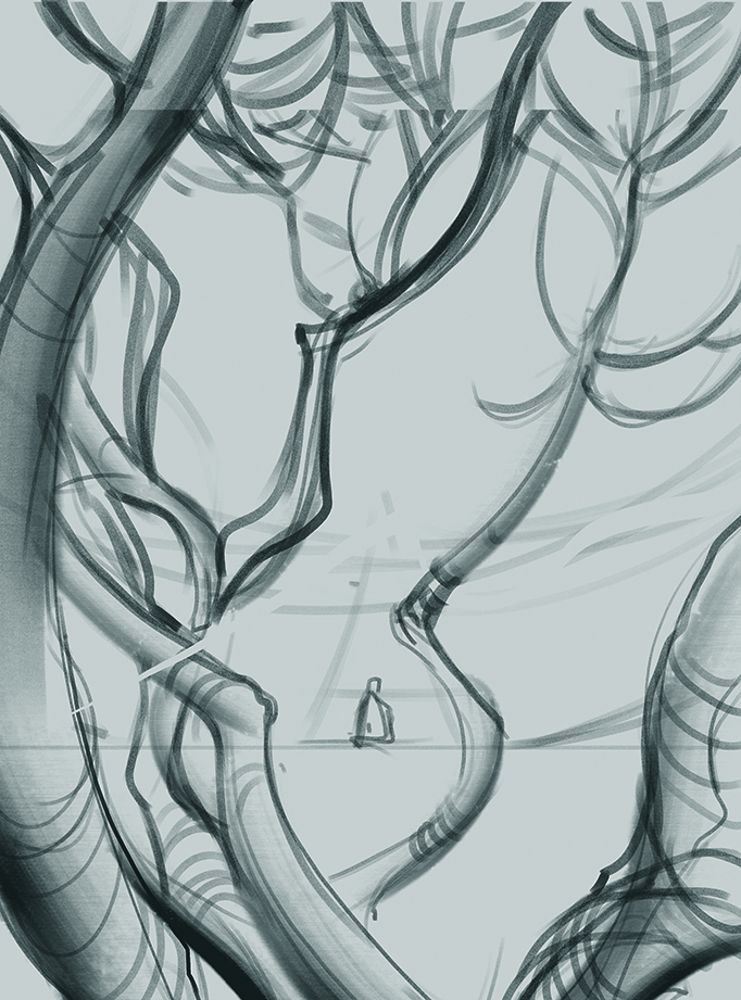
From my thumbnails, I felt the story I wanted to tell about a pensive character was best emphasised by the ornate and filled composition of option one, as this sketch was the most interesting and promising for further work. Since the thumbnail was extremely rough, at this stage it’s necessary to clear up and harmonise the composition. The placement of the character and the branches arranged around them that form a frame enhance the image’s feeling of their thoughtfulness and isolation, which brings extra narrative and depth to the illustration.
03. Begin working with values
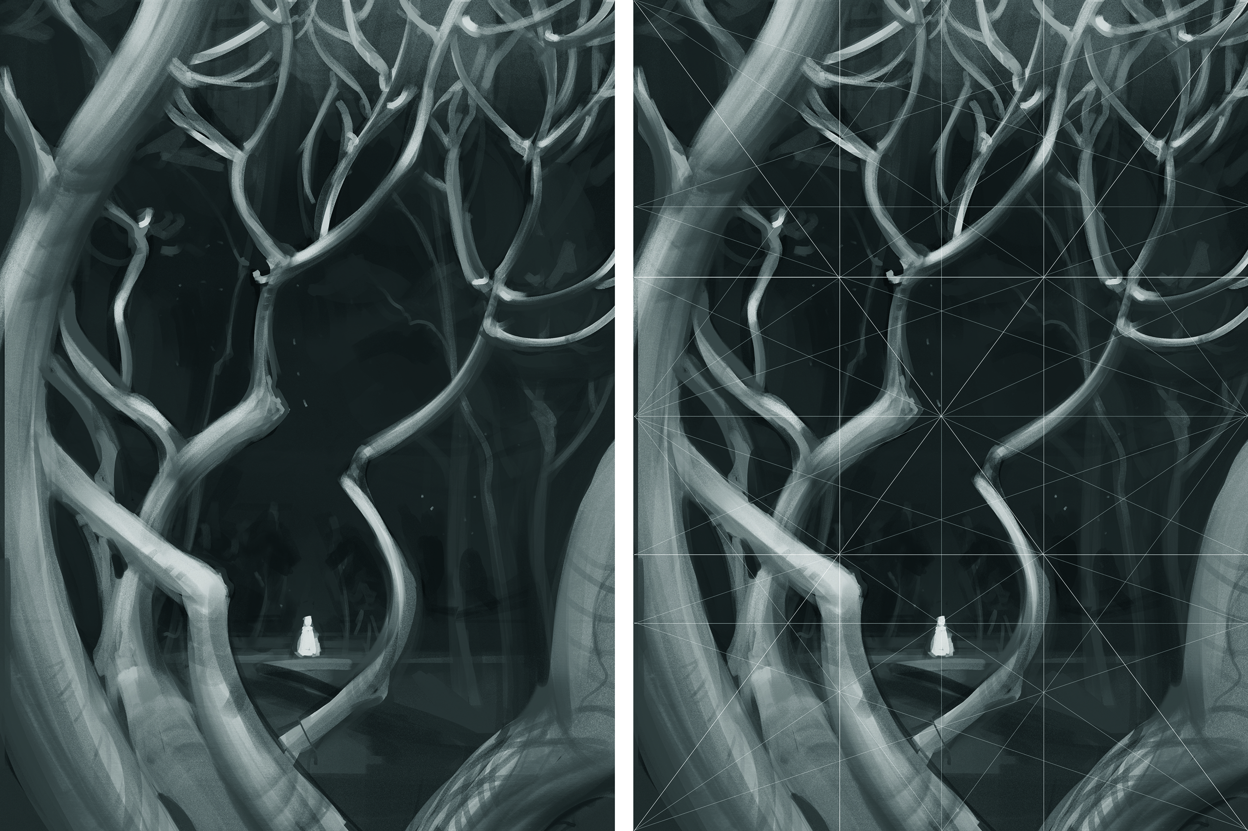
The next step is completed in greyscale. Already at this stage of the process, the illustration is beginning to acquire atmosphere and mood through correctly constructed tonal relationships. The lighter branches echoing the luminous character and contrasting with the surrounding darkness create a mysterious and slightly magical atmosphere, perfectly complementing the idea of thoughtfulness and isolation set by the composition.
It’s also worth paying attention to the composition at this stage, and I’d recommend checking it over using a composition grid to ensure the guides and compositional centre are positioned in the right places.
04. Push your idea forward
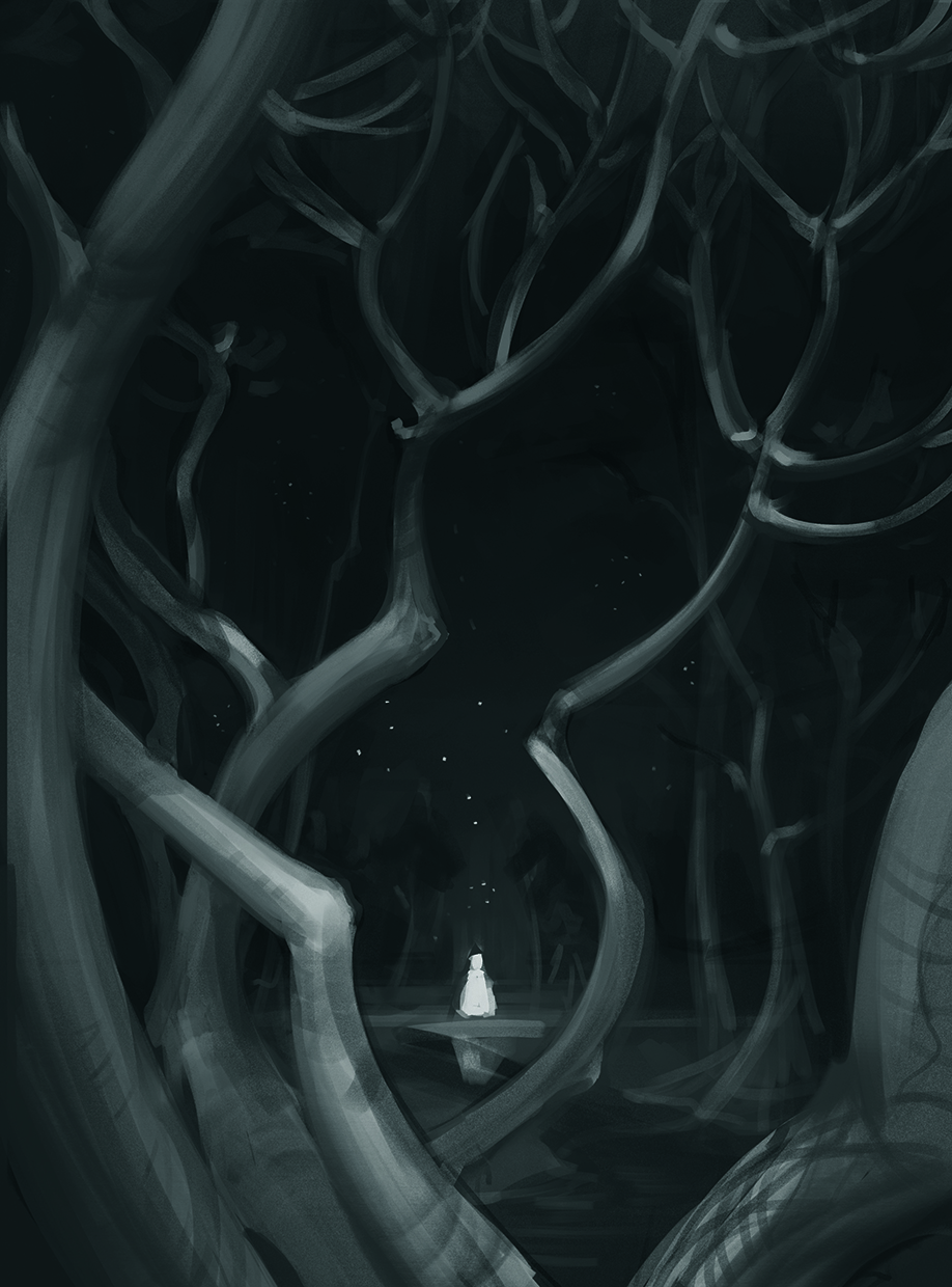
Once the basic values have been built and the composition has been corrected, you can move on to finalising the contrasts. Since the character is the focal point of the illustration, they should be the element with the most contrast on the page. As you move away from the focal point, the contrasts should become softer. Along with refining the contrasts, some key details can be outlined for further painting to enhance the atmosphere of the illustration. For example, the water and stars are key to giving the illustration a mystical atmosphere.
05. Search for references
After completing the greyscale, you can move on to adding colour. To make this process easier, you should find around five references that will become a reliable support for further work. For this illustration, the paintings Night Brings Good Counsel and Silent Night by Eric Bowman, and Blue by Min Yum were all excellent help.
The atmosphere, colour and light of these paintings perfectly resonate with both my idea and the finished greyscale. To ensure your work is focused, you need to clearly understand what purpose each reference serves. Silent Night was my main reference for colour and light, Blue was a great example of graphics, and Night Brings Good Counsel was the key reference for the mood.
06. Bring in a base colour (right)
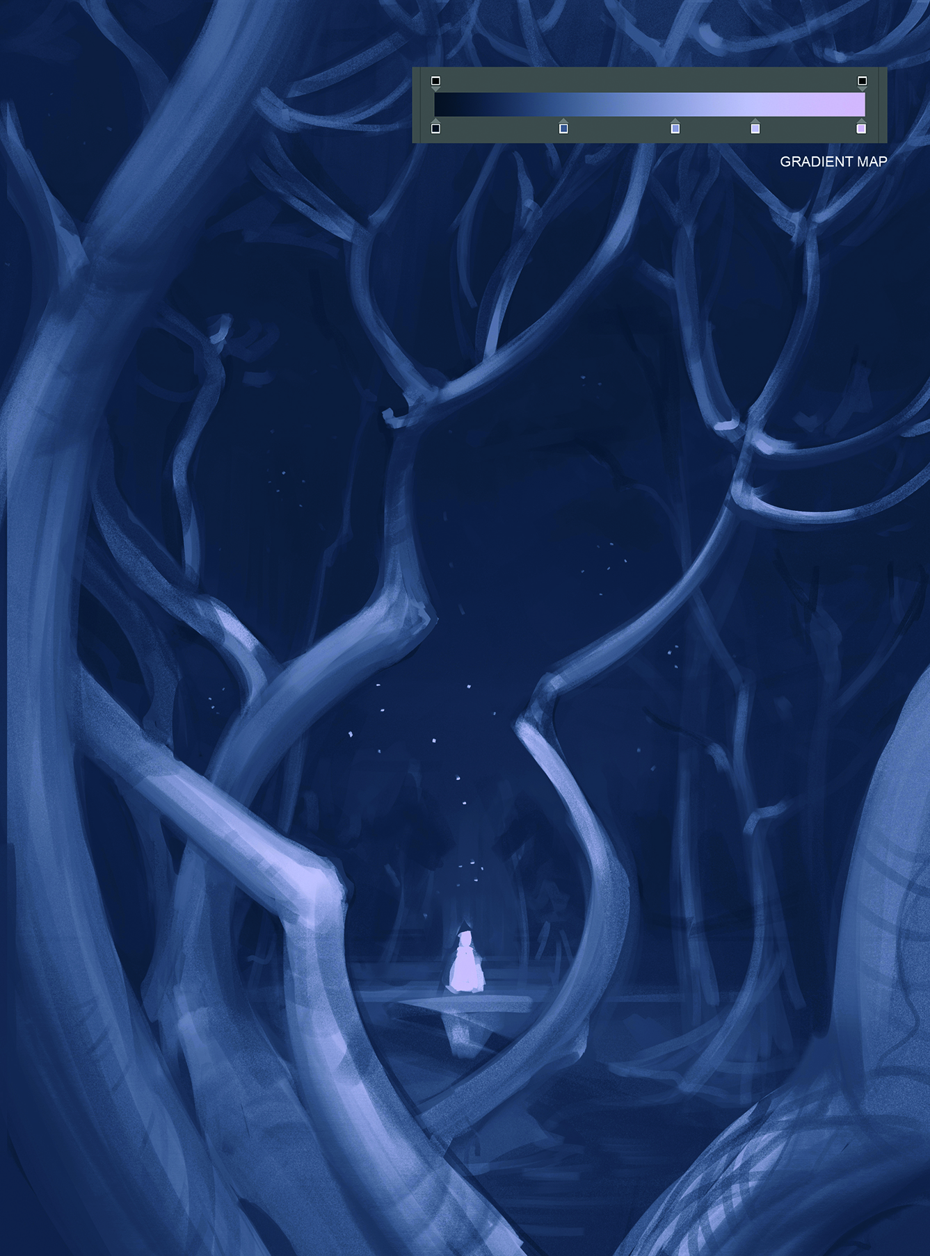
It’ll be easier to start working with colour if you set a base colour using a gradient map. This allows you to immediately put several basic shades into the illustration that will be simpler to work with in future. My gradient map uses dark blue for the shadows, lilac for midtones, and pink for the highlights. It’s easiest to stick to more neutral colours now so you have room to add pops of colour later on. Of course, you can immediately play with more saturated colours if the illustration requires it.
Continue building up colour on a new layer on top of the base colour layer. This way we’ll still have the opportunity to roll back a few steps and try other colours. Distribute colour spots, keeping in mind the hierarchy of values and contrast distribution within the illustration. You shouldn’t get too focused on the greyscale at this stage; if you want to change some aspect for the sake of better representing your idea, then go for it!
07. Keep your artwork layered

Before finalising the illustration, make sure it’s made in layers that are convenient to work with. Doing this will enable you to make changes more freely to different areas of the image without the fear of spoiling the finished and successful elements already in the bag.
I’ve found the most optimal method for this is to divide the illustration into the foreground, midground and background, as well as to separate small and complex details, for example tree leaves in the foreground or stars in the background, onto separate layers.
08. Work on the background
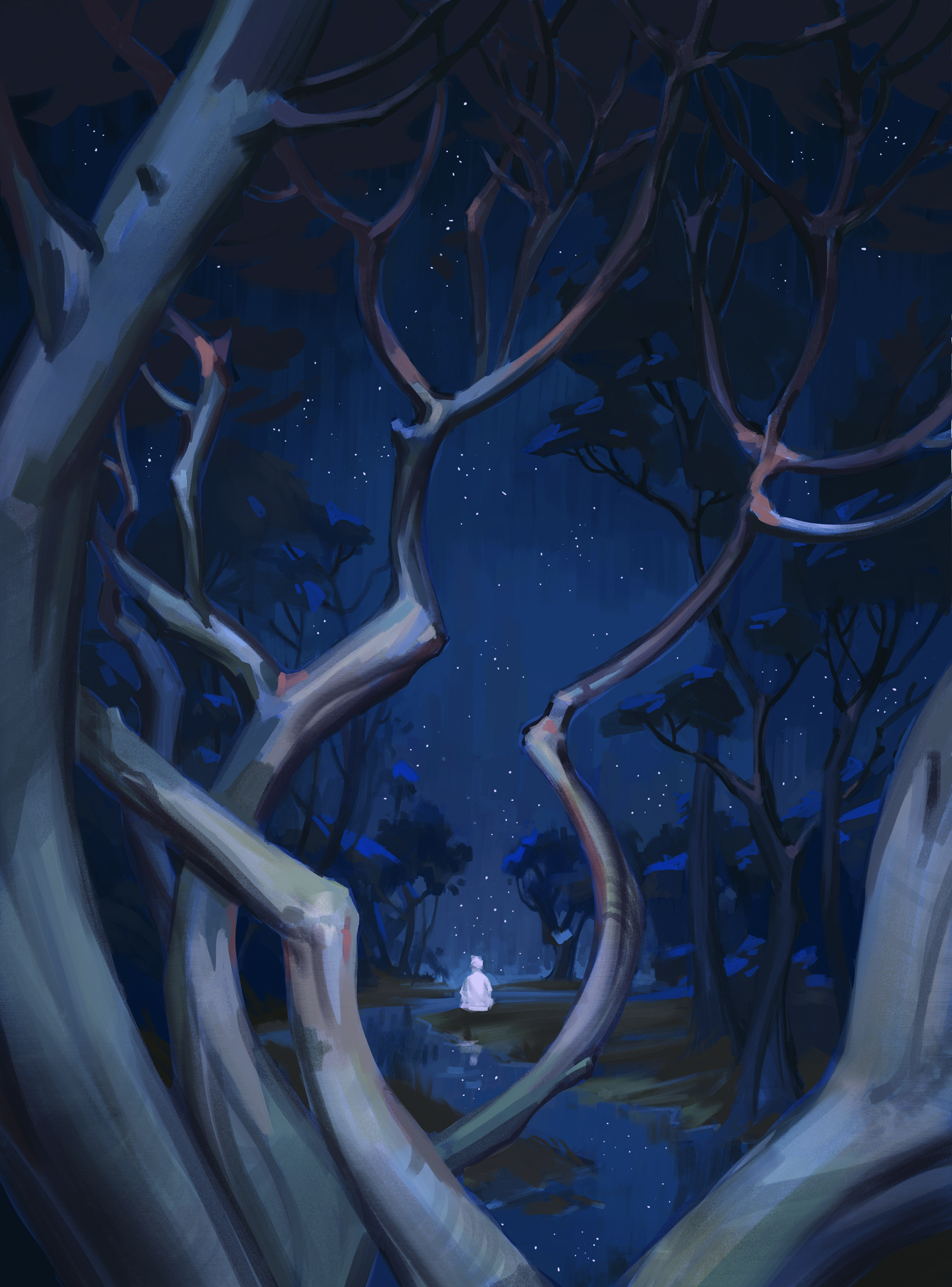
Since the foreground already looks quite final, the next step is to work on the midground and background. To do this, we need to work out the forms better and add more medium and small details. It’s important to remember that the further the object is from the viewer and the less significant it is, the more general its detailing should be.
At this stage it’s also worth enhancing the sense of space. Since this illustration tends more towards graphics than painting, the aerial perspective used here isn’t so strongly expressed and the space acquires its depth primarily due to the scale and guides.
09. Add more details to make the atmosphere stand out
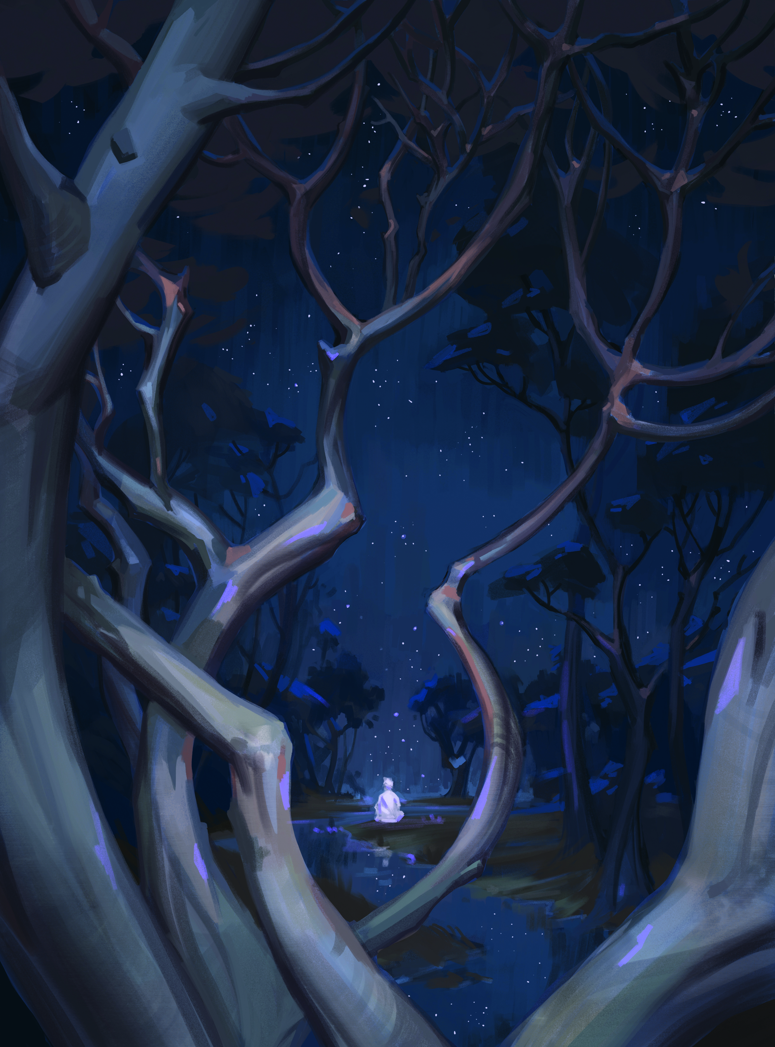
Come this point most of the illustration is ready, but its magical atmosphere can still be enhanced by adding colour accents. I chose a rich light purple colour for this task. In addition to the fact this colour is commonly associated with all things mystical, it harmonises well with the blue, purple and brown shades already used throughout the artwork.
Along with the accents, at this stage it’s necessary for us to once again go through the entire illustration, refine all the rough edges and strengthen the focal point. As a result, the branches seen in the foreground became a touch more refined, and some additional accent details appeared around the focal point.
10. Add extra touches
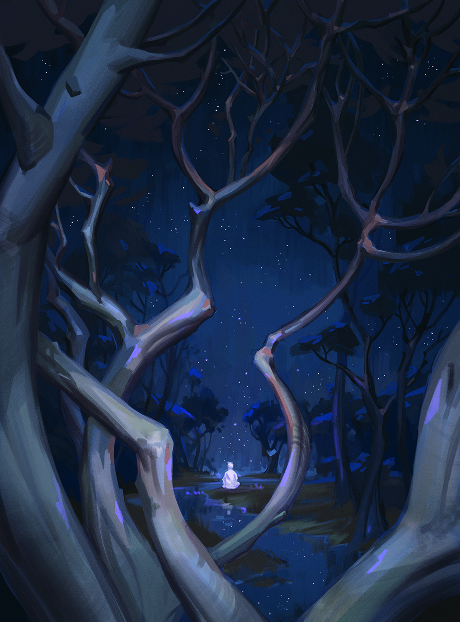
Now the illustration will need to go through some post-processing. At this stage, adding overlay effects and making small changes to the values, colour or textures can create additional interesting features. For this illustration, a slight darkening vignette has been added, and the contrast of the focal point has been increased slightly. A noise effect was also added on top of the scene.
The best way to do this is to create a new layer on top of the entire image, fill it with a medium grey, go to Filter>Noise>Add Noise and apply it to this layer with any values you like, then change the blending mode to Soft Light. The saturation of the effect can be adjusted using the layer’s transparency settings.
11. Turn up the atmosphere

After considering some feedback, I felt it was worth revising the composition of my illustration to push the atmosphere up a notch. It became clear the idea of branches in the foreground should be abandoned, as although they created an interesting frame, at the same time they were close to the viewer and fragmented the space too much.
However, simply removing them would have left the space too empty, so larger trees and an aurora were brought in, which helped to further develop the expressive, atmospheric feeling of the image.
This content originally appeared in ImagineFX magazine, the world's leading digital art and fantasy art magazine. ImagineFX is on sale in the UK, Europe, United States, Canada, Australia and more. Limited numbers of ImagineFX print editions are available for delivery from our online store (the shipping costs are included in all prices).
Sign up to Creative Bloq's daily newsletter, which brings you the latest news and inspiration from the worlds of art, design and technology.
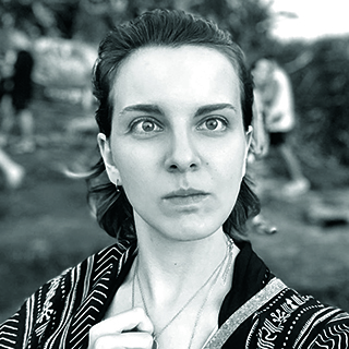
Also known as EvKimo, Eugenia is an illustrator, art director and concept artist whose long list of credits includes the hit dungeon-crawling RPG Diablo IV among a range of other projects.
