The 5 best ever World Cup football designs
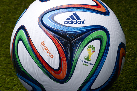
We count down the five greatest World Cup soccer ball designs and introduce the 2014 Adidas Brazuka.
Sign up to Creative Bloq's daily newsletter, which brings you the latest news and inspiration from the worlds of art, design and technology.
You are now subscribed
Your newsletter sign-up was successful
Want to add more newsletters?

German sportswear and equipment manufacturer Adidas has been at the heart of pop culture for decades and a design icon for longer than that. It's no exaggeration to say that some people passionately support the Adidas brand in the same way that they might support their local soccer team.
One surprising obsession for a branch of these sports addicts is football design. You thought it was just a plastic or leather inflatable sphere, didn't you? Wrong. And the announcement of a new World Cup ball design gets the anoraks weak at the knees, and Adidas - which has owned the rights to supply the World Cup ball since 1970 - has created a strikingly colourful offering in 2014's Brazuka.
The Brazuka will be used at this summer's tournament in Brazil. Its name comes from the colloquial term that describes the Brazilian way of life, but by happy coincidence also sounds a bit like 'bazooka' which will keep the sports commentators happy when they're scrabbling around for a pun following a well-struck shot.
Article continues below 
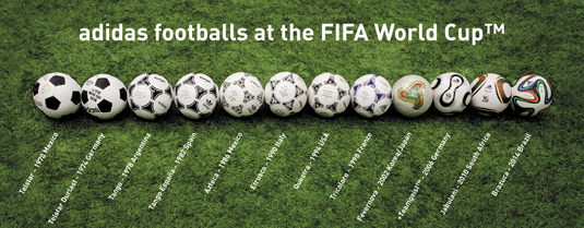
Head to the Adidas World Cup website to find out more, but to help celebrate the latest World Cup ball, here is a countdown of the best five football designs from Adidas' long history of supplying the essential equipment to the World Cup.
05. Fevernova (2002)

For the 20 years following the introduction of the Tango design (below), Adidas' World Cup footballs had retained that ball's basic design while adding styling flourishes and colour variations.
Not so with the Fevernova, created for the 2002 World Cup held in Japan and Korea - the design features four large triangle-ish shapes sitting across several hexagonal/pentagonal panels rather than being contained with a single lanel, a la Tango. The colours and design represent Asian culture, which seems a bit vague but led to an attractive football design.
04. Tango (1978)

Designed for the 1978 World Cup in Argentina, the Tango was a mould-breaking ball design that formed the blueprint for Adidas' soccer balls for decades to follow.
Sign up to Creative Bloq's daily newsletter, which brings you the latest news and inspiration from the worlds of art, design and technology.
The distinctive three-sided shapes printed on the panels created a circle in the negative space, with the overall effect proving attractive and interesting - particularly when the ball is in flight. The Tango was so distinctive and such a sales success that it virtually became a byword for 'ball' amongst children growing up through the '80s.
03. +Teamgeist (2006)

The +Teamgeist was the first World Cup ball from Adidas to fundamentally change the manufacturing process - if you look closely, this is the only ball here not to be made up of a combination of hexagonal and pentagonal panels stiched together. And the +Teamgeist's design (if not its silly name) emphasised the new ball's radical four-panel structure beautifully.
02. Telstar durlast (1974)

The Telstar Mexico from 1970 is still how many people picture a soccer ball in their mind's eye - if you asked 10 random people to quickly draw a football, they'd draw the white-and-black hexagon-and-pentagon panel pattern of the Telstar.
But arguable the cleanest version of the Telstar design was the 'durlast' version created for the 1974 World Cup in West Germany, which had black lettering rather than the Mexico's gold.
01. Azteca (1986)

The Azteca may look like a Tango with squiggles, but if you delve deeper you'll see that the squiggles in the ball created for the Mexico '86 World Cup are meant to reflect that country's Aztec murals and architecture.
This was the first time that the ball had been designed specifically to incorporate a stylised element of the host nation's heritage and that helped it to remain rooted in football folklore.
What's your favourite World Cup ball? How would you design a soccer ball? Tell us in the comments...

Craig Stewart is a writer, SEO strategist and content marketer, and is a former editor of Creative Bloq. Craig has written about design, typography, tech and football for publications including Creative Bloq, T3, FourFourTwo and DSG, and he has written a book on motoring for Haynes. When he's not writing, you'll usually find Craig under his old car learning about DIY repairs the hard way.
